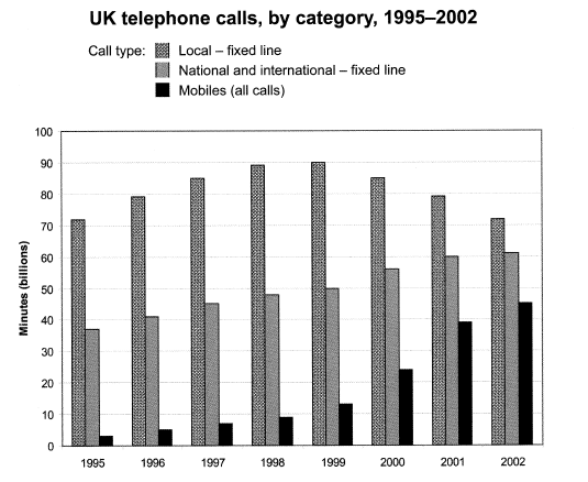
The chart below shows the total number of minutes (in billions)of telephone calls in the uk, divided into three categories, from 1995-2002 . Summarise the information

In
this
graph chart
we can see that there are three Add a comma
,chart
catagory
of call type, first one is Correct your spelling
category
local-fixed
Add an article
a local-fixed
the local-fixed
line
, second
one
national and international-fixed Correct pronoun usage
apply
line
, third
Add an article
the third
one
is Mobiles(all calls)
There is Correct pronoun usage
apply
total
number of Change the article
a total
the total
minutes
(in billion
)of telephone calls in the UK,divided into three Correct your spelling
billions
categories
,form
1995-2002. At Correct your spelling
from
first
we can see that the local fixed Add a comma
,first
line
is higher than other
two Correct article usage
the other
categories
. In 1995 the rate
of local
fixed Correct article usage
the local
line
is in 70minutes(billions
).on Correct article usage
the other
other hand
the national and international-fixed Change the wording
another hand
other hands
line
is in 35 to 38 minutes
(billions
). And the last
mobiles
(all calls) is in 5 Fix the agreement mistake
mobile
minutes
(billions
) .
The total rate
of minutes
(billions
)of all categories
was increased in this
7 years. We can see that the Correct determiner usage
these
rate
of of
local-fixed Remove the redundancy
apply
line
was increasing till 1999 after 1999 it was decreasing. In category two the national and international-fixed line
we can see that it is increasing form
1995 to 2002. The Correct your spelling
from
rate
of national
and international-fixed Add an article
a national
line
is constantly increasing. On other Fix the agreement mistake
lines
hand
the Add a comma
,hand
rate
of mobile (all calls) has increased a lot Correct quantifier usage
more than
than
Change preposition
in
past
. The Correct article usage
the past
rate
of mobiles(all calls) has huge
number of Change the article
a huge
the huge
of
Remove the redundancy
apply
minutes
(billions
). It moves so fast than other
two Correct article usage
the other
categories
.
From the hole
graph Correct your spelling
whole
chart
we can see that the total number of Add a comma
,chart
minutes
(billions
) was constantly increasing, accept
Correct your spelling
except
local
- Correct article usage
the local
fixed
Add a hyphen
fixed-line
line
. Local
fixed Add an article
The local
line
also
increases between 1995 to 1999 after that we can see that it was decreasing .Unauthorized use and/or duplication of this material without express and written permission from this site’s author and/or owner is strictly prohibited. Excerpts and links may be used, provided that full and clear credit is given to Writing9 with appropriate and specific direction to the original content.
Introduction: The introduction is missing.
▼
Introduction: Change the first sentence in the introduction.
▼
Introduction: The chart intro is missing.
▼
Introduction: The chart intro is missing.
▼
Vocabulary: Replace the words line, minutes, categories, rate, billions with synonyms.
▼
Vocabulary: Only 5 basic words for charts were used.
▼
Vocabulary: The word "chart" was used 2 times.
▼
Vocabulary: The word "graph" was used 2 times.
▼
Vocabulary: The word "number of" was used 3 times.
▼
Vocabulary: The word "increased" was used 3 times.
▼