The graph below shows the proportion of the population aged 65 and over between 1940 and 2040 in three different countries.

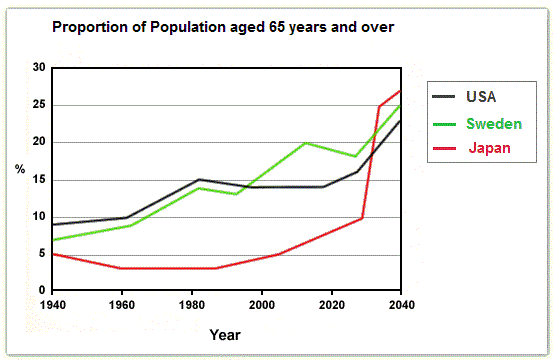
The graph illustrates the portion of the population between the ages of 65 and above in the USA, Sweden and Japan from 1940 to 2040.
Unit
measured in percentage.
Add an article
The unit
Overall
, Japan had the highest and the lowest amount of people within this
age bracket with about 25% and 3% in 2040 and 1980 respectively. Additionally
, it can be seen that,
the USA and Sweden maintained a close margin in their figures, with approximately 23% for both nations in 2040.
Looking closely at the data presented, America had a consistent upward trend with a sharp fall in 2020, the numbers continued to raise up until the Remove the comma
apply
last
year. Similarly
, Sweden’s figures showed a close resemblance with the former, but with a continuous record of an upward movement through out
its course.
In Japan Correct your spelling
throughout
however
, in the Add the comma(s)
,however
year
1940, 1960, 1980 and 2000 there was a downward trend for Fix the agreement mistake
years
this
category of people with around 3% at the lowest.Submitted by kumrash2019 on
Unauthorized use and/or duplication of this material without express and written permission from this site’s author and/or owner is strictly prohibited. Excerpts and links may be used, provided that full and clear credit is given to Writing9 with appropriate and specific direction to the original content.
Vocabulary: The word "figures" was used 2 times.
▼
Vocabulary: The word "trend" was used 2 times.
▼