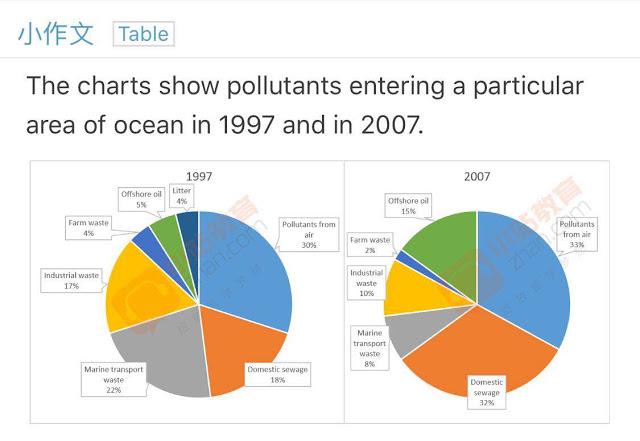
The pie chart below shows information about different types of pollutants entering in a particular area of ocean in 1997 and 2007

This
pie chart analysts
proportions of different types of contaminants Replace the word
analyses
discharging
in a specific area of Wrong verb form
discharged
ocean
in 1997 and 2007.
Correct article usage
the ocean
It is clear that
in 1997, the amount of trash are in the majority and the proportion of air pollution was the lowest. However
, in 2007, most of pollutants
are oil Add an article
the pollutants
whereas
the minority was agricultural runoff.
In 1997, trash is the most popular type of contaminant, at 42% but the figure of
trash dropped nearly threefold to 15% in 2007. Comparatively, there was only 15% of oil in Change preposition
for
this
area in 1997 then
there was a significant increase in the percentage of oil, at
52% and become the largest amount of pollutant at the same time.
The figure Change preposition
to
of
air pollution was only 3% and was the lowest rate in 1997. Change preposition
for
Meanwhile
the data about sewage and agricultural runoff are 15% and 25% respectively. In 2007, the percentage of air pollution rose more than five times, Add a comma
,Meanwhile
at
15%. Change preposition
to
By contrast
, both the figures of
agricultural runoff and sewage decreased to 10% or below.Change preposition
for
Unauthorized use and/or duplication of this material without express and written permission from this site’s author and/or owner is strictly prohibited. Excerpts and links may be used, provided that full and clear credit is given to Writing9 with appropriate and specific direction to the original content.
Sentences: Add more complex sentences.
▼
Introduction: The introduction is missing.
▼
Introduction: Change the first sentence in the introduction.
▼
Introduction: The chart intro is missing.
▼
Introduction: The chart intro is missing.
▼
Vocabulary: The word "figure" was used 3 times.
▼
Vocabulary: The word "amount" was used 2 times.
▼
Vocabulary: The word "percentage" was used 2 times.
▼
Vocabulary: The word "proportions" was used 2 times.
▼