the graph below shows the amounts of waste produced by three companies over a period of 15 years. Summarize the main features and make comparison where relevant.

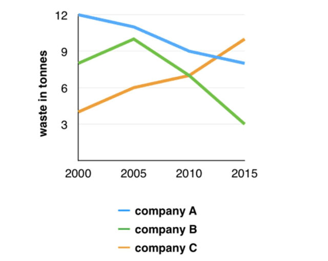
The waste produced by company A was the most, with around 12
tones
Correct your spelling
tonnes
waste
in 2000. The total trend Change preposition
of waste
was
decreased noticeably and reached about 8 Unnecessary verb
apply
tones
in 2015. This
drop trend was also
seen in company
B, the figure climbed to 10 Change the capitalization
Company
tones
by 2005, but after that
it plumbed dramatically Add a comma
,that
then
reached 3 Correct word choice
and then
tones
in 2015.
There was an opposite line of waste in tones
which is company
C, with the figure were 4 Change the capitalization
Company
tones
which was the lowest in 2000. But it has a
substantially rose in 15 years Correct article usage
apply
then
reached 10 tones
and became the highest one in 2015.Unauthorized use and/or duplication of this material without express and written permission from this site’s author and/or owner is strictly prohibited. Excerpts and links may be used, provided that full and clear credit is given to Writing9 with appropriate and specific direction to the original content.
Introduction: The introduction is missing.
▼
Introduction: The chart intro is missing.
▼
Basic structure: Write more paragraphs.
▼
Basic structure: Add more body paragraphs.
▼
Common mistake: Your writing should be 150-250 words.
Introduction: The chart intro is missing.
▼
Basic structure: Write more paragraphs.
▼
Vocabulary: Replace the words tones with synonyms.
▼
Vocabulary: The word "figure" was used 2 times.
▼
Vocabulary: The word "trend" was used 2 times.
▼
Vocabulary: The word "reached" was used 3 times.
▼