the pie charts below give information about world population in 1900 and 2000

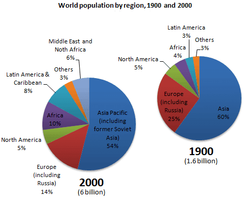
The two pie charts illustrate the data of the populace of different areas around the globe between 1900 and 2000.
Overall
, pie charts represented a tremendous increase of
the planet's population. Asia as a region was the most populated in the Change preposition
in
contary
to the smallest number of people Correct your spelling
contrary
country
lived
in Africa.
In Wrong verb form
living
details
, the ratio of Asian and European regions declined over the century. Europe’s ratio dropped from 25% to 14%, Fix the agreement mistake
detail
while
Asia declined from 60% to 54%.
On the other hand
, from 1900 to 2000, the percentage of people living in Africa more than doubled since
4.5% to 10%, Change preposition
from
while
Latin America’s proportion almost tripled in the same period. North America’s percentage, howeverhowever
, remained constant at 5% in 1900 and 2000. The Middle East and North Africa, a new category in 2000, represented 6% of Correct your spelling
however however
world
population.Add an article
the world
Submitted by bammesdilia24 on
Unauthorized use and/or duplication of this material without express and written permission from this site’s author and/or owner is strictly prohibited. Excerpts and links may be used, provided that full and clear credit is given to Writing9 with appropriate and specific direction to the original content.
Sentences: Add more complex sentences.
▼
Linking words: Don't use the same linking words: "while".
▼
Common mistake: Your writing should be 150-250 words.
Vocabulary: The word "charts" was used 2 times.
▼
Vocabulary: The word "represented" was used 2 times.
▼
Vocabulary: The word "percentage" was used 2 times.
▼
Vocabulary: The word "ratio" was used 2 times.
▼
Vocabulary: The word "declined" was used 2 times.
▼