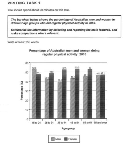
IELTS Academic Writing Task 1 Bar Topics 2024
This list contains a selection of IELTS Academic Writing Task 1 bar topics that were submitted by students who completed the IELTS exam in 2024. Select a topic at random and start practicing and enhancing your writing abilities.


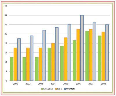
bar
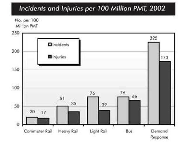
You should spend about 20 minutes on this task.
The chart below shows numbers of incidents and injuries per 100 million passenger miles travelled (PMT) by transportation type in 2002.
Summarise the information by selecting and reporting the main features and make comparisons where relevant.
You should write at least 150 words.


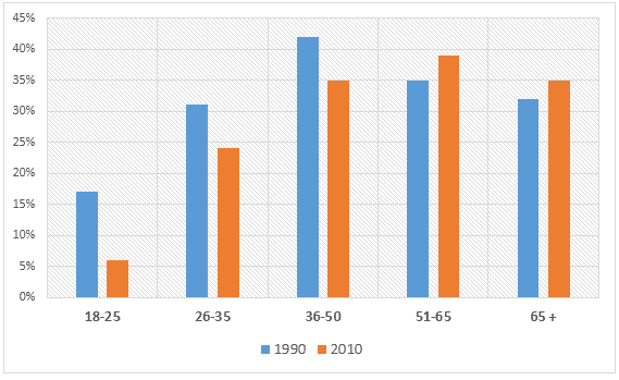
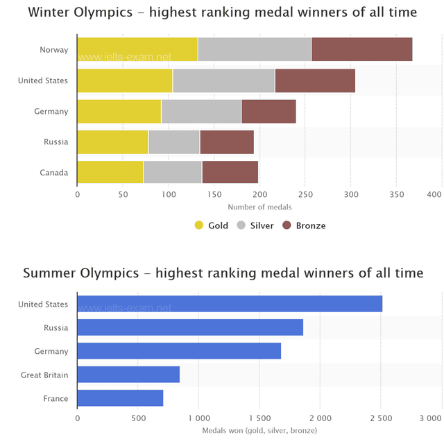
bar
Task 1 Sample Questions and Band 9 Model Answers
For more information and help with your IELTS test visit- IELTSAdvantage.com
The graph above shows the stock price of four technology companies between 2011 and 2016.
Summarise the information by selecting and reporting the main features, and make comparisons where relevant.


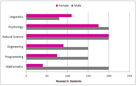

bar
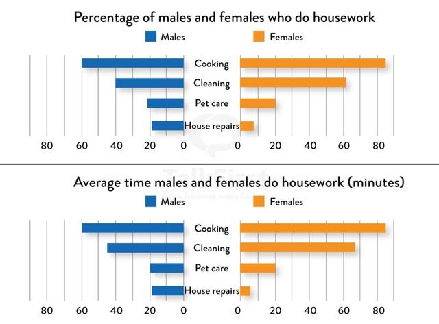
You should spend about 20 minutes on this task.
The first chart below shows the percentages of women and men in a country involved in some kinds of home tasks (cooking, cleaning, pet caring and repairing the house. The second chart shows the amount of time each gender spent on each task per day.
Summarise the information by selecting and reporting the main features and make comparisons where relevant.
You should write at least 150 words.


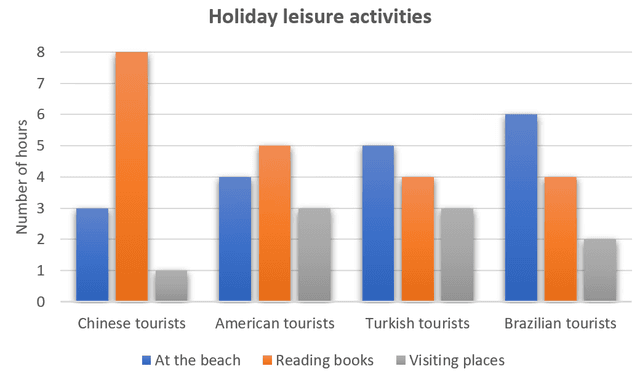


bar
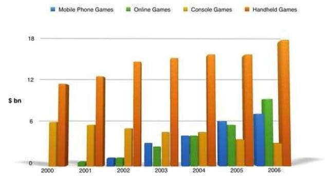
You should spend about 20 minutes on this task.
The bar graph shows the global sales (in billions of dollars) of different types of digital games between 2000 and 2006.
Write a report for a university, lecturer describing the information shown below.
Summarise the information by selecting and reporting the main features and make comparisons where relevant.
You should write at least 150 words.


bar
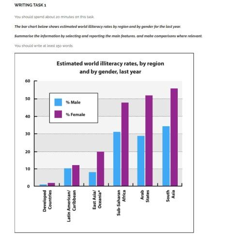
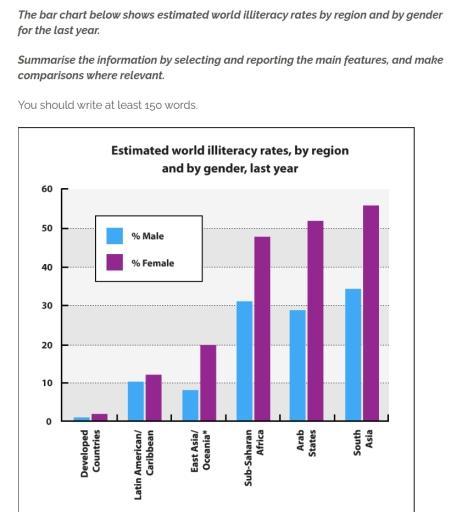
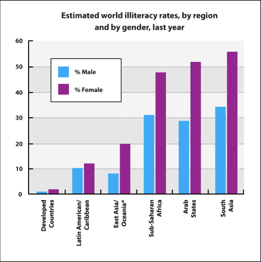
You should spend about 20 minutes on this task.
The bar chart below shows estimated world illiteracy rates by region and by gender for the last year.
Summarise the information by selecting and reporting the main features, and make comparisons where relevant.
You should write at least 150 words.
Estimated world illiteracy rates, by region and by gender, last year


bar
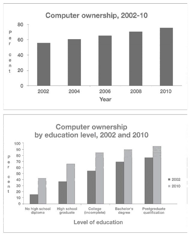
The graphs below give information about computer ownership as a percentage of the population between 2002 and 2010, and by level of education for the years 2002 and 2010. Summarize the information by selecting and reporting the main features, and make comparisons where relevant. Write at least 150 words. (20 mins.)


bar
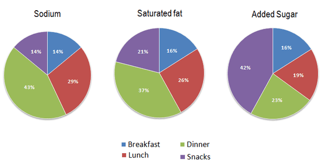
The charts below show that percentage of their daily intake of various nutrients the average person in the USA consumes in each meal and in snacks. These nutrients may be unhealthy if eaten too much.
Summarie the information by selecting and reporting the main features, and make comparisons where relevant.


bar
You should spend about 20 minutes on this task.
The charts below compare the age structure of the populations of France and India in
1984.
Write a report for a university, lecturer describing the information shown below.
Summarise the information by selecting and reporting the main features and make
comparisons where relevant.
You should write at least 150 word

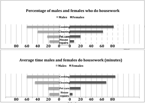
bar
The first chart below shows the percentages of women and men in a country involved in some kinds of home tasks (cooking, cleaning, pet caring and repairing the house. The second chart shows the amount of time each gender spent on each task per day.
Summarise the information by selecting and reporting the main features and make comparisons where relevant.
You should write at least 150 words.


🚀 Prepare for IELTS writing section today!
- Unlimited Task 1 checksGet all the feedback you need to keep improving your charts and letters.
- Unlimited Task 2 checksPractice and perfect your skills with essays.
- Personalized suggestionsKnow how to boost your score.
- Detailed mistakes analysisGet instant feedback. Spot every mistake.
- Topic ideas generatorGet topic-specific ideas to enhance your writing.
- Vocabulary helperGet the right words for any topic.
- Progress trackingTrack your writing improvements.