IELTS Academic Writing Task 1 Pie Topics 2024
This list contains a selection of IELTS Academic Writing Task 1 pie topics that were submitted by students who completed the IELTS exam in 2024. Select a topic at random and start practicing and enhancing your writing abilities.


pie
Writing Task 1 (From Cambridge IELTS Book 10, test 1)
You should spend about 20 minutes on this task.
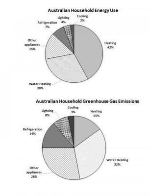
The first chart below shows how energy is used in an average Australian household. The second
chart shows the greenhouse gas emissions which result from this energy use.
Summarise the information by selecting and reporting the main features, and make
comparisons where relevant.
Write at least 150 words
Writing Task 1 (From Cambridge IELTS Book 10, test 1)
You should spend about 20 minutes on this task.
The first chart below shows how energy is used in an average Australian household. The second
chart shows the greenhouse gas emissions which result from this energy use.
Summarise the information by selecting and reporting the main features, and make
comparisons where relevant.
Write at least 150 words


pie
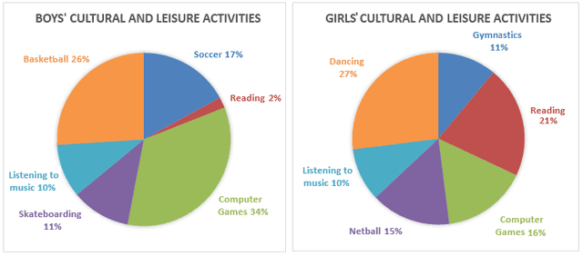
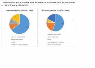
The pie graphs below show the result of a survey of children’s activities. The first graph shows the cultural and leisure activities that boys participate in, whereas the second graph shows the activities in which the girls participate.
Write a report for a university lecturer and report the main features, and make comparisons where relevant.


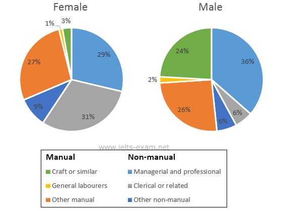


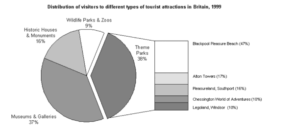


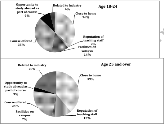
pie
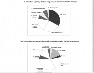
The pie charts below show responses by teachers of foreign languages in Britain to a survey concerning why their students are learning a foreign language. The first chart shows the main reason for learning a foreign language. The second chart shows how many teachers felt that there has been a recent change in the reason. Write a report for a university lecturer describing the information below.


pie
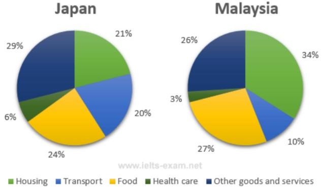
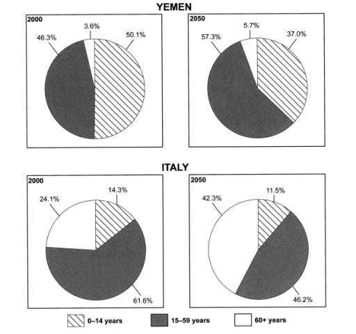
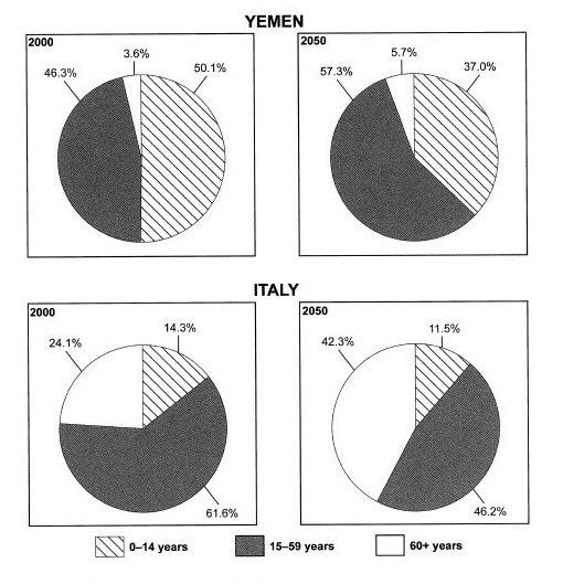
A glance at the four pie charts provided reveals a comparison of the people
of the two countries, Yemen and Italy for the three various age groups in two different Periods, in 2000 and foresight for 2050.
Overall, it is apparent from the information supplied that the remarkable change in society related to 15-59-year-olds during these years for both countries.
In 2000, in Yemen, the old people made up 3.6percent of the total number of people in comparison with 24.1percent in Italy. The 0-14-year group in Italy reached 14.3 percent, which was almost 3 times higher than that of Yemen. Moreover, in Italy, the figure for 15-59 year-age was by far the most important in 2000, accounting for 61.6 percent, while Yemen's young people just reached 46.3 percent at the same time.
In 2050, the 0-14 age group in Yemen is forecasted to account for 37 percent, which is higher than that figure in Italy roughly 25percent. On the other hand a tiny fraction of the old people is projected to be recorded in Yemen, 42.3percent of Italy's people are expected to be elderly. The figure for Yemen and Italy's 15-59-year-old people is predicted to occupy 57.3percent and 46.2percent, respectively.


pie
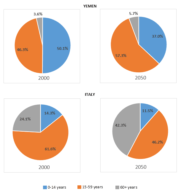
These pie charts show population data for two countries – Yemen and Italy. On the left, the pie charts show the nations’ demographics in 2000, and on the right they show projected figures for 2050. Both countries are estimated to undergo major changes in the age of their population.
In 2000, slightly over half of Yemeni people are in the youngest age group, which is less than fourteen years old. A little less than half are aged between fifteen and fifty-nine years old, and the remaining 3.6% of the population is sixty years old or more. However, it is projected that in 2050 the percentage of the population aged below fourteen years will decline while the other two groups increase. There will be only 37% of the population aged less than fourteen years, while the percentage aged fifteen to fifty-nine will grow to 57.3%.
Italy will follow a similar trend. Its youth population will decline from 14.3% to 11.5% while the number of elderly people nearly doubles. However, whereas in Yemen the group of people aged fifteen to fifty-nine grew, in Italy it will be somewhat reduced from nearly two thirds to less than a half of the total population.


🚀 Prepare for IELTS writing section today!
- Unlimited Task 1 checksGet all the feedback you need to keep improving your charts and letters.
- Unlimited Task 2 checksPractice and perfect your skills with essays.
- Personalized suggestionsKnow how to boost your score.
- Detailed mistakes analysisGet instant feedback. Spot every mistake.
- Topic ideas generatorGet topic-specific ideas to enhance your writing.
- Vocabulary helperGet the right words for any topic.
- Progress trackingTrack your writing improvements.