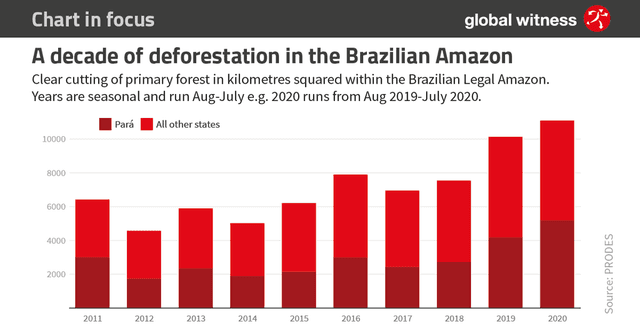
IELTS Academic Writing Task 1 Multiple Topics 2024
This list contains a selection of IELTS Academic Writing Task 1 multiple topics that were submitted by students who completed the IELTS exam in 2024. Select a topic at random and start practicing and enhancing your writing abilities.


multiple
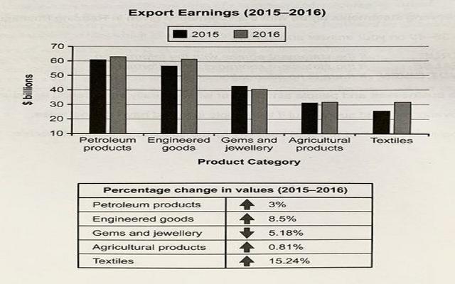
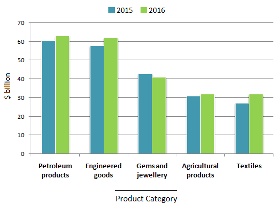
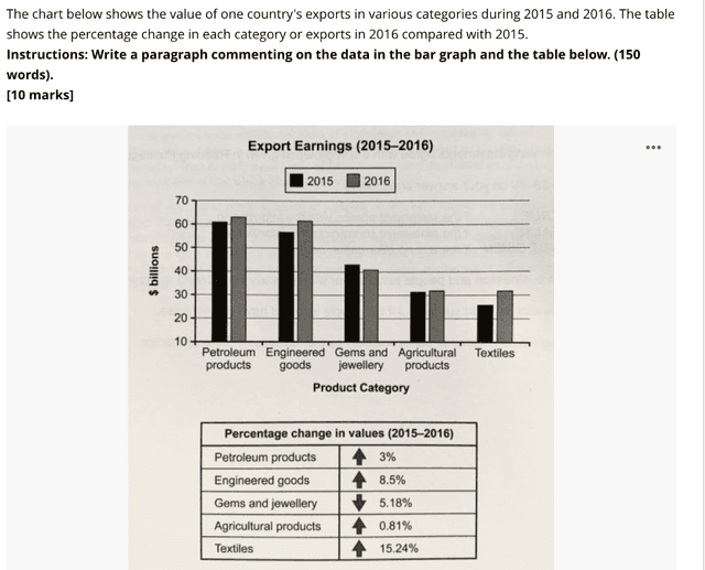
The chart below shows the value of one country's exports in various categories during 2015 and 2016. The table shows the percentage change in each category of exports in 2016 compared with 2015.
Summarise the information by selecting and reporting the main features, and make comparison where relevant.

multiple
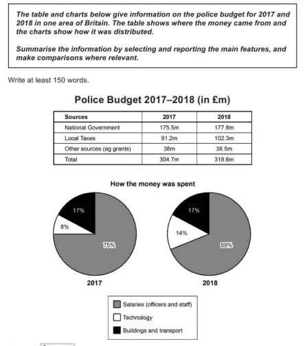
You should spend about 20 minutes on this task.
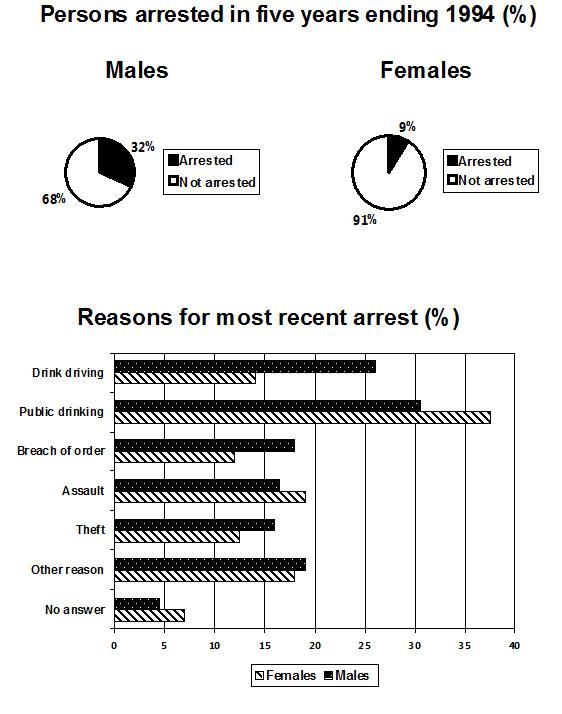
The pie chart shows the percentage of persons arrested in the five years ending 1994 and the bar chart shows the most recent reasons for arrest.
Summarize the information by selecting and reporting the main features and make comparisons where relevant.
Write at least 150 words.

multiple
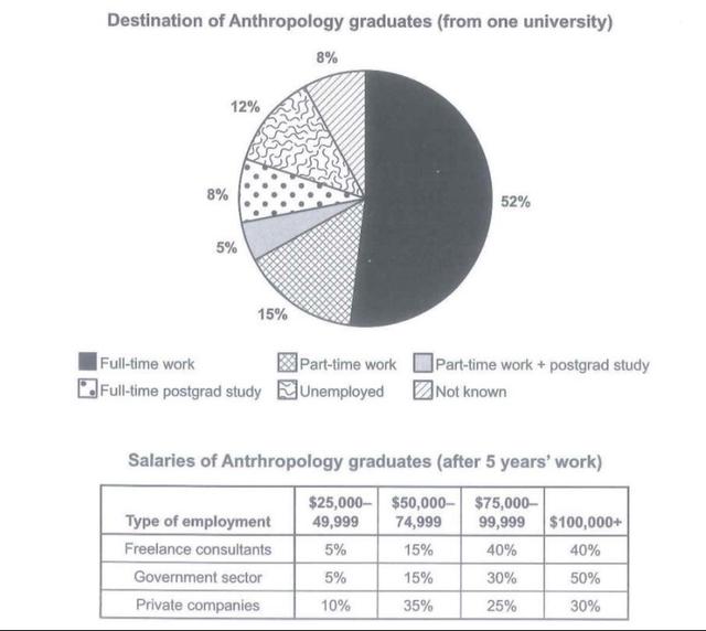
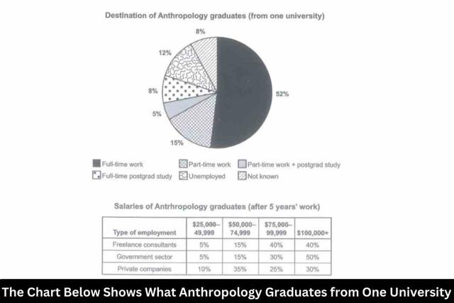
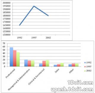
chart below shows what Anthropology graduates from one university ald after finishing their undergraduate degree course. The table shows the salaries of the anthropologists in work after five years.
Summarise the information by selecting and reporting the main features, and make comparisons where relevant.


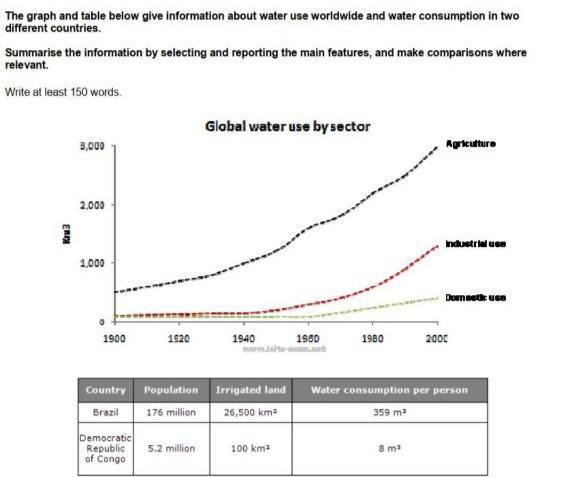
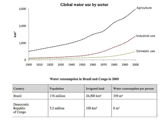
multiple
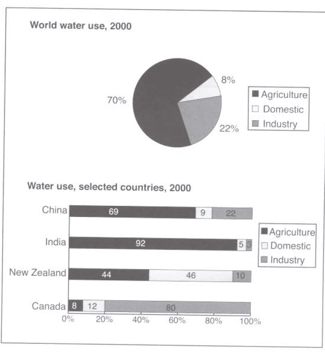
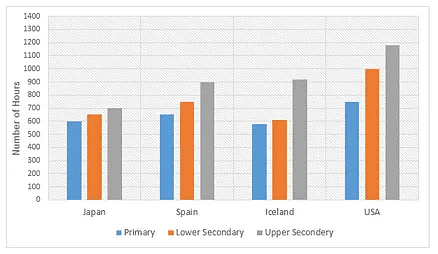
The chart gives information about the average annual water consumption in kilolitre per property in Australian cities, namely Sydney, Perth, Adelaide, Brisbane, Melbourne and Canberra for last year, with the pie chart that shows the distribution of Australian water consumption by the year 2014.


multiple
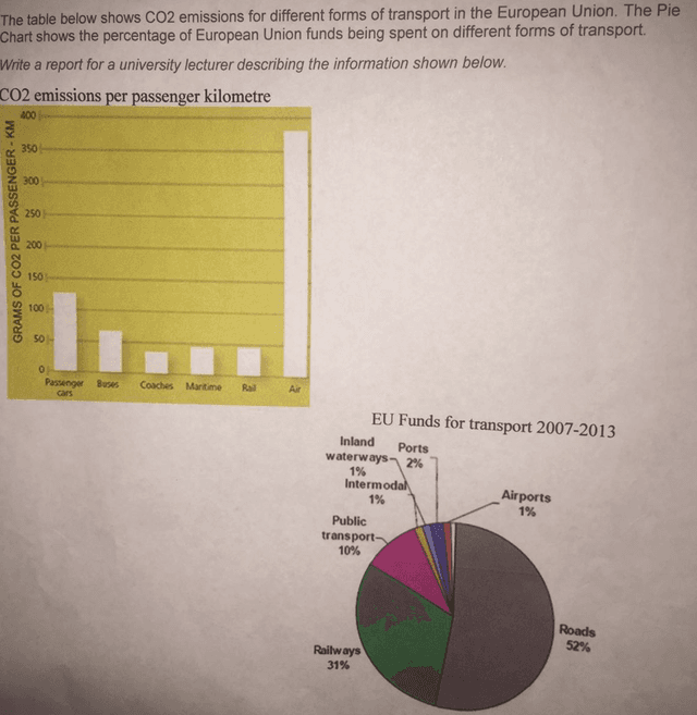
The table below shows CO2 emissions for different forms of transport in the European Union. The Pie Chart shows the percentage of European Union funds being spent on different forms of transport.
Write a report for a university lecturer describing the information shown below.
CO2 emissions per passenger kilometre
co2 emissions
EU Funds for transport 2007-2013
eu funds for transport
written by: ata bitaraf


multiple
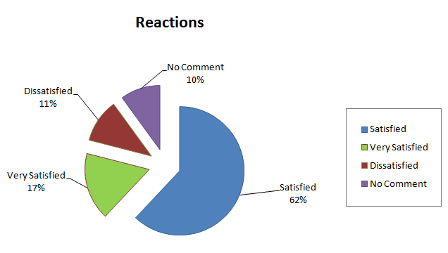
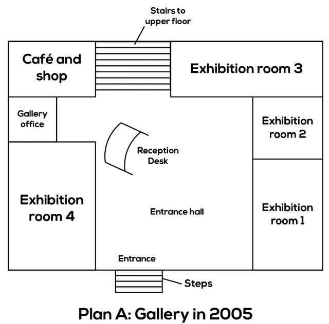
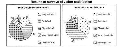
The table below shows the numbers of visitors to the Ashdown museum during the year before and the year after it was refurbished. The charts show the result of surveys asking visitors how satisfied they were with their visit, during the same two periods.
Summaries the information by selecting and reporting the main features, and make comparisons where relevant.


multiple
The bar chart below shows the numbers of men and women attending various evening courses at an adult education centre in the year 2009. The pie chart gives information about the ages of these course participants.
Summarize the information by selecting and reporting the main features and make comparisons where relevant.


multiple
The chart below shows the value of one country's exports in various categories during 2015 and 2016. The table shows the percentage changel each category of exports in 2016 compared with 2015.
Summarise the information by selecting and reporting the main features, t make comparisons where relevant.


multiple
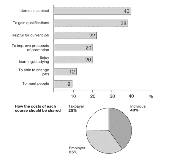
The chart below show the result of a survey of adult education. The first chart shows the reasons why adults decide to study. The pie chart shows how people think the costs of adults education should be shared.
Write a report for a university lecturer, describing the information shown below.
The chart below show the result of a survey of adult education. The first chart shows the reasons why adults decide to study. The pie chart shows how people think the costs of adults education should be shared.
Write a report for a university lecturer, describing the information shown below.


multiple
You should spend about 20 minutes on this task.
The following table and graph give information about the Gross Domestic Product (GDP) and employment sectors of a developing country.
Summarise the information by selecting and reporting the main features, and make comparisons where relevant.
You should write at least 150 words


multiple
You should spend about 20 minutes on this task.
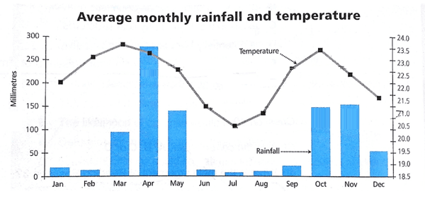
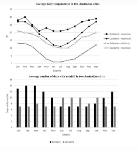
The graph and chart below give information on the average daily maximum and minimum temperatures in degrees Celsius (°C) and the average number of days with rainfall each month for two Australian cities.
Write a report for a university, lecturer describing the information shown below.
Summarise the information by selecting and reporting the main features and make comparisons where relevant.
You should write at least 150 words.


multiple
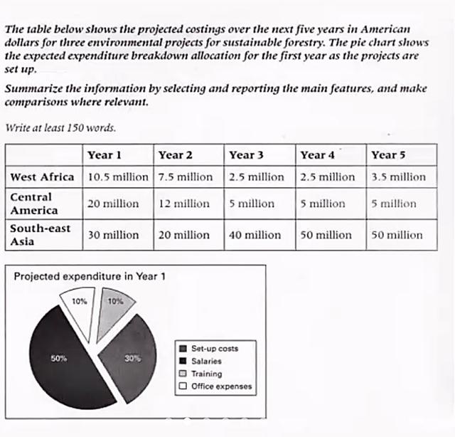
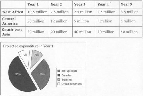
The table below shows the projected costing over the next five years in american dollar for three environmental projects for sustainable foresty. the pie chart shows the expected expenditure brealdown allocation for the year as the projects are set up. Summerize the information by selecting and reporting the main features and male comparisons whre relevent

multiple
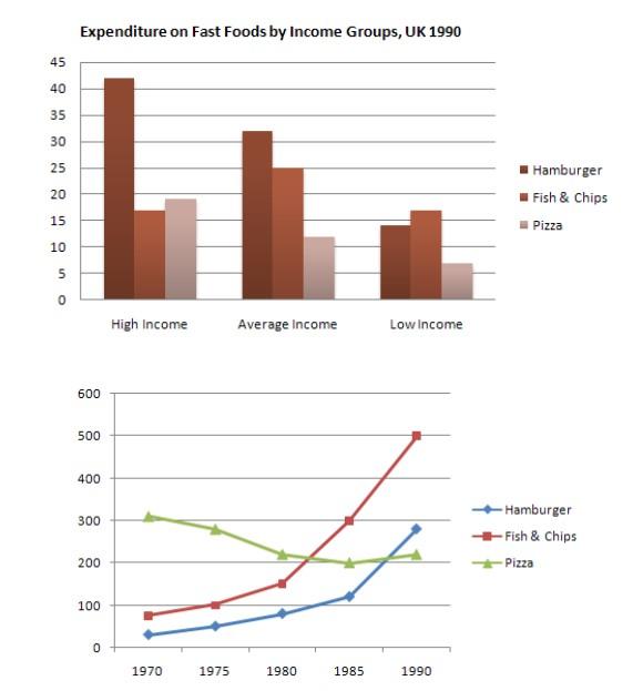
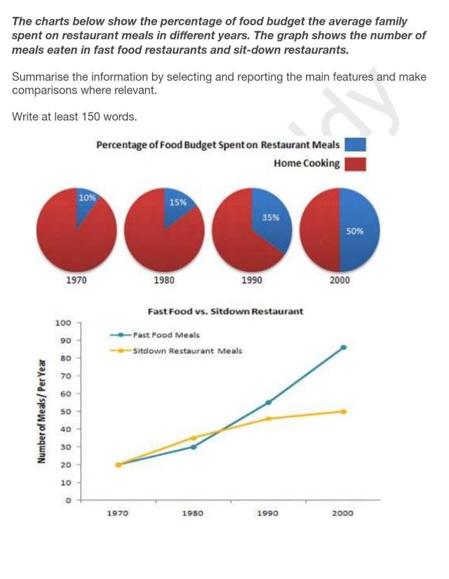
The charts below show the percentage of their food budget the average family spent on restaurant meals in different years. The graph shows the number of meals eaten in fast food restaurants and sit-down restaurants. Summarise the information by selecting and reporting the main features, and make comparisons where relevant.

🚀 Prepare for IELTS writing section today!
- Unlimited Task 1 checksGet all the feedback you need to keep improving your charts and letters.
- Unlimited Task 2 checksPractice and perfect your skills with essays.
- Personalized suggestionsKnow how to boost your score.
- Detailed mistakes analysisGet instant feedback. Spot every mistake.
- Topic ideas generatorGet topic-specific ideas to enhance your writing.
- Vocabulary helperGet the right words for any topic.
- Progress trackingTrack your writing improvements.