IELTS Academic Writing Task 1 Table Topics 2026
This list contains a selection of IELTS Academic Writing Task 1 table topics that were submitted by students who completed the IELTS exam in 2026. Select a topic at random and start practicing and enhancing your writing abilities.
table
Study the table below that shows the results of a survey of 200 adolescents and their parents. Then compare the first paragraphs of two different responses to the survey and answer questions 1-2. 1 Which response do you think is more satisfactory? Why? 2 Why do you think the writer of Response 2 has chosen to include certain supporting details and not others?


table
The graphs below show the average daily hours of sunshine and the average monly temperature in Darwin and Melbourne. Summarise the information by selecting and reporting the main features, and make comparison where relevant.


table
Take a look at the graphics and complete the task. The table and charts show some information about different sports in one country. Summarise the information by selecting and reporting the main features, and make comparisons where relevant.


table
The table below shows the percentages of the population by age groups in one town who rode bicycles in 2011. Summarise the information by selecting and reporting the main features, and make comparisons where relevant.

table
The graph below shows the percentage of people unemployed in the total labour work force across 9 countries in 1994 and 2004. Summarise the information by selecting and reporting the main features, and make comparisons where relevant.


table
The table below shows the proportion of different categories of families living in poverty in Australia in 1999. Summarise the information by selecting and reporting the main features, and make comparisons where relevant.


table
The table below shows the proportion of different categories of families living in poverty in Australia in 1999. The table below shows the proportion of different categories of families living in poverty in Australia in 1999.
table
The table below shows the number of people working different jobs in one country in 2015 and 2025, and its projected changes. Summarise information by selecting and reporting the main features and make comparisons where relevant.

table
the table below gives information about changes in modes of travel in England between 1985 and 2000. summarise the information by selecting and reproitng the main features, and make comparisons where relevant.


table
The Table shows how many international students study in Canada and the United States by country of origin. Summarize the information by selecting and reporting the main features and making comparisons where relevant.


table
The graph below gives information about changes in modes of travel in England between 1985 and 2000. Average distance in miles traveled per person per year, by mode of travel

table
The table shows the income and expenditure of Brooklyn Hall, the building used to hire in over tThe table gives information about the total income and consumption of Brooklyn Hall in each place for 3 years. Overall, the profit of the hall has reduced in each year significantly.Also, the hire of rooms has the main amount of money in the period. Firstly, the hire of rooms had some small drop and rise but it can be considered steady. In contrast,the cafe had a gradual increase. In addition, the funding for the council tower was 20000 pounds but it dropped to 15000 pounds. On the other hand, funding of bodies had the same situation and it had a fall from 22000 to 20000 pounds in the second year and in the third year, it was 7000 pounds less than the first year. Moreover, the total income had a steady rise and started at 72000 and ended at 78000 pounds. However, the expenditure increased more, Therefore the profit decreased in every year and became 9 times less ( from 9000 to 1000 pounds).he period of three years.
table
The table data shows the proportion of income adults and children spent on 4 common items in the United Kingdom in 2005. Summarise the information by selecting and reporting the main features, and make comparisons where relevant.
table
The table below shows the percentage of the population and the types of houses they live in 3 areas of a city. Summarize the information by selecting and reporting the main features and make comparisons where relevant.


table
The table below shows statistics about the top five countries for international tourism in 2012 and 2013.


table
The given table illustrates the data about the independent films released in the UK and republic of Ireland based on the category of movies in the year 2012.


table
The table shows the changes in carbon production in four countries from 1995 to 1999. Summarize the information by selecting and reporting the main features, and make comparisons where relevant.


table
The table illustrates the percentage of students attending four secondary school types from 2000 and 2009 Summarise the information by selecting and reporting the main features and make comparisons where relevant


table
The table below shows the average band scores for students from different language groups taking the IELTS General Test in 2010. Summarise the information by selecting and reporting the main features, and make comparisons where relevant.
table
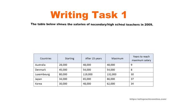
1chat) The table below gives information about salaries of secondary/high school teachers in five countries in 2009

table
the table below shows the percentage participation of women in senior managment in three companies between 1960 and the year 2000.


table
IELTS Question > The table below gives information about the percentage of total household expenditure on three categories in five countries in 2002. Summarise the information by selecting and reporting the main features, and make comparisons where relevant.
table
Table-The table shows the number of employees and factories producing silk in England and Wales between 1851 and 1901.


table
The table below the income and jobs generated last year by tourism in Canadian states and territories. Summarise the information by selscting and reporting the main features, and make comparisons where relevant.


table
The table and charts below give information on the police buudget for 2017 and 2018 in one area of Britain. The table shows where the money come from and the chart show how it was distributed. Summarise the information by selecting and reporting the main features, and make comparisons where relevant.


table
The table below show that the amount of three types of fish farmed in one region between 2008 and 2018


table
The table below shows local catches and imports of fresh fish into Perth, Australia for the years 2004 - 2014.


table
The chart and table below give information about population figures in Japan. Japan’s population: past, present and future trends.


table
The table below shows the percentage of adults in urban and rural areas who took part in four free time activities in 1990 and 2010. Summarize the information and compare where relevant, by selecting and reporting the key features.


table
The table below describes the number of employees and factories in England and Wales from 1851 to 1901. Summarize the information by selecting and reporting the main features and make comparisons where relevant.
table
The table shows the Proportions of Pupils Attending Four Secondary School Types Between Between 2000 and 2009. Summarize the information by selecting and reporting the main features and make comparisons where relevant. Z


table
The charts below show the number of international students in Canada and USA in 2002 and 2003, also the changes of the increase in student population over the two years. Summarise the information by selecting and reporting the main features, and make comparisons where relevant.

table
The table below shows the proportion of the workforce who are women and the proportion of managers who are women in five different countries. Summarize the information by selecting and reporting the main features, and make comparisons where relevant.


table
The table illustrates the percentage of school children attending four different types of secondary school from 2000 to 2009.
table
The table below shows the results of surveys in 2000, 2005 and 2010 avout one university. Summarise the information and reporting the main features, and make comparisons where relevant.
table
The table gives information about the three countries with the highest populations. Summarise the informtion by selecting and reporting the main features, and make comparisons where relevant.


table
The table below shows percentages of students with different attitudes for facilities in the university in the UK in 2008. Summarise the information by selecting and reporting the mainfeatures, and make comparisons where relevant.


table
The table shows the proportion of Australian families that owned certain household appliances in 1995 and 2002. Summarise the information by selecting and reporting the main features, and make comparisons where relevant.


table
The table below shows the percentages of the population by age groups in one town who rode bicycles in 2011.


table
Question: The table below shows the number of cinemas in three areas in a European country in 2004 and 2009, along with the percentage change over this period. Summarise the information by selecting and reporting the main features, and make comparisons where relevant.


table
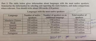
The table below gives information about the languages that high school students speak at home in one district

table
The table below show response to a questionnaire given by two groups of people (Club members and the general public) who showed their opinions about a new theatre.


table
The table below shows social and economic indicators for four countries in 1994, according to United Nations statistics. Describe the information shown below in your own words. What implications do the indicators have for the countries?


table
The table shows the number of overseas visits to the UK by country of residence and mode of travel in two years. Summarise the information by selecting and reporting the main feayures, and make comparisons where relevant.


table
You should spend about 20 minutes on this task. The table below shows the number of temporary migrant worker in four countries in 2003 and 2006 and the number of these workers per 1,000 people in these countries in 2006. Summarise the information by selecting and reporting the main features, and make comparisons where relevant. You should write at least 150 words.


table
The table below shows the number of full-time students from India who studied at various universities in the UK in 2020/21 and 2021/22. Summarise the information by selecting and reporting the main features, and make comparisons where relevant.


table
The table below shows the number of cars made in Argentina, Australia and Thailand from 2003 to 2009. Summarise the information by selecting and reporting the main features, and make comparisons where relevant.


table
The table below shows the number of people from five European nations living in each other's countries in 2011. Summarise the information by selecting and reporting the main features, and make comparisons where relevant.


table
The table below shows the sales made by a coffee shop in an office building on a typical weekday. Summarize the information by selecting and reporting the main features, and make comparisons where relevant.


table
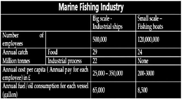
The table below compares the data for the world’s large-scale and small-scale sea fishing industries.

table
The table below shows the percentage of first year students who gave ‘very good’ rating to the resources provided by the college, for three courses.


table
The table gives information about the amount of money in developing countries by the USA, EU countries and other countries from 2006 to 2010.


table
The table below presents the food consumption per a person weekly in European country in 1992, 2002, and 2012. Summarise the information by selecting and reporting the main features, and make comparisons where relevant.


table
The table shows the number of universities ranked top 200 in the world in three subjects in five countries. Summarize the information by selecting and reporting the main points and make comparisons where relevant.


table
The table below shows the results of a survey of first-year students taking various courses at a particular university. It shows how many of the students considered various aspects of their course 'very good'. Summarize the information by selecting and reporting the main points and make comparisons where relevant.


table
The table below gives information about changes in modes of travel in England between 1985 and 2000. Summarise the information by selecting and reporting the main features, and make comparisons where relevant.


table
The graph and table below give information about water use worldwide and water consumption in two different countries. Summarize the information by selecting and reporting the main features, and make comparisons where relevant.


table
The table below shows social and economic indicators for four countries in 1994, according to United Nations statistics. Summarise the information by selecting and reporting the main features, and make comparisons where relevant.

table
The table below provides information on rental charges and salaries in three areas of London. Write a report for a university lecturer describing the information shown below.


table
The table below shows the average annual fees for students to get their master's degree in three different countries in 2007.


table
The chart below shows the value of one country's exports in various categories during 2015 and 2016. The table shows the precentage change in each category of exports in 2016 compared with 2015.


table
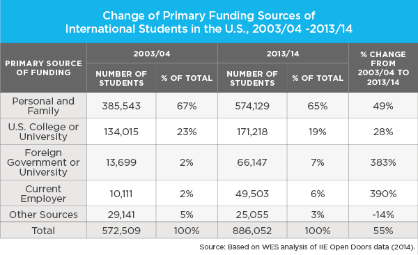
The table below shows the primary funding sources of international students in the US during the years 2003/04 and 2013/14. Write a 150-word report for a university lecturer describing the data and make comparisons where relevant.

table
The table describes the changes of people who went for international travel in 1990, 1995, 2000 and 2005. (million).


table
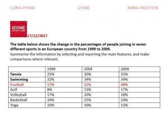
The table shows the change in the percentage of people joining in seven different sports from 1999 to 2009

table
The table shows the percentage of people with mobile phones who use various features on their phone between 2006 and 2010.

table
The table below shows how many people (in millions) used different forms of public transport in MIlan from 2010 to 2014


table
The table below gives information about changes in modes of travel in Netherland between 2001 and 2006. Summerise the information by selecting and reporting the main features, and make comparisons where relevant.


table
The table displays trends concerning the amounts of fast food consumed in Melbourne. Summarise the information by selecting and reporting the main features, and make comparisons where relevant


table
The table illustrates data about earnings of senior grade's tutors in states as Australia, Denmark, Luxembourg, Japan, Korea during 2009


table
The diagram below shows average weekly earning of full-time workers in the USA in 2013 according to sex and race Summarise the information by selecting and rreporting the main features ,and make comparisons where relevant.


table
The table shows information about metro systems in six different cities. Summarise the information by selecting and reporting the main features and make comparisons where relevant.


table
The table below shows the results of surveys in 2005, 2010 and 2015 about McGill University. Summarise the information by selecting and reporting the main features, and make comparisons where relevant.


table
The chart gives employment and education statistics for eight European countries in 2015. Summarise the information by selecting and reporting the main features and make comparisons where relevant.


table
The table shows the worldwide market share of the mobile phone market for manufactures in the years 2005 and 2006. Summarise the information by selecting and reporting the main features, and make comparisons where relevant.


table
The table below shows carbon dioxide emissions from transport in three European countries in 1994 and 2004.


table
The table below shows the proportion of different categorie of families living in poverty in Australia in 1999. summarise the information by selecting and reporting the main features, and make comparisons where relevant.


table
Topic: The table below shows population figures for four countries for 2003 and projected figure for 2025 and 2050.


table
The table below gives information about salaries of secondary/high school teachers in five countries in 2009. Summarise the information be selecting and reporting the main features, and make comparisons where relevant.
table
The table shows the number of medals won by the top ten countries in the London 2022 Olympic Games .


table
The table below gives information on consumer spending on different items in five different countires in 2002. Summarize the information by selecting and reporting the main features, and make comparisons where relevant. (Cong Thanh)
table
Imagine that you are doing a project on the most popular Valentine's Day presents in Zetland. You have found some data on the subject - the results of the opinion polls (see the table below). The most popular Valentine's Day presents Flowers Number of respondents (%) 37 Sweets Perfume Tickets to the cinema or theatre Gift certificates 25 20 10 8 Write 200-250 words. - make an opening statement on the subject of the project; - select and report 2-3 facts; - make 1-2 comparisons where relevant and give your comments; - outline a problem that can arise with choosing a present and suggest a may of solving it; conclude by giving and explaining your opinion on the best present for Valentine', Day.


table
The table shows results of surveys done in in 1980 and 2010 on various aspects of city living in a particular city. Units are measured in percentage?


table
The table compares the salaries of teachers in secondary and high schools in five countries in 2009.


table
The table below illustrates UK participation in selected sports by gender between 2005/06 and 2008/09. Summarise the information by selecting and reporting the main features, and make comparisons where relevant.


table
The table below presents the number of children ever born to women aged 40-44 years ni Australia for each year the information was colected since 1981. Summarise the information by selecting and reporting the main features, and make comparisons where relevant.


table
The graph and table below show average monthly temperatures and average number of hours of sunshine per year in three major cities. Summarise the information by selecting and reporting main features.


table
Take a look at the graphics and complete the task. The table and chart show data about reading among people under 30 years old. Summarise the information by selecting and reporting the main features, and make comparisons where relevant.
table
The table below shows the result of a survey asked 6800 Scottish (aged 16 years and over) whether they had taken part in different cultural activities in the past 12 months. Summarise the information by selecting and reporting the main features and make comparisons where relevant.


table
The graphs below show the cinema attendance in Australia and the average cinema visits by different ge groups from 1996 to 2000. Summarize the information by selecting and reporting the main features and make comparisons where relevant


table
The table below shows the annual costs for students to study in masters programmes in three different countries in 2007. Summarize the information by selecting and reporting the main features, and make comparisons where relevant.


table
The table shows data about the underground railway systems in six major cities with the date opened, kilometers of the route, and passenger numbers per year in millions.
table
The table below shows the number of visitors to ashdown museum before and after being refurbished


🚀 Prepare for IELTS writing section today!
- Unlimited Task 1 & Task 2 checksPractice with essays, charts, and letters.
- Personalized suggestions & mistake analysisSpot every mistake and boost your score.
- Topic ideas & vocabulary helpersExpand your ideas and use the right words.
- Progress trackingWatch your writing improve with every practice.