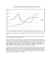
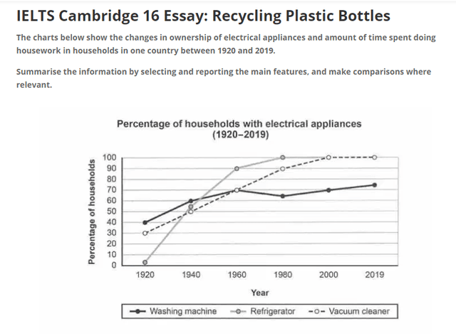
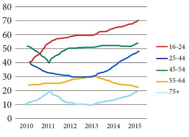
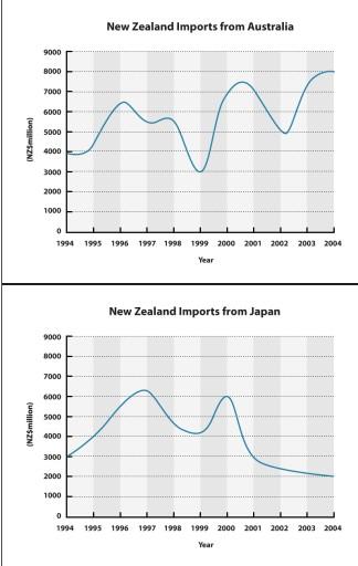
Get a band score and detailed report instantly. Check your IELTS essays right now!
This list contains a selection of IELTS Academic Writing Task 1 line topics that were submitted by students who completed the IELTS exam in 2024. Select a topic at random and start practicing and enhancing your writing abilities.
line
The graph below shows the population change between 1940 and 2000 in three different counties in the U.S. state of Oregon.
line
this graph shows the percentage of the population living in cities in (Philippiens, Malaysia, Thailand, Indonesia) from 1970 to 2040.
line
the chart below shows the changes that took place in 3 different areas of crime in Newport city centre from 2003 - 2012 summarise the information by selecting and reporting the main features, and make comparisons where relevant.
line
The graph shows the percentage of UK adolescents following a vegetatian diet.
line
The line graph shows the number of population shows TV and Radio from october -november 1992.
line
The chart below shows the changes that took place in three different areas of crime in Newport city centre from 2003 to 2012.
line
The line graph below illustrates the production of paper, wood pulp and sawn-wood in the UK between 1980 and 2000.
line
The line graph shows three different crimes in England and Wales in 1970-2005
line
The graph below shows information about the use of public transport in one country by age and location of residence in 2016.
line
MamadjonovSamandar:
The graph below shows four countries of residence pf overseas students in Australia.
Summarize the information ba selecting and reporting the main features, and make make comparisons where relevant
line
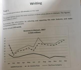
You should spend about 20 minutes on this task.
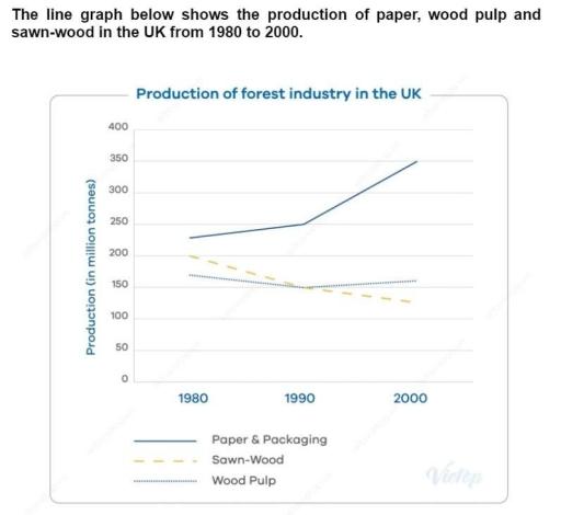
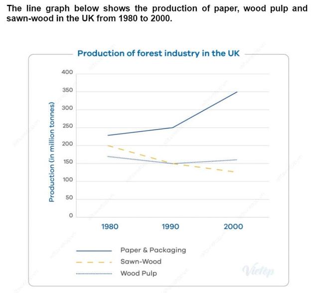
The graph below shows the change in production (Million Tonnes) of three products in the forest industry in a European country.
Summarise the information by selecting and reporting the main features, and make comparisons where relevant.
Write at least 150 words.
line
the line graph below shows the consumption of 4 kinds of meat in a European country from 1979 to 2004.
line
The line graph shows the Population in the state of Oregon by county. Three counties that incresed in population between 1940 and 2000, Columbia, Yamhill and Washington had shown the
different increasing.
line
The line graph below gives information on cinema attendance in the UK.
line
The graph below gives information about the percentage of the population in four Asian countries living in cities from 1970 to 2020, with predictions for 2030 and 2040. Summarise the information by selecting and reportion the main features, and make comparisons where relevant.
line
The line graph presents three common criminal activities in England and Wales between 1970 and 2005.
line
Line graph shows the consumption of fats between 1971 and 1997
line
The line chart shows average attendance at the cinema among various age groups in the US from 2000 to 2011
line
the line chart shows trend in terms of employment in the USA in millions
line
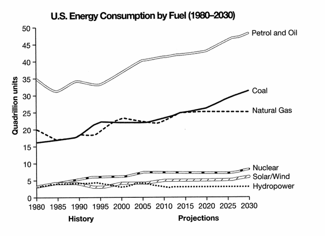
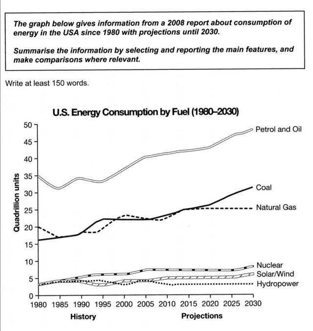
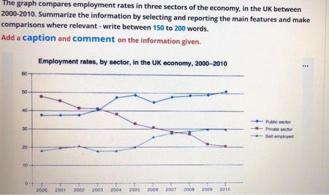
The graph below gives information from a 2008 report about consumption of energy in the USA since 1980 with projections until 2030. summarise the information by selecting and reporting the main features, and make comparisons where relevant.
Nrite at least 150 words.
U.S. Energy Consumption by Fuel (1980-2030)
50
45
40
35
Petrol and Oil
uadrillion units
25
20
15
10-
5
0
-
1980 1985 1990 1995 2000 2005 2010 2015 2020 2025 2030
Projections
line
U.S. Energy Consumption - Task 1
You should spend 20 minutes on this task.
The graph below shows U.S. Energy Consumption by Fuel (1980-2030).
Summarize the information by selecting and reporting the main features and make comparisons where relevant.
Write at least 150 words.
line
The graph below shows the favorite sport of people from the US between 1985 and 2015
line
The graph belowe shows average carbon dioxide (CO2) emissions per person in the United Kingdom, Sweden, Italy and Portugal between 1967 and 2007
line
The line chart shows the trends of employment in the USA and predictions to the future.
line
The graph shows the rate of smoking among men and women in Somaliland
line
The line graph shows the number of books that were borrowed in four different month in 2014 from 4 village libraries.
line
The line chart below shows the annual fish consumption per capita in various regions from 1980 to 2020. Summarise the information by selecting and reporting the main features, and make comparisons where relevant.
line
The chart shows monthly retail sales of different kinds of the stores in the USA last year.
Summarise the information by selecting and reportign the main features, and make comparisons where relevant.
line
The graph below shows how people in USA spent their free time between 1980 and 2010
line
The graph below shows food consumption in Australia between 1950 and 2010.
Summarise the information by selecting and reporting the main features, and make comparison where relevant.
line
The line graph compares the number of goods transported to the UK by four various modes of transportation in the years 1974 to 2002. Data are expressed in million of tonnes.
line
The graph below shows the amount of goods transported in the UK from 1974 to 2002.
line
The diagram below provides the propotion of tourists to England visiting four various attractions in Bringhton.
line
The graph below gives information from a2008 report about consumption of
energy in the USA since 1980 with projectionsuntil 2030.
Summarise the information by selecting andreporting the main features, and
makecomparisons where relevant.
line
The graph below gives information about the number of cases of diarrhea in Mashhad between 1983 and 1992.
Summarise the information by selecting and reporting the main features, and make
comparisons where relevant.
line
The line graph illustrates the number of parcels delivered by two major companies over 80 years, between 1920 and 2000.
line
The charts below shows the changes in ownership of electrical appliances and amount of time spent doing housework in households in one ocuntry between 1920 and 2019. Summarize the information by selecting and reporting the main features, and make comparisons where relevant
line
The graph below gives information on wages of Somecountry over a ten-year period.
Write a report for a university tutor describing the information shown.
line
The line chart below shows the percentage of of people in different age groups who played video games more than ten hours a week between 1984 and 2003
line
The two line graphs below show New Zealand import figures from Australia and Japan in the
years 1994 - 2004.
Summarise the information by selecting and reporting the main features, and make
comparisons where relevant.
line
The graph below shows the number of tourists visiting a particular Caribean island between 2010 and 2017.
Summarise the information by selecting and reporting the main features ,and make comparision where relevent.
line
The line chart shows average attendance at the cinema among various age groups in the Great Britain from 1984 to 2000.
line
The line graph illustrates the average number of UK worker traveling by three different transport from 1970 to 2030.
line
The chart below show the the information about male and female gym membership between 1980 and 2010.
line
the graph below show the average closing price of selected precious metal from 2013 to 2021
line
The line graph below shows the number of shops that closed and the number of new shops that opened in one country between 2011 and 2018.
line
The graph line shows radio and television audience throughout the day in 1992.
line
The chart below shows the percentage of households owning four types of electronic devices between 1995 and 2015. Summarize the information by selecting and reporting the main features, and make comparisons where relevant
line
The line graph shows the proportion of students aged 18-25 studying in the universities of Singapore, Malaysia, Philippines and Thailand from 1961 and 2011. Summarise the information by selecting and reporting the main features, and make comparisons where relevant.
line
The line chart below shows the effect of vaccination on the number of reported cases of whooping cough, a childhood disease, in Britain.
line
The chart below shows the total number of minutes (in billions) of telephone calls in the UK, divided into 3 categories, from 1995- 2002.
line
The graph below shows the number of tourists visiting a particular Caribbean islan between 2010 and 2017.
Summerise the information by selecting and reporting the main features, and make compariosns where relevant.
line
The charts below show the changes in ownership of electrical apliances and amount of time spent doing in households in one country between 1920 and 2019. Summarises the information by selecting and reporting the main features, and make comparison where relevant.
line
The line graph shows the global demand of different types of textile from 1980 to 2015.
line
The chart shows requests for in formations at a tourist office in the United Kingdom from january to June. Summarize the information by selecting and reporting the main features and make comparison where relevant.
line
The graph below shows the total revenue of three pizza places in Vietnam. The figures
were taken in 2017. Summarise the informaton by selecting and reporting the main features, and make comparisons where relevant.
Write at least 150 words.
line
The chart below shows the levels of employment in different sectors of the UK economy from 1910 to 2010.Summarise the information by selecting and reporting the main features, and make comparisons where relevant. Write at least 150 words.
line
The shown Line graph below illustrates the condition of participation by club members to different courses.
line
The graph below gives information about the number of jobs in four sectors of the economy in the US between1960 and 2020.
line
The line graph shows thefts per thousands vehicles in four European countries between 1990 and 1999. Summarize the information and make comparison where relevant. Write at least 150 words.
line
The chart shows requests for in formations at a tourist office in the United Kingdom from januari to June. Summarize the information by selecting and reporting the main features and make comparison where relevant.
line
he given chart illustrates the level of serious violent crime namely rape, robbery, aggravated assault and homicide between 1978 and 2000.
line
The line graph illustrates the percentage of audiences in UK who listen to radio and watch TV during the day from October to December 1992
line
The diagram gives information about the number of parcels delivered by two major mail services companies from 1920 to 2000.
line
the graph below shows the number of shops that closed and the number of new shops that opened in one country between 2011 and 2018.
summarize information and make a comparison. write at least 150 words.
line
the charts below show the changes in ownership of electrical
line
The following graph shows the number of people (by age) attending cinema more than once a month.
line
the charts below show the changes in ownership of electrical appliance
line
The line graph below gives information about the number of visitors to three London museums between June and September 2013.
line
the graph below shows the number of shops that closed and
line
The line graph presents the average closing price of valuable metals between 2013 and 2021
line
The line graph shows thefts per thousand vehicles in four countries between 1990 and 1999.
Summarize the information by selecting and reporting the main features and make comparisons where relevant.
line
The graph line below shows the percentage of workers in five
European countries taking fixed stays or more sickness absences per year from 1991 to 2001.
line
The given chart illustrates the percentage of four different recycled materials between 1982 and 2010 in a country.
line
The graph below shows the number of books read by men and women at Burnaby Public Library from 2011 to 2014.
Summarise the information by selecting and reporting the main features, and make comparisons where relevant.
line
The graph below gives information about the percentage of the population in four Asian countries living in cities from 1970 to 2020, with predictions for 2030 and 2040.
Summaries the information by selecting and reporting the main features, and make comparisons where relevant.
line
The line chart shows trends in terms of employment in the USA in millions and predictions for thte future.
line
The two line graphs below show New Zealand import figures from Australia and Japan in the years 1994 - 2004.
line
the graph show the amount of money spent on books in Germany, Italy, France and Austria between 1995 and 2005
line
The chart graph shows the percentage of tourists to Scotland who visited four different types of attractions from 1980 to 2010
line
The graph compares the sales of different music formats from 1994 to 2006. Summarize the information by selecting and reporting the main features and make comparisons where relevant.
line
The graph below shows the percentage of female students on four different courses at one university from 1970 to 2015
line
The line graph below show the average monthly temperatures in three major cities
line
The graph shows the nebberredfteverseas vigtters lEuredicted different areas in a European country between 1987 and 2007. Summarize the information by selecting and reporting the main features, and make comparisons where relevant.
line
The graph shows data about the annual earnings of three bakeries in Calgary, 2000-2010.
Summarise the information by selecting and reporting the main features, and make comparisons where relevant.
line
The graph below shows the percentage of adults whose healthcare need went unmet in the past year from 2008 to 2022 in 6 different European nations.
Summarise the information by selecting and reporting the main features, and make coparisons where relevant.
line
Line graph: Car ownership
The graph below gives information about car ownership in Britain from 1971 to 2007.
line
The given line graph represents the trend of food consumptions in China between 1985 and 2010.
line
The graph below shows the investment trends of men and women in the UK since 1950. Summarise the information by selecting and reporting the main features, and make comparisons where relevant.
line
the line graph below show the Internet Users as percentage of population with 3 countries between 1999 and 2005 Summarize the information by selecting and reporting the main features, and make comparisons where relevant.
line
The line graph compares the daily travel of British commuters using three different vehicles from 1970 to 2030.
line
The graph shows data on populations in four countries living in the city from 1970 to 204p
line
the graph below show the number of university graduates in canada from 1992 to 2007.
line
The line chart shows exports in billions of dollars
line
The line graph gives the details of changing modules of local access to contemporary technology in the UK between the years of 1996 to 2003.
line
the graph below shows the proportion of four different material that were recycled that were recycled from 1982 to 2010
line
The line graph below shows the number of cell phone subscribers in a particular city, by gender.
Summarize the information by selecting and reporting the main features, and make comparisons where relevant
line
The chart below shows the changes that took place in three different areas of
crime in New Port city center from 2003 to 2012.
line
the graph shows goods transport in the UK(1974-2002)
line
The chart below shows the rate of three crimes.
🚀 Prepare for IELTS writing section today!
Unlimited Task 1 checks
Get all the feedback you need to keep improving your charts and letters.