The graph below shows the population of India and China from the year 2000 to the present day with projections for growth to the year 2050. Summarise the information by selecting and reporting the main features, and make comparisons where relevant.
The bar chart shows the participation of children is selected leisure activities in Australia. Summarize the information by selecting and reporting the main features and make comparisons where relevant.
The map below is of the town og Garlsdon. A new supermarket is planned for the town. The map shows two possible sites for the supermarket.
The graph below shows the number of visitors to three museums (the British Museum, the Natural History Museum, and the Science Museum) in London from 2000 to 2015.
The map below shows the plan of a proposed new town. Summarize the information by selecting and reporting the main features, and make comparisons where relevant.
MamadjonovSamandar: The graph below shows four countries of residence pf overseas students in Australia. Summarize the information ba selecting and reporting the main features, and make make comparisons where relevant
The table below shows information about age, average income per person and population below the poverty line in three states in the USA. Summarize the information by selecting and reporting the main features, and make comparisons where relevant.
Chorleywood is a village near London whose population has increased steadily since the middle of the nineteenth century. The map below shows the development of the village. Summarise the information by selecting and reporting the main features, and make comparisons where relevant.
The bar chart below gives information about how families in one country spent their weekly salary
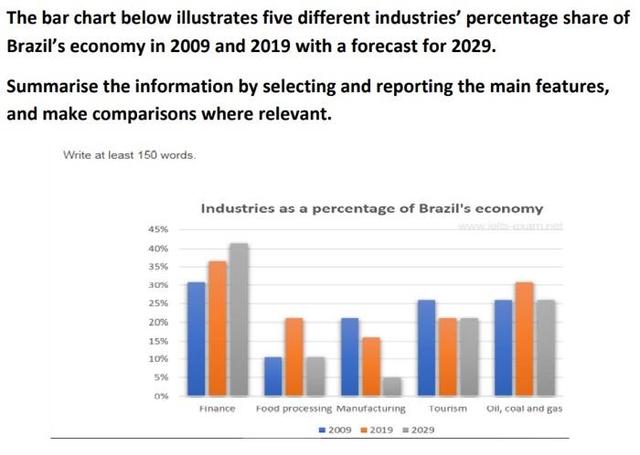
The bar chart below illustrates five different industries' percentage share of Brazil's economy in 2009 and 2019 with a forecast for 2029.
The chart below gives information about Southand's main exports in 2000, 2020, and future projections for 2025. Summarise the information by selecting and reporting the main features, and make comparisons where relevant.
The diagram below shows how instant noodels are manufactured. Summarise the information by selecting and reporting the main features, and make comparisons where relevant.
The diagram below shows the recycling process of plastics.
The chart above shows information about various professions in the U.K. and their salaries. The table shows the average working hours per week for each profession Write a report for a university, lecturer describing the information shown below. Summarise the information by selecting and reporting the main features and make comparisons where relevant.
The maps below show a science park in 2008 and the same park today. write 150 words
The chart below shows global sales of the top five mobile phone brands between 2009 and 2013.
The chart below shows the different levels of post-school qualifications in Australia and the proportion of men and women who held them in 1999. Summarise the information by selecting and reporting the main features and make comparisons where relevant.
The chart below shows the amount of energy generated from wind in four countries from 1985 to 2000.
The maps below show an industrial area in the town of Norbiton, and the planned future development of the site. Summarize the information by selecting and reporting the main features, and make comparisons where relevant.
The graph below shows the amount of money spent on books in Germany, France, Italy and Austria between 1995 and 2005.The graph below shows the amount of money spent on books in Germany, France, Italy and Austria between 1995 and 2005.
The pie chart shows the amount of money that a children’s charity located in the USA spent and received in one year.
The tables below give information about sales of Fairtrade*- labelled coffee and bananas in 1994 and 2004 in five European countries.
The chart below shows the numbers of three types of visitor to a museum between 1997 and 2012. Summarize the information by selecting and reporting the main features, and make comparisons where relevant
The table below gives details of world electricity production by renewable sources in the four years between 2009 and 2012. Summarize the information by selecting and reporting the main features and making comparisons where relevant.
The line graph below shows the production of paper, wood pulp and sawn-wood in the UK from 1980 to 2000.
The graph below shows the average time spent by four car manufacturers to produce vehicles at their US factories.
The line chart shows trends in terms of employment in the USA in millions and predictions for the future.
The chart below shows participation in certain leisure activities by children in Australia. Write a report for a university lecturer describing the information shown below.
The charts below show what percentage of their daily intake of various nutrients the average person in the USA consumes in each meal and in snacks. These nutrients may be unhealthy if eaten too much. Summarise the information by selecting and reporting the main features, and make comparisons where relevant.
The chart below shows the number of men and women in further education in Britain in three periods and whether they were studying fulltime or part-time. Summarise the information by selecting and reporting the main features, and make comparisons where relevant.
The chart below shows how frequently people in the USA ate at fast-food shops between 2003 and 201
The chart gives information about the average annual water consumption in kilolitre per property in Australian cities, namely Sydney, Perth, Adelaide, Brisbane, Melbourne and Canberra for last year, while the pie chart that shows the distribution of Australian water consumption by the year 2014.
The graph below shows the number of visitors to three museums between 2000 and 2006
The graph below gives information about the percentage of the population in four Asian countries living in cities from 1970 to 2020, with predicitions for 2030 and 2040
The bar chart below shows percentages of three groups of Australian children taking part in four kinds of activities in 2012. Summarise the information by selecting and reporting the main features, and make comparisons where relevant.
The line graphs below show the subscriptions to mobile and fixed phone lines in four different countries between 2005 and 2015. Summarise the information by selecting and reporting the main features and make comparisons where relevant.
The chart below shows the sleep patterns of people in five different occupations according to a Canadian study. Summarise the information by selecting and reporting the main features, and make comparisons where relevant
To the right is a line graph which shows the number of farms and farm workers in the United States from 1910 – 2000. Describe the information in the graph.
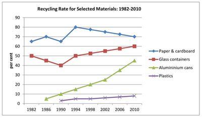
The given chart illustrates the percentage of four different recycled materials between 1982 and 2010 in a country.
The charts below show what UK graduate and postgraduate students who did not go into full-time work did after leaving college in 2008. summarise the information by selecting and reporting the main features, and make comparison where relevant.
The table and pie show the total value and sources of fish imports to the UK from 1990 to 2000. Summarize the information by selecting and reporting the main features, and make comparisons where relevant.
The bar chart below shows the average duration of housework women did (unemployed, part-time employed and full-time) when compared to men who had full-time work in the UK between 1985 and 2005. Summarise the information by selecting and reporting the main features, and make comparisons where relevant.
Task one the two pie charts show the patron of expenditure in US between 1966-1996. Summarise the information by selecting the reporting and main feature and making comparisons where relevant
The chart below shows the results of three surveys on absenteeism in a particular European country in the years 2000, 2005, and 2010.
The bar chart below shows the hours per week that teenagers spend doing certain activities in Chester from 2002 to 2007. Summarise the information by selecting and reporting the main features and making relevant comparisons.
the graph below shows the percentages of people in different age groups to the gym at least once a month in Europe from 1998 to 2018 and the projection
The diagram shows how Olive Oil is manufactured. Write a report for a university lecturer describing the information below.
The table shows the population ratio of females per 100 males in six different areas (Africa, Asia, Europe, North America, Central America, and Oceania) in 1995 and 2005. Summarize and report key features.
The charts below show the favourite takeaways of people in Canada and the number of Indian restaurants in Canada between 1960 and 2015. Summarise the information by selecting and reporting the main features, and make comparisons where relevant.
The chart shows the number of mobile phones and landlines per 100 people in selected countries.