IELTS Academic Writing Task 1 Unknown Topics 2024
This list contains a selection of IELTS Academic Writing Task 1 unknown topics that were submitted by students who completed the IELTS exam in 2024. Select a topic at random and start practicing and enhancing your writing abilities.


unknown
The diagram below shows the production of steam using a gas-cooled nuclear reactor.
Summarise the information by selecting and reporting the main features, and make comparisons where relevant.
The diagram below shows the production of steam using a gas-cooled nuclear reactor.
Summarise the information by selecting and reporting the main features, and make comparisons where relevant.


unknown
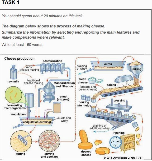
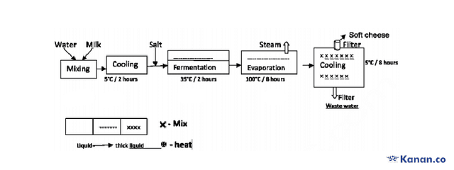
The diagram below shows the process of making soft cheese. Summarise the information by selecting and reporting the main features, and make comparisons where relevant.
The given diagram illustrates the all process of making soft cheese briefly. The main five steps of production are mixing, cooling, fermentation, evaporation, and cooling.


unknown
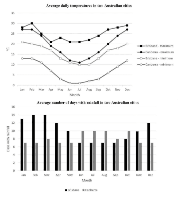
The graph and chart below give information on the average daily maximum and minimum temperatures in degrees Celsius and the average number of days with rainfall each month for two Australian cities.
Summarise the information by selecting and reporting the main features and make comparisons where relevant


unknown
You should spend about 20 minutes on this task.
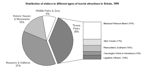
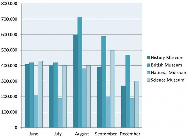
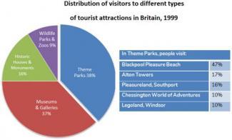
The chart below shows the results of a survey of people who visited four types of tourist attraction in Britain in the year 1999.
Summarise the information by selecting and reporting the main features and make comparisons where relevant.
You should write at least 150 words.


unknown
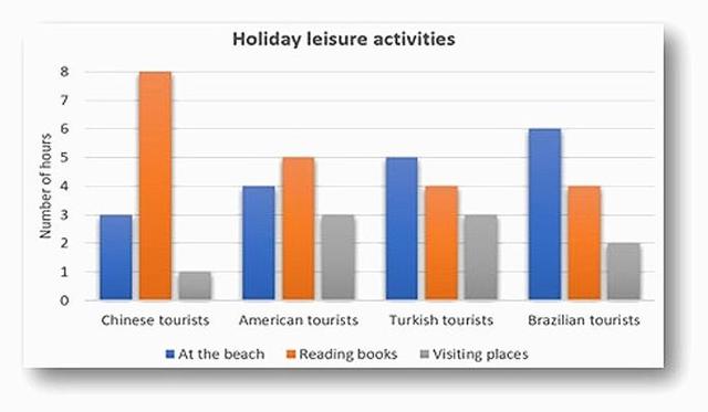
The chart shows the average number of hours each day that Chinese, American, Turkish and Brazilian tourists spent doing leisure activities while on holiday in Greece in August 2019.
Summarise the information by selecting and reporting the main features and make comparisons where relevant.
Write at least 150 words


unknown
The chart below shows the types of communication training taken by  , employees in an international company and the reasons why they took   part in this training.
Summarize the information by selecting and reporting the main features, and make comparisons where relevant.
The given diagram illustrates the categories of communication training and the reasons why nbsp and employees participated in this training course.

unknown
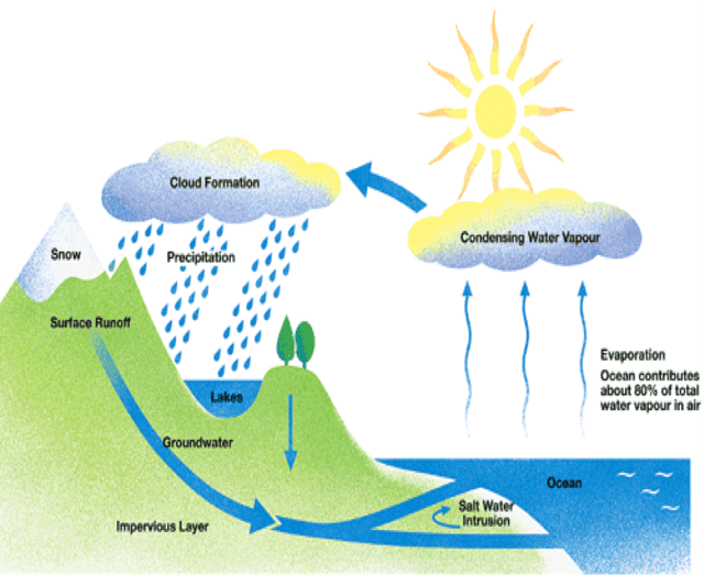
Write IELTS essay task 1 with at least 150 words with the topic "The diagram below shows the water cycle, which is the continuous movement of water on, above and below the surface of the Earth. Summarize the information by selecting and reporting the main features and make comparisons where relevant."

🚀 Prepare for IELTS writing section today!
- Unlimited Task 1 checksGet all the feedback you need to keep improving your charts and letters.
- Unlimited Task 2 checksPractice and perfect your skills with essays.
- Personalized suggestionsKnow how to boost your score.
- Detailed mistakes analysisGet instant feedback. Spot every mistake.
- Topic ideas generatorGet topic-specific ideas to enhance your writing.
- Vocabulary helperGet the right words for any topic.
- Progress trackingTrack your writing improvements.