The line chart shows the birth rate in the USA and China from 1920 to 2000

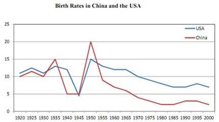
The line chart illustrates the
birth
rates
in the United States and China
from 1920 to 2000.
The chart presents the birth
rates
in China
and the USA over the period from 1920 to 2000. The data for the United States is represented by a blue line, while
the statistics for China
are depicted by a red line.
Both lines started at 10 per cent, and their changes were nearly identical before 1945. After 1945, specifically in 1950, China
's birth
rate surged from 5 to 20, whereas
the birth
rate in the USA only increased to 15. However
, despite a
experiencing significant growth, both countries' Correct article usage
apply
birth
rates
later declined considerably. By the year 2000, the USA and China
's rates
were comparatively low.
Overall
, it is evident that these two countries underwent substantial changes. Initially
, their rates
were quite similar, but eventually, both experienced a decline in birth
rates
by the year 2000."Submitted by akzharkynzhamal on
Unauthorized use and/or duplication of this material without express and written permission from this site’s author and/or owner is strictly prohibited. Excerpts and links may be used, provided that full and clear credit is given to Writing9 with appropriate and specific direction to the original content.
Vocabulary: Rephrase your introduction. Words match: 71%.
▼
Vocabulary: Replace the words birth, rates, china with synonyms.
▼
Vocabulary: Rephrase the word "undefined" in your introduction.
▼
Vocabulary: The word "chart" was used 2 times.
▼
Vocabulary: The word "changes" was used 2 times.
▼
Vocabulary: The word "declined" was used 2 times.
▼