The charts below show the proportion of the energy produced from different sources in a country between 1985 and 2003 Summarize the information by selecting and reporting the main features and make comparisons with relevant.

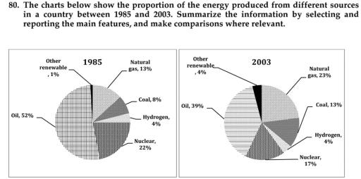
The charts illustrate the fraction of
energy
which is produced from a variety of sources between the years 1985 and 2003 in one country
comprising oil
, nuclear, hydrogen
, coal, natural gas and others.
Overall
, it is clear that
the main resource in the country
is oil
and both hydrogen
and other renewable generate energy
the least.
To begin
with, oil
in 1985 occupied well over 50% of energy
production in the country
and
followed by nuclear and natural gas which registered 22% and 13% respectively. The Correct word choice
apply
energy
in the country
is produced by coal at 8% while
hydrogen
and renewable resources were about 4% and 1% in 1985.
Additionally
, the energy
that came from oil
in the year 2003 decreased to 39% as well as
nuclear which also
declined by 5%. On the contrary
, the proportion of natural gas and coal was shot up to 23% and 13%, furthermore
, other renewable which rose by 3% in 2003. Only hydrogen
source remained the same percentage as in 1985.Correct article usage
the hydrogen
Submitted by nnatthinee on
Unauthorized use and/or duplication of this material without express and written permission from this site’s author and/or owner is strictly prohibited. Excerpts and links may be used, provided that full and clear credit is given to Writing9 with appropriate and specific direction to the original content.
Vocabulary: Replace the words energy, country, oil, hydrogen with synonyms.
▼
Vocabulary: Use several vocabularies to present the data in the second paragraph.
▼