The charts below show the proportion of the energy produced from different sources in a country between 1985 and 2003 Summarize the information by selecting and reporting the main features and make comparisons with relevant.

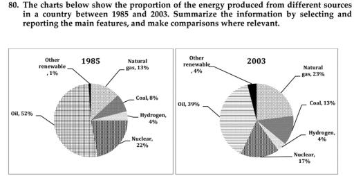
The pie charts display data about the production of energy from various resources in an unnamed nation.
Overall
, oil is considered the most produced form of power in the 2 years.while
hydrogen is stable in the two periods of time.
In detail oil represents 52%which is considered the highest form of energy production in 1985.while
it fell down
by Change preposition
apply
13%in
2003 and Correct your spelling
13% in
also
was the highest use .In addition
, natural gas decreased by relative amount in the 2 periods.
the hydrogen showing a steady rank between the two years.Meanwhile, the use of nuclear power and other renewable energy decreased from 22%to17% and 4%to1% respectively in 1985 and 2003Submitted by moonymum0011 on
Unauthorized use and/or duplication of this material without express and written permission from this site’s author and/or owner is strictly prohibited. Excerpts and links may be used, provided that full and clear credit is given to Writing9 with appropriate and specific direction to the original content.
Linking words: Don't use the same linking words: "while".
▼
Common mistake: Your writing should be 150-250 words.
Vocabulary: The word "decreased" was used 2 times.
▼