The charts below show the proportion of the energy produced from different sources in a country between 1985 and 2003 Summarize the information by selecting and reporting the main features and make comparisons with relevant.

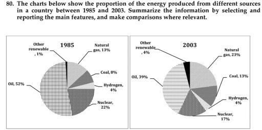
These two pie charts depict how much
energy
was produced from distinctive sources
in a nation between 1985 and 2003.
Overall
, it is clear that
the use of hydrogen as a source has stayed the same in the two periods given. Other sources
were used more in 2003, while
the use of oil
to create energy
decreased dramatically in 2003.
First,
the energy
which was created from oil
in 1985 was 52%; it was also
the most popular source of energy
in that year. In 2003, the usage of oil
plummeted substantially, and the proportion was 39%. It needs to be said that, after decreasing, oil
was still the most usable source of energy
in 2003. Second,
other sources
like natural gas, coal, nuclear, and other renewable sources
rocketed considerably in 2003, and their percentages are 23, 13, 17, and 4, respectively.
Finally
, in 1985, the proportion of energy
produced from hydrogen was 4% and stayed unchanged in 2003.Submitted by abbasisarina340 on
Unauthorized use and/or duplication of this material without express and written permission from this site’s author and/or owner is strictly prohibited. Excerpts and links may be used, provided that full and clear credit is given to Writing9 with appropriate and specific direction to the original content.
Vocabulary: Replace the words energy, sources, oil with synonyms.
▼
Vocabulary: The word "proportion" was used 2 times.
▼
Vocabulary: The word "stayed" was used 2 times.
▼

