IELTS Academic Writing Task 1 Bar Topics 2026
This list contains a selection of IELTS Academic Writing Task 1 bar topics that were submitted by students who completed the IELTS exam in 2026. Select a topic at random and start practicing and enhancing your writing abilities.
bar
The chart belo gives information about the ratio of income to spending (in dollars) by American by age range in 2013. Summerise the information by selecting and reporting the main features and make comparisons where relevant


bar
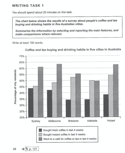
The chart below shows the results of a survey about ppeople's coffee and tea buying and drinking habits in five Australian cities.
bar
The bar chart below shows shares of expenditure for five major categories in the United States, Canada, The United kingdom, and Japan in the year 2009.
bar
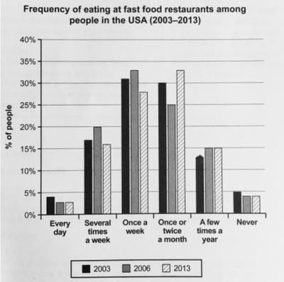
The bar chart below shows how frequently people in USA are in fast food restaurants between 2003 and 2013.

bar
The chart below shows information about changes in the revenue of 5 toothpaste manufacturers in 2000 and 2005 compared with the revenue in 1995.


bar
The bar chart below provides information about the top ten rice producing countries in the world in 2015. Summarise the information by selecting and reporting the main features and making comparisons where relevant.


bar
The bar chart shows the proportion of people aged over 65 years old in Germany, Canada, and the UK over a period of 50 years.


bar
The chart below shows changes in the number of international students in Australia in 2019 and 2020. Summarise information by selecting and reporting the main features and make comparisons where relevant
bar
The chart below shows the total number of journeys per year for a European city. Summarise the information by selecting and reporting the main features, and make comparisons where relevant.


bar
The chart below shows the results of a ssurvey about people's cffee and tea buying and drinking habits in five Asutralian cities.


bar
Bar graphs below provide information about computer ownership as a percentage of the population between 2000 and 2010, and by level of education for the years 2000 and 2010.


bar
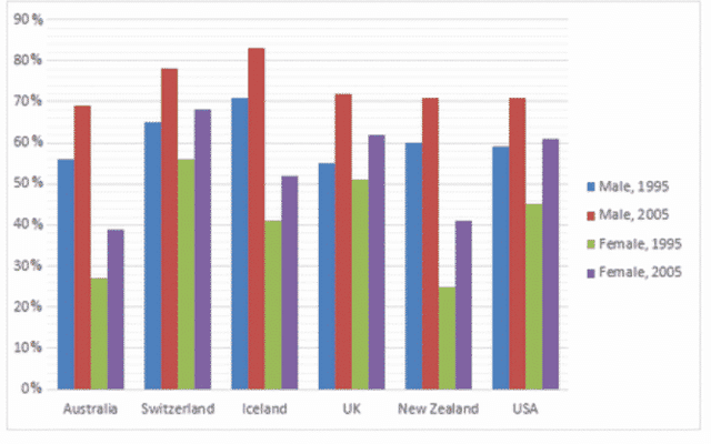
The bar chart shows the percentage of adult male smokers in seven countries along with the world average in 2000 and 2015. Summarise the information by selecting and reporting the main features and make comparisons where relevant.


bar
The chart below shows percentages of young people choosing different ways to solve the global warming in four different countries in 2008. Summarise the information by selecting and reporting the main features, and make comparisons where relevant.


bar
The chart below shows the places visited by different people living in Australia. Summarise the information by selecting and reporting the main features, and make comparisons where relevant.


bar
The bar chart below shows the percentage of Australian men and women in differenr age groups who did regular physical activity in 2010.
bar
The bar chart below provides information about the numbers of Australian students who studied in five different countries between 2004 and 2006. Summarise the information by selecting and reporting the main features, and make comparisons where relevant.


bar
The bar chart below illustrates five different industries' percentage share of Country B's economy in 2005 and 2015 with a forecast for 2025. Summarise the information by selecting and reporting the main features, and make comparisons where relevant.


bar
The chart below shows the main reasons why students chose to study at a particular university in the UK in 1995 and 2005. Summarize the information by selecting and reporting the main features, and make comparisons where relevant.


bar
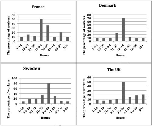
The bar charts below describe the weekly hours worked by people in four Scandinavian countries in 2002. Summarise the information by selecting and reporting the main features, and make comparisons where relevant.

bar
The graph below shows the average daily sales of selected food items at the Brisk Cafe by season. Summarize the information by selecting and reporting the main features, and make comparisons where relevant.


bar
The diagram below shows information about student attendance in various schools. Summarise the information by selecting and reporting the main features, and make comparisons where relevant.


bar
the chart below show the results of a survey about people's coffee and tea buying and drinking habits in five Australian cities. summarize the information and make a comparison.

bar
The bar chart shows the number of times per week (in 1000s), over five weeks, that three computer packages were downloaded from the internet.


bar
The average number of hours of teaching per year done by each teacher in four different countries in 2001. Summarise the information by selecting and reporting the main features, and make comparisons where relevant.


bar
The bar chart below shows about the average children born per woman in 5 countries in 1970 and 2000. Summarise the information by selecting and reporting the main features and make comparisons where relevant.


bar
The chart below shows the number of house holds in the US by their annual income in 2007, 2011, and 2015. Summarize the information by selecting and reporting main features, and make comparisons where relevant.
bar
The chart below shows the number of households in the U.S. by their annual income in 2007, 2011, and 2015. Summarize the information by selecting and reporting the main features and make comparisons where relevant.


bar
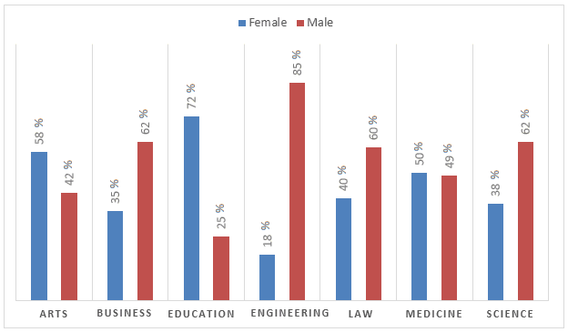
The graph shows the percentage of male and female academic staff members across the faculties of a major university in 2012

bar
The bar chart below shows the production of the world’s oil in OPEC and non-OPEC countries. Write a short report for a university lecturer describing the information shown below.


bar
The bar charts below show the prevelance of obesity among boys and girls aged 12-19 years by ethnicity, in the United States for the years 2004 and 2014


bar
The bar chart below shows how households in a European country spent their weekly income in 1990 and and in 2020. Summarise the information by selecting and reporting the main features, and make comparisons where relevant.


bar
the charts below show the level o ìf partecipation in education and science in developing and industrialised countries in 1980 and 1990. write a report for a university lecturer describing the information shown below.


bar
The bar charts below show the prevalence of obesity among boys and girls aged12 to 19 years by ethnicity, in the United States for the years 2004 and 2014. Summariseinformation by selecting and reporting the main features, andamake comparisons where relevant.

bar
The bar chart shows the number of visits to a community website in the first and second years of use.


bar
The bar chart below shows the leisure activities that teenagers in Canada report to be their favorite. Summarize the information by selecting and reporting the main features, and make comparisons where relevant.
bar
The bar chart below shows the percentage of people who ate five protains of fruits and vegatables per day in the UK from 2001 and 2008


bar
The bar chart below shows the salt intake of men and women in different age groups in a country in Europe in 2019.


bar
The graph below shows the contribution of three sectors - agrieulture, manufacuring, and business and financial services - to the UK economy in the twentieth century.


bar
The bar chart shows coffee and tea buying and drinking habits in five Australian cuties. Summarize the information by selecting and reporting the main features and comparisons where relevant.


bar
The bar chart below shows the percentage of New Zealand smokers in the age group 18-25 years, for the period 2014-2018.

bar
Academic IELTS Sample 4 – The bar chart below shows the results of a survey and shows factors affecting work performance


bar
The chart below shows changes in average house prices in five different cities between 1990 and 2002 compared with the average house prices in 1989.


bar
The first chart illustrates the proportion of residents possessing computer from 2002 to 2010. The second bar chart compares the percentage of people who owned computer by level of their education between 2002 and 2010.


bar
The chart below shows the percentage of households in owned and rented accommodation in England and Wales between 1918 and 2011. Summarise the information by selecting and reporting the main features and make comparison where relevant.

bar
The chart below gives information about the journey to school by children aged 11 to 16 in the UK in a year. Summarise the information by selecting and reporting the main features, and make comparisons where relevant. Your report should comprise a minimum of 150 words.


bar
The graph below shows the percentage of urban/suburban and rural households in a European country that had acces between 1999 and 2004.


bar
The chart below shows the expenditure on three categories among different age groups of residents in the UK in 2004.


bar
The bar chart below shows the number of international students enrolled in four different universities in Australia in 2010 and 2020. Summarize the information by selecting and reporting the main features, and make comparisons where relevant.


bar
The graph below shows the different modes of transport used to travel to and from work in one European city in 1960, 1980 and 2000. Write a report for a university lecturer describing the information below. » You should » You should not spend more than 20 minutes on this task.


bar
The charts below show information about the annual profits, the final stock prices and the market share of five different video game companies in 2022.

bar
The world health organization recommends that people should eat five or more portion of fruit and vegetables per day. The bar chart shows the percentage of males and females in the UK by age group in 2006.

bar
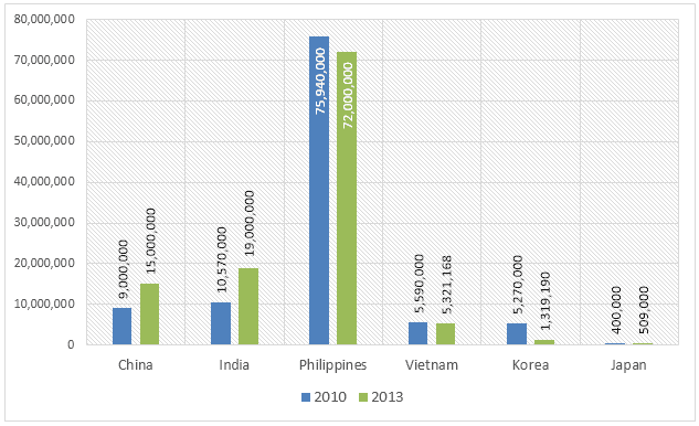
The bar graph below shows the amount of carbon emissions in different countries during three different years. Summarize the information by selecting and reporting the main features, and make comparisons wherever relevant. Carbon Emissions by Country thousand metric tonnes 1800000 1600000 1400000 1200000 1000000 800000 600000 400000 200000 • 1975 • 1990 # 2005 USA Germany United Kingdom China Canada India


bar
The graph below shows the contribution of three sectors - agriculture, manufacturing and business and financial services - to the UK economy in the twentieth century.
bar
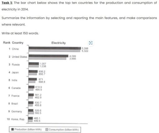
The bar chart below shows the top ten countries for the production and consumption in billion kWh of electricity in 2014. Summarise the information by selecting and reporting the main features, and make comparison where relevant.

bar
The bar chart below describes some changes about the percentage of people were born in Australia and who were born outside Australia living in urban, rural and town between 1995 and 2010. Summarise the information by selecting and reporting the main features and make comparisons where relevant.


bar
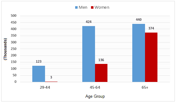
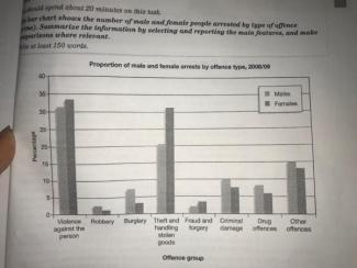
The bar chart shows the number of male and female people arrested by type of offence (crime). Summarize the information by selecting and reporting the main features.


bar
The chart below shows changes in the number of international students in Australia in 2019 and 2020. Summarize the information by selecting and reporting the main features and make comparisons where relevant.


bar
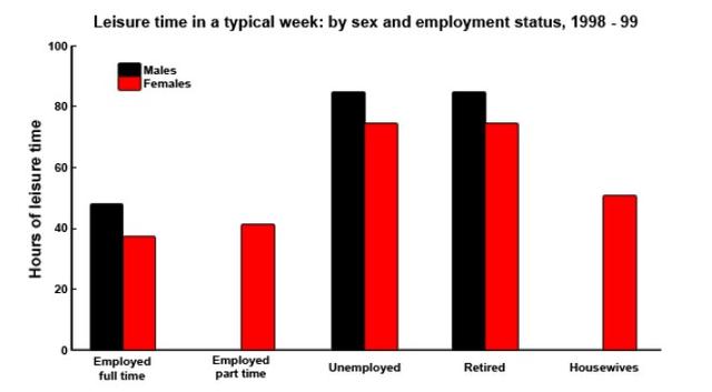
The chart below shows the amount of lesiure time enjoyed by men and women of different employment status.

bar
thw graph below gives information about the percentage of the population in four Asian countries living in cities from 1970 to 2020, with predictions for 2030 and 2040.


bar
The chart beiow shows the percentage of households in owned and rented accommodation in England and Wales between 1918 and 2011. Summarise the information by selecting and reporting the main features, and make comparisons where relevant
bar
the first chart below shows the number if british vistors to the is and american vistors to the uk from 2011and 2015 . the second cgart show the aniunt spent by those vistors in that periods.

bar
The bar chart shows the divorce rates in two European countries from 2011 to 2015. Summarize the information by selecting and reporting the main features, and make comparisons where relevant.


bar
The chart shows the minimum number of days spent per week on sport and exercise by young people in England. Write a report for a university lecturer describing the information shown below.


bar
The chart below shows figures for attendances at hospital emergency care departments in Northern Ireland by age group in December 2016 and December 2017. Summarise it.


bar
The bar charts show household expenditure across four main areas in the UK, Australia and Japan in 2013. Summarise the information by selecting and reporting the main features and make comparisons where relevant


bar
The bar chart below illustrates the proportion of women, men and children consuming five servings of fruit and vegetables each day in 8 years between 2001 and 2008 in the UK


bar
The chart below shows the percentage of people who ate five portions of fruit and vegetable per day in the uk from 2001 to 2008

bar
The chart below shows the percentages of different types of household waste that were recycled in one city between 1992 and 2002. Summarise the information by selecting and reporting the main features, and make comparisons where relevant.In some countries, most people prefer to rent a house rather than buy their houses. What are the advantages and disadvantages of renting a home?


bar
The chart below shows the resultsof a survey about people's coffee and tea buying and drinking habits in five australian cities. summarise the information by selecting and reporting the main features, and make comparisons where relevant.

bar
The bar chart illustrates the change in age ratio of viewers per month to a European country from 2000 to 2011.

bar
The chart below shows the proportion of businesses making e-commerce purchases by industry in Canada between 2015 and 2019. Summarise the information by selecting and reporting the main features, and make comparisons where relevant.


bar
Question: The chart below shows the results of a survey people coffee and tea buying and drinking habits in five Australian cities

bar
The chart below shows the resuits of a survey about people's coffee and teabuying and drinking habits in five Australian cities.Summarise the information by seiecting and reporting the main features, and make comparisons where relevant

bar
The chart below shows the percentage of people accessing news via different media in one country in 2013, 2015, and 2017. Summarize the information by selecting and reporting the main features, and make comparisons where relevant.


bar
The chart below shows how frequently people in the USA ate at fast-food shops between 2003 and 2013. Summarize the information by selecting and reporting the main features, and make comparisons where relevant.


bar
The bar chart provides information about how often people in the USA spent ate fast food from 2003 to 2013.

bar
The chart shows components of GDP in the UK from 1992 to 2000. Summerize the information by selecting and reporting the main features and make comparisons where relevant.


bar
The chart below shows the changes in the percentage of households with cars in one European country between 1971 and 2001.Summarise the information by selecting and reporting the main features, and make comparisons where relevant.

bar
The chart below shows the percentage of households in owned and rented accommodation in England and Wales between 1918 and 2011. ▪️Summarise the information by selecting and reporting the main features, and make comparisons where relevant.


bar
The graph below gives information about the number of people who smoked cigarettes in the UK between 2011 and 2021. Summarise the information by selecting and reporting the main features and make comparisons where relevant. Zhaina


bar
The bar charts show the number of foreign students enrolled on two music production courses at a college in Scotland. Summarize the information by selecting and reporting the main features, and make comparisons where relevant.


bar
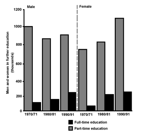
The chart below shows the number of men and women (in thousands) in further education in Britain in three periods and whether they were studying full-time or part-time.

bar
The bar chart below gives the information about the average number of visitors in 4 other museums in London from June to October


bar
The bar chart belows shows the percentage of Australian men and women in different age groups who did regular physical activity in 2010.
bar
The chart below shows the number of car trips taken by men and women for different purposes per day in a European city. Summarise the information by selecting and reporting the main features, and make comparisons where relevant.


bar
The bar chart shows the number of male and female people arrested by type of offense (crime). Summarize the information by selecting and reporting the main features. and make comparisons where relevant.

bar
The bar chart shows the results of a survey, in which peopThe bar chart shows the results of a survey, in which people in Europe and the USA were asked what they consider to be the most important factor in the success of a business. Summarise the information by selecting and reporting the main features, ad make comparisons where relevant.
🚀 Prepare for IELTS writing section today!
- Unlimited Task 1 & Task 2 checksPractice with essays, charts, and letters.
- Personalized suggestions & mistake analysisSpot every mistake and boost your score.
- Topic ideas & vocabulary helpersExpand your ideas and use the right words.
- Progress trackingWatch your writing improve with every practice.