IELTS Academic Writing Task 1 Pie Topics 2026
This list contains a selection of IELTS Academic Writing Task 1 pie topics that were submitted by students who completed the IELTS exam in 2026. Select a topic at random and start practicing and enhancing your writing abilities.
pie
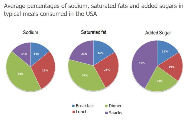
The chart below show the average percentages in typical meals of three types of nutrients, all of which may be unhealthy if eaten too much. Summarise the information by selecting and reporting the main features, and make comparisons where relavant.


pie
The charts below show the percentage in typical meals of three types if nutrient, all of which maybe unhealthy if eaten too much.


pie
the threeb pie charts below show the changes in annual spending by a particular UK school in 1981,1991 and 2001


pie
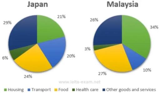
The pie chart blow shows the average household expenditures in Japan and Malaysia in the year 2010. Summarise the information by selecting and reporting the main features, and make comparisons where relevant.
pie
The pie charts show the electricity generated in Germany and France from all sources and renewables in the year 2009. Summarise the information by selecting and reporting the main features and make comparisons where relevant.


pie
The pie graphs below show the result of a survey of children’s activities. The first graph shows the cultural and leisure activities that boys participate in, whereas the second graph shows the activities in which the girls participate. Write a report describing the information shown in the two pie graphs.


pie
The pie charts below show the comparison of different kinds of energy production in France in two years. Summarize the information by selecting and reporting the main features, and make comparisons where relevant.


pie
The chart below show the proportion of income spent on different areas by one university, in 2005 and 2015.


pie
The pie charts below show the percentage of time working adults spent on different activities in a particular country in 1958 and 2008. Summarise the information by selecting and reporting the main features and make comparisons where relevant


pie
The pie charts on the left illustrate the proportion of three electricity-generating sources in the German and French markets in 2009 while the charts on the right further detail the composition of the segment of renewable energy in that same year. Angsa

pie
THE CHARTS BELOW SHOW THE AVERAGE PERCENTAGES IN TYPICAL MEALS OF THREE TYPES OF NUTRIENTS ALL OF WHICH MAY BE UNHEALTHY IF EATTEN TOO MUCH.

pie
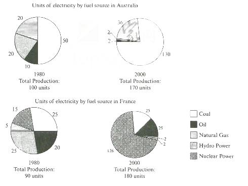
The pie charts below show units of eletricity production by fuel source in Australia and France in 1980 and 2000. Summarise the information by selectiong and reporting the main features, and make comparisons where relevan

pie
Topic: The pie charts below give information on the ages of the populations of Oman and Spain in 2005 and projection for 2055.


pie
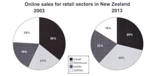
The pie charts below describe the online shopping sales for retail sectors in New Zealand in 2003 and 2013.

pie
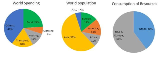
The pie charts below give data on the spending and consumption of resources by countries and how the population is distributed.


pie
The devices people use to watch television in Canada. The pie charts below show the devices people in the 18 to 25 age group use to watch television in Canada in two different years. (


pie
The pie chart below show the makeup of the congress in country X after Election Day. Write a report for a university lecturer describing the information.


pie
The two pie charts show the percentage of pollutants entering a particular part of ocean in 1997 and 2007. Summarize the information by selecting and reporting the main features, and make comparisons where relevant.


pie
The pie charts below shows the distribution of students by gender and by the subject they are studying at a major university in 2020. Summarise the information by selecting and reporting the main features and make comparisons where relevant.


pie
two pie charts show the patterns of expenditure in the us between 1966 - 1996. summariese the information by selecting and reporting the main features,and make comparisons where relevant.
pie
The charts below show the average percentages in typical meals of three types of nutrients, all of which may be unhealthy if eaten too much. Summarise the information by selecting and reporting the main features

pie
the charts below show tha average percentages in meals of three types of nutrients all of which may be unhealthy if eaten too much
pie
The given 4 pie charts illustrate which three fast food restaurants were the most preferred among teenagers in Vietnam and Indonesia in two different years 2017 and 2027.
pie
The charts show the proportion of holidaymakers of one region staying in different types of accommodation in three different years. Summarize the information by selecting and reporting the main features, and make comparisons where relevant.


pie
THE PIE CHART SHOW THE REASONS PEOPLE IN GREAT BRITIAN HAD FOR VISITING ART MUSEUMS IN THE YEARS 1990 and 2000


pie
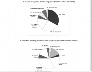
The pie charts below show responses by teachers of foreign languages in Britain to a survey concerning why their students are learning a foreign language. The first chart shows the main reason for learning a foreign language. The second chart shows how many teachers felt that there has been a recent change in the reason. Write a report for a university lecturer describing the information below.


pie
The three pie charts show the production, consumption of coffee and where the profit goes around the world.


pie
The chart below shows the results of a recent survey into the causes of poor school attendance in the UK. Summarise the information by selecting and reporting the main features, and make comparisons where relevant.


pie
The pie charts below show the percentage of students at one adulteducation center taking various courses offered in 1985 and this year Summarize the information by selecting and reporting the mainfeatures,and make comparisons where relevant.


pie
The two pie charts below show the online shopping sales for retail sectors in Canada in 2005 and 2010. Summerise the information by selecting and reporting the main features, and make comparisons where relevant.


pie
The pie charts below give data on the spending and consumption of resources by countries of the world and how the population is distributed. Summarize the information by selecting and reporting the main features, and make comparisons where relevant.

pie
The charts show the main methodof transport of people travelling to one university in 2004 and 2009


pie
The three pie charts show the proportion of four kinds of vehicles used in the UK in 1965, 1985 and 2005. Summarize the information by selecting and reporting the main features, and make comparisons where relevant


pie
The pie charts give information about 4 different products (Cotton,Wheat,Vegetable,Fruit)which exported in Uzbekistan between 2012 and 2018.

pie
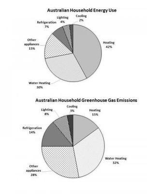
The first chart below shows how energy is used in an average Australian household. The second chart shows the greenhouse gas emissions which result from this energy use. Summaries the information by selecting and reporting the main features, and make comparisons where relevant.


pie
The chart below give information on the consumption of water by agricultural products in Australia in 2014, and the share of income they produced.

pie
The pie charts show the revenue sources and expenditures of a children’s charity in the USA in one year. Summarize the information by selecting and reporting the main features, and make comparisons where relevant


pie
The pie charts below show the percentage of time working adults spent on different activities in a particular country in 1959 and 2008. Summarize the information and by selecting and reporting the main features and make comparison where relevant.

pie
The pie chart below shows the native languages spoken by students at Bakersfield senior college in two separate years.

pie
The first pie chart below shows European Union member state shares of installed capacity of renewable egergy for last year. The second pie chart below shows the breakdown for Germany's sources of renewable energy, also for last year. Summarise the information by selecting and reporting the main features, and make comparisons where relevant.


pie
The three pie charts provide information about the percentage of degrees granted in terms of four different professions at the National University over the period in question.


pie
The pie charts below show the percentage of five types of food sold by a supermarket in 2003 and2013. Summarize the information by selecting and reporting the main features, and make comparisons where relevant.


pie
The charts below show the results of a survey of adult education. The first chart shows the reasons why adults decide to study. The pie chart shows how people think the costs of adult education should be shared

pie
The pie chart below gives information on the main reasons to visit public libraries in the UK in 1991 and 2000


pie
the charts below show the proportions of British students at one university in England who were able to speak other languages in addition to English, in 2000 and 2010. Summarise the information by selecting and reporting the main features, and make comparision where relevant.


pie
(From Cambridge IELTS Book 10, test 1) The first chart below shows how energy is used in an average Australian household. The second chart shows the greenhouse gas emissions which result from this energy use. Summarise the information by selecting and reporting the main features, and make comparisons where relevant.
pie
The two pie charts illustrate the most frequent passenger complaints of two international airlines as well as their passengers' overall satisfaction. The airlines are One World Air and Blue Sky Airways.


pie
The given pie charts compare the expenses in 7 different categories in 1966 and 1996 by American Citizens. Write a report for a university lecture describing the information below.


pie
The three pie charts below show the changes in annual spending by a particular uk school in 1981, 1991 and 2001. Summarize the information by selecting and reporting the main features, and make comparisons where relevant.


pie
The pie charts below show the average household expenditures in Japan and Malaysia in the year 2010. The pie charts below show the average household expenditures in Japan and Malaysia in the year 2010.

pie
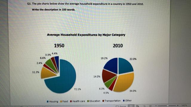
The pie chart below show the average household expenditures in a country in 1950 and 2010 summarise the information by selecting and reporting the main features and make conversion where relevant


pie
The given pie charts compare statistics for the yearly expenses of 5 different categories by a specific school in the United Kingdom between 1981 and 2001


pie
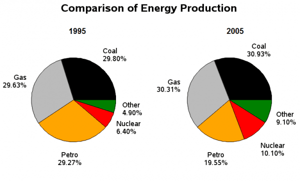
pie chart give informtion about different kind of energy production in France between 1995 and 2005


pie
The pie charts below give data on the spending and consumption of resources by countries of the world and how the population is distributed.

pie
The pie chart below shows information about where coffee is produced, consumed and where profit goes. Summarise the information by selecting and reporting the main features, and make comparisons where relevant.
pie
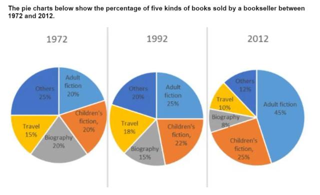
The pie charts show the percentsge of five sorts of books sold in bookstore in 1972, 1992 and 2012.

pie
The pie charts below show how general household costs were broken down in a certain city in both 2017 and 2018. Summarise the information by selecting and reporting the main features and make comparisons where relevant.


pie
The charts below present information about electricity generated using renewable and non-renewable energy in USA in 2009 and 2019. Summarise the information by selecting and reporting the main features and make comparisons where relevant.


pie
The pie charts below show the average household expenditure in Japan and Malaysia in the year 2010. Summarise the information by selecting and reporting the main features and make comparisons where relevant
pie
The pie charts below give date on the spending and consumption of resources by countries of the world and how the population is distributed.
pie
The charts below give information on the ages of the populations of Yemen and Italy in 2000 and projections for 2050. Summarize the information by selecting and reporting the main features and make comparison where relevant.


pie
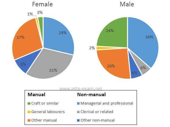
The graph belw shows theb percerntage of female workers and workers aged 50 or above in the workforce. summarise thevinformaion by selecting and reporting the main features, and make comparisons where relevant.

pie
The pie charts below show the percentage of time working adults spent on different activities in a particular country in 1958 and 2008. Summarise the information by selecting and reporting the main features and make comparisons where relevan

pie
The pie charts below show the number of hours spent in a British university library by undergraduates, postgraduates, and the total student population. Summarize the information by selecting and reporting the main features, and make comparisons where relevant


pie
The pie charts below show the comparison different kinds of energy production in France in 1995 and 2005.

pie
The charts below give information on the ages of the populations of Yemen and Italy ni 20 and projections for 2050. Summarise the information by selecting and reporting the main features, and make comparisons where relevant.


pie
The pie chart shows the main reason why agricultural land becomes less productive. The pie chart shows the main reason why agricultural land becomes less productive.


pie
The charts below show the average percentages in typical meals of three types od nutrients, all of which may be unhealthy if eaten too much. summarise the information by features, and reporting the main feature, and make comparisons where relevant.


pie
The pie charts below show usage share of desktop browsers in 2019 and 2021. Summarise the information by selecting and reporting the main features and make comparisons where relevant.


pie
The pie charts compare ways of accessing the news in Canada and Australia. Summarise the information by selecting and reporting the main features, and make comparisons where relevant.


pie
The chart below shows how much money is spent in the budget on different sectors by the UAE government in 2000.


pie
The three pie chart illustrates extend granted at the National University for a period twenty years.


pie
The pie chart shows the amount of money that a children's charity located in the USA spent and received in one year, 2016. Summarize the information by selecting and reporting the main features and make comparisons where relevant.


pie
The charts below give information on the consumption of water by agricultural products in Australia in 2014, and the share of income they produced.

pie
The Charts below show the results of a questionnaire that asked visitors to the Parkway Hotel how they rated the hotel's customer service. The same questionnaire was given to 100 guests in the years 2005 and 2010.


pie
The pie charts below show the proportions of visits to Ireland last year by age group, and by gender and type of visit.


pie
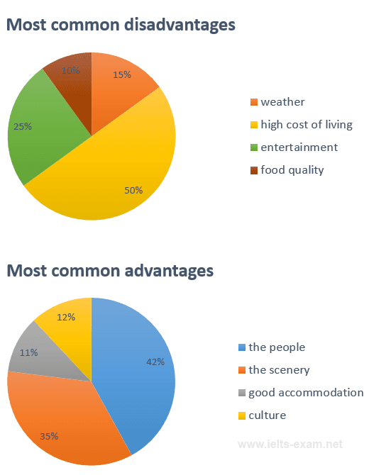
The pie charts below show the most common advantages and disadvantages of Bowen Island, according to a survey of visitors.

pie
The charts below show the proportions of British students at one university in England who were able to speak other languages in addition to English, in 2000 and 2010. Summarise the information by selecting

pie
The pie graphs show the nutritional consistency of two dinners. Write a report to a university lecturer describing the data? summarize the information, and make a comparison.


pie
The chart below shows the results of two surveys, carried out at the beginning and end of the year, asking a restaurant's unhappy customers why they were dissatisfied with their experience.
pie
The pie charts below show average household expenditure in Hong Kong and Britain in the year 2000.


pie
The charts below show movie preferences in the country of Evonia for people aged from 20-35 years, 36-50 years and 51-65 years.


🚀 Prepare for IELTS writing section today!
- Unlimited Task 1 & Task 2 checksPractice with essays, charts, and letters.
- Personalized suggestions & mistake analysisSpot every mistake and boost your score.
- Topic ideas & vocabulary helpersExpand your ideas and use the right words.
- Progress trackingWatch your writing improve with every practice.