The graph and table below give information about water use worldwide and water consumption in two different countries. Summarize the informationby selecting and reporting the main feature, and make comparisons where relevant.
The map below shows the development of an area between 1995 and the present. Summarize the information by selecting and reporting the main features and make comparisons where relevant.
The graph below shows the consumption of meat in Spain between 2001 and 2011. Summarise the information by selecting and reporting the main features, and make comparison where relevant.
the graph below shows the annual visitor to new zealand from 5 countries for the years 1996 to 2014.
The diagrams below show a public park when it first opened in 1920 and the same park today. Summarise the information by selecting and reporting the main features, and make comparisons where relevant.
The first table below shows changes in the total population of New York City from 1800 to 2000. The second and third tables show changes in the population of the five districts of the city (Manhattan, Brooklyn, Bronx, Queens, Staten Island) over the same period.
The charts below show the percentage of time working adults spent on different activities in a particular country in 1958 and 2008.
Chorleywood is a village near London whose population has increased steadily since the middle of the 19th century. The map below shows the development of the village. Write a report for a university, lecturer describing the information shown below. Summarise the information by selecting and reporting the main features and make comparisons where relevant.
The graph below gives information about the percentages of the population in four Asian countries living in cities from 1970 to 2020, with predictions for 2030 and 2040.
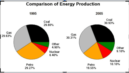
The pie charts show information about energy production in a country in two separate years Summarize the information by selecting and reporting the main features and making comparisons where relevant.
The chart below shows what Anthropology graduates from one university did after finishing their undergraduate degree course. The table shows the salaries of the anthropologists in work after five years. Summaries the information by selecting and reporting the main features, and make comparisons where revelant.
The map shows the change of a village called Chorleywood between 1868 and 1994.
The charts below show the protein and calorie intakes of people in different parts of the world.Summarise the information by selecting and reporting the main features, and make comparisons where relevant.
The bar chart below shows the hours per week that teenagers spend doing certain activities in Chester from 2002 to 2007. Summarise the information by selecting and reporting the main features and making relevant comparisons.
The bar chart below shows US seafood imports between 2002 and 2022 and the forcast for 2032. The pie chart shows the geographical structure of these imports in 2022.
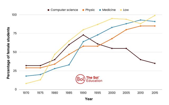
The graph below shows the percentage of female students on four different courses at one university from 1970 to 2015
The diagrams below show changes of a cinema from 1980 until now. Summarize the information by selecting and reporting the main features, and make comparisons where relevant.
The charts below show the main reasons for study among students of different age groups and the amount of support they received from employers. Summarise the information by selecting and reporting the main features, and make comparisons where relevant.
The table below shows statistics about the top five countries for international tourism in 2012 and 2013.
The chart below contains information provided by Australia's tertiary institutions about the percentage of male and female students who enrolled in different subjects in 1995.
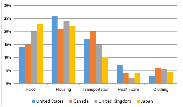
The bar charts show household expenditure across four main areas in the UK, Australia and Japan in 2013. Summarise the information by selecting and reporting the main features and make comparisons where relevant
The table data shows the proportion of income adults and children spent on 4 common items in the United Kingdom in 2005.
The table below shows the consumption of three basic foods (wheat, maize, rice) by people in four different countries. Summarise the information by selecting and reporting the main features, and make comparisons where relevant.
The diagrams show the structure of solar panel and its use. Summarize the information by selecting and reporting the main features, and make comparisons where relevant.
the bar chart below shows shares of expenditures for five major categories
The chart below shows what Anthropology gradutes from one university did after finishing their undergradute degree course. The table shows the salaries of the anthropologists in work after five years.
Some people The charts below show the proportions of British students at one university in England who were able to speak other languages in addition to English, in 2000 and 2010. Summarise the information by selecting and reporting the main features, and make comparson
The bar chart shows percentage of people in a European country going to cinemas on different days. Summarise the information by selecting and reporting the main features and make comparisons where relevant.
The graph below shows the number of books read by men and women at Burnaby Public Library from 2011 to 2014.
The graph bellow shows the number of visitors to three museums between 2000 and 2005.
The chart shows the number of mobile phones and landlines per 100 people in selected countries.
The table and chart below. Give information on the police budget for 2017 and 2018 in one area of Britain. The table shows where the money came from and the chart shows how it was distributed. Summarize the information by selecting and reporting the main features and make comparison where relevant
The bar chart below shows the sector contributions to India’s gross domestic product from 1960 to 2000. Summarise the information by selecting and reporting the main features, and make comparisons where relevant.
The pie charts show information about energy production in a country in two separate years.
The graph shows data about the annual earnings of three bakeries in Calgary, 2000-2010. Summarise the information by selecting and reporting the main features, and make comparisons where relevan
The diagram details the process of making leather products. Summarise the information by selecting and reporting the main feather, and make conparison where relevant.
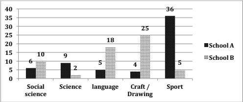
The bar chart shows information about the favorite subjects of students from two middle schools, school A and school B.
The line chart below shows the percentage of of people in different age groups who played video games more than ten hours a week between 1984 and 2003
The chart below gives information about the percentage of male and female teacher in six different kind of education setting in UK in 2010.
The maps below show changes that took place in Youngsville in New Zealand over a 25 year period from 1980 to 2005.
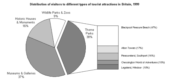
The chart below shows the results of a survey of people who visited four types of tourist attraction in Britain in 1999. Summarise the information by selecting and reporting the main features and make comparisons where relevant.
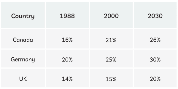
The table below shows information and prediction regarding the change in percentage of the population aged 65 and above in three countries.
The tables below give information about sales of fairtrade labeled coffee and bananas in 1999 and 2004 in five European countries.
The graph shows the average monthly change in the prices of three metals during 2014. Summarise the information by selecting and reporting the main features, and make comparision where relevant.
The graph below shows the unemployment rates in the US and Japan between March 1993 and March 1999.
The maps show two different plans designed for a conference room. Summarise the information by selecting and reporting the main features, and make comparisons where relevant.
The chart below gives information about global population percentages and distribution of wealth by region.
The table below shows the percentage use of four different fuel types to generate electricity in five Asian countries in 2005. Summarise the information by selecting and reporting the main features, and make comparisons where relevant. Fuel type used to generate electricity (%)
The charts below give information about the amount of electricity used. Summarise the information by selecting and reporting the main features, and make comparisons where relevant.
The chart below shows the proportions of graduates from Brighton University in 2019 entering different employment sectors. Summarise the information by selecting and reporting the main features, and make comparisons where relevant.