IELTS Academic Writing Task 1 Table Topics 2026
This list contains a selection of IELTS Academic Writing Task 1 table topics that were submitted by students who completed the IELTS exam in 2026. Select a topic at random and start practicing and enhancing your writing abilities.
table
The table below show daily oil production in four countries from 2000 to 2004. Summarize the information by selecting and reporting the main features, and make comparisons where relevant.


table
The ple chart below shows the main reasons why agricultural land becomes less productive. The table shows how these causes affected three regions of the world during the 1990s. Summarise the Information by selecting and reporting the main features, and make comparisons where relevant.


table
The table below shows the sales made by a coffee shop in an office building on a typical weekday. Summarise the information by selecting and reporting the main features, and make comparisons where relevant


table
The table below shows the sales at a small restaurant in a downtown business district. Summarise the information by selecting and reporting the main features, and make comparisons where relevant.


table
The graph and table below give information about the percentage of graduates who worked full-time after university and their average salary in Australia from 2004 to 2012.


table
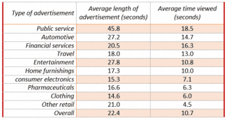
“The table shows the average length of video advertisements on the internet and the average length of time viewers spend watching them. Summarize the information by selecting and reporting the main features and make comparisons where relevant.”

table
The table below gives information on average hours and minutes spent by UK males and females on different daily activities.


table
The table above shows a survey on the preference of different age groups in a European country on different TV programmes in 2012. Summarise the information by selecting and reporting the main features and make comparisons where relevant


table
The table below gives details of world electricity production by renewable sources in the four years between 2009 and 2012.


table
The chart below shows how the UK unemployed spent their time in the year 1982. Write a report to a university lecturer describing the information below.


table
The chart below gives information about the production of grains, measured in million metric tons, from the years 2010 to 2015, with projections until 2030. Summarise the information by selecting and reporting the main features, and make comparisons where relevant.


table
The table below provides information about the three largest Pacific islands. Summarise the information by selecting and reporting the main features and make comparisons where relevant.


table
The table below shows the percentage of first year students who gave "very good" rating to the resources provided by the college, for three courses. Summarize the information by selecting and reporting, the main features and make comparisons where relevant.


table
the table below gives information about the three countries with the highest populations. Summarise the information and make a comparison.
table
The table belowshows the results of a 20-year study (research/ survey) into why adults (grown-ups – individuals over 18) in the UK attend arts events (go to art-related activities). the table given presents the data on the reasons for the grown ups in the UK to go to art events in a period of twenty years in percentages Summarise the information by selecting and reporting the main features, and make comparisons where relevant.


table
The given table illustrates the proportions of attendance in secondary schools in India. These values are given from 2000 to 2015 with a gap of 5 years.
table
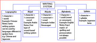
The diagram shows the main systems of writing used throughout the world. summarise the information by selicting and repeating the main features.

table
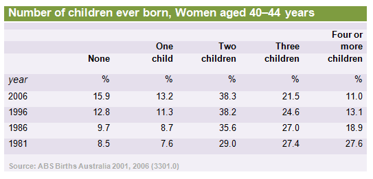
The given table depicts the information about the proportion of number of children ever born ta a female aged 40-44 in Australia for each year after 1981. Overall, the percentage of women in Australia with no children have increased in a times span of two decades and several years, where as the percentage of women with four or more children has decreased with a great margin. Starting from, the proportion of females in Australia with no children have increased with 1.2% in first 5 years where as in next 25 years it jumped up to 15.9%. similarly the proportion of women with one child also increased in 2006 up to 13.2% where whereas it was only 7.6 in 1981. Linking to it, the females with two children have showed a steady growth up to 38.3 in 2006 as compared to 27.4% in year. Moving for the, the woman with three children have showed a study decline. Adding to it, the percentage of women with four or more children follows a similar trend where it dropped up to 11% in 2006 compared to 27.6%.

table
The table below gives information on consumer spending on different items in five different countries in 2002. Summarise the information by selecting and reporting the main features, and make comparisons where relevant. Percentage of national consumer expenditure by category - 2002


table
The table below shows the changes in some household types in Canada from 1984 to 2020. Summarise the information by selecting and reporting the main features, and make comparisons where relevant.


table
The table below shows percentages of students with different attitudes for facilities in the university in the UK in 2008. Summarise the information by selecting and reporting the mainfeatures, and make comparisons where relevant.


table
The table below gives information about the employment rates and the average annual salaries of new graduates in an Australian university in 2009. Summaries the information by selecting and reporting the main points and make comparisons where relevant.


table
The table below shows the figures for imprisonment in five countries between 1930 and 1980. Summarize the information by selecting and reporting the main features, and make comparisons where relevant.


table
The table below gives information on consumer spending on different items in five different countries in 2002. Summarise the information by selecting and reporting the mainfeatures, and make comparisons where relevant.


table
The table below gives information on consumer spending on different items in five different countries in 2002. Percentage of national consumer expenditure by category - 2002
table
The table shows the Proportions of Pupils Attending Four Secondary School Types Between Between 2000 and 2009. Summarise the information by selecting and reporting the main features and make comparisons where relevant.
table
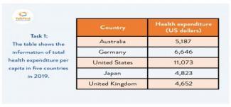
The table shows the information of total health expenditure per capita in five countries in 2019.

table
The table below shows the expenses of a used bookstore in Scotland for the first and last month of the same year. Summarise the information by selecting and reporting the main features, and make comparisons where relevant.


table
The table below shows the salaries of secondary/high school teachers in 2009. Summarize the information by selecting and reporting the main features and make comparison where relevant.


table
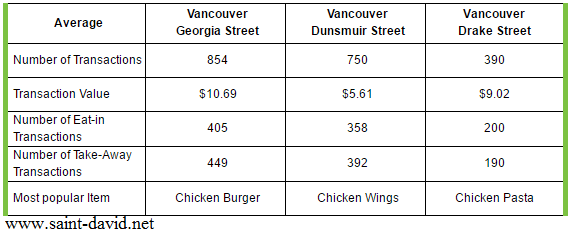
The table below shows the sales made by a coffee shop in an office building on a typical weekday. ielts-academic-coffee-shop-sales Summarise the information by selecting and reporting the main features, and make comparisons where relevant


table
The table illustrates how much money was used for improvement purposes in the USA, EU countries and other countries between 2006 and 2010.


table
The table below gives information on consumer spending on different items ni five different countries ni 2002. Summarise the information by selecting and reporting the main features, and make comparisons where relevant.

table
The table below gives information about the three countries wit the highest populations. Summarise the information by selecting and reporting the main features and make comparisons where relevant.
table
The table shows the changes in carbon production in four countries from 1995 to 1999. Summarize the information by selecting and reporting the main features, and make comparisons where relevant.


table
The graph shows changes in the sales of musical instruments in the UK from 2008 to the present and gives predictions for future sales. Summarise the information by selecting and reporting the main features, and make comparisons where relevant.


table
The table data shows the proportion of income adults and children spent on 4 common items in the United Kingdom in 2005. Summarise the information by selecting and reporting the main features, and make comparisons where relevant.
table
The table below gives give information about salaries of secondary/high school teachers in five countries in 2009


table
The diagrams below show the results of a survey from Taiwan explaining how students, wanting to study overseas, chose a university from 1998-2008. Summarise the information by selecting and reporting the main features, and make comparision where relevant.


table
The table shows the income and expenditure of Brooklyn Hall, the building used to hire in over the period of three years.


table
The table below shows the results of surveys in 2005, 2010 and 2015 about McGill University. Summarise the information by selecting and reporting the main features, and make comparisons where relevant.


table
The table below shows the sales at a small restaurant in a downtown business district. Summarize the information by selecting and reporting the main features, and make comparisons where relevant.


table
NOVEMBER 16 EXAM DISCUSSION The table below shows the percentage of men and women employed in four different types of industries in one twon in 1990, 2000, and 2010.


table
The table below shows the changes in participation levels in various sports in the USA between 2010 and 2014 for people aged 18 and 34.


table
The table below shows information about metro systems in 6 different cities. Summarise the information by selecting and reporting the main features, and make comparisons where relevant. Write at list 150 words.


table
The table below describes percentages of homeschooled students in Some Country in 1999- 2004. Write a report for a university lecturer describing the information shown.


table
The graph and table below give information about water use worldwide and water consumption in two differetn countries. Summarize the information by selecting and reporting the main features, and make comparisons where relevant.


table
The table below shows the results of a survey of the number of participants in eight sports and the amount of time spent on each sport per month. Write a report for a university lecturer describing the information shown below.


table
The table below shows the percentage of men and women employed in four different types of industries in one town in 1990, 2000, and 2010
table
The chart shows sources of funding for research and development (R&D) in the UK from 2010 to 2012. The table below shows the percentage of national income spent on R&D for a range of countries. Summarize the information by selecting and reporting the main features, and make comparisons where relevant.
table
You should spend about 20 minutes on this task. The table below shows the number of temporary migrant worker in four countries in 2003 and 2006 and the number of these workers per 1,000 people in these countries in 2006. Summarise the information by selecting and reporting the main features, and make comparisons where relevant. You should write at least 150 words.


table
THE TABLE BELOW GIVES INFORMATION ABOUT A BAKERY'S AVAREAGE SALES IN THREE DIFFERNET BRANCHES IN 2015.


table
The table below shows the number of temporary migrant worker in four countries in 2003 and 2006 and the number of these workers per 1,000 people in these countries in 2006. Summarise the information b

table
The table below compares the proportion of national expenditures in Ireland, Italy, Spain, Sweden and Turkey on the various types of consumer goods in 2002.


table
The table describes the changes of people who went for international travel in 1990, 1995, 2000 and 2005. (million). Summarise the information by selecting and reporting the main features and make comparisons where relevant.


table
The table shows data about underground railways systems in six major cities with date opened, kilometers of route and passenger numbers per year in millions. Summarise the information by selecting and reporting the main features, making comparisons where relevant.


table
The chart below shows what Anthropology graduates from one university did after finishing their undergraduates degree course. The table shows the salaries of the anthropologists in work after five years.


table
The table below shows the number of students living in the UK gaining English language teacher training qualifications in 2007/8 and 2008/9, and the proportion of male qualifiers.


table
The graphs show percentage of mobile phone owners using various mobile phone features. Summarise the information by selecting and reporting the main features, and make comparisons where relevant.


table
The table below the results of a survey on workplace complaints in Germany in 2001. Summarise the information by selecting and reporting the main features, and make comparisons where relevant.


table
The table below presents the number of children ever born to women aged 40-44 years ni Australia for each year the information was colected since 1981. Summarise the information by selecting and reporting the main features, and make comparisons where relevant.


table
The table illustrates secondary and high school teachers’ earnings in Australia, Denmark, Luxembourg, Japan and Korea in 2009.


table
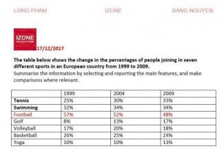
The table shows the change in the percentage of people joining in seven different sports from 1999 to 2009

table
The table below gives information about consumer spending on different items in fiver different countries in 2002. Summarise the information by selecting and reporting the main features, and make comparisons where relevant.


table
The table below shows the results of a survey that asked 6800 Scottish adults (aged 16 years and over) whether they had taken part in different cultural activities in the past 12 months.


table
The table shows information about the numbers of people who took the seven most popular airlines in the US in 1995 and 2005. Summarize the information by selecting and reporting the main features, and make comparisons where relevant.

table
The chart below shows what Anthropology graduates from one university did after finishing their undergraduate degree course. The table shows the salaries of the Anthropolgist in the work after five years.


table
The table bellow gives information about changes in modes of travel in England beween 1985 and 2000. Summarise the information by selecting and reporting the main features, and make comparisons where relevant


table
The table below shows the change in number of people engaged in various physical activities between the years 2001-2009 in Australia (in million people). Summarise the information by selecting and reporting the main features, and make comparisons where relevant.


table
thr table and the charts below give information the police budget for 2017 and 2018 in a one area of britian. the table shows where the money vame from and the chart shows how it was distributed


table
The table below gives information on consumer spending on different items in five different countires in 2002. Summarize the information by selecting and reporting the main features, and make comparisons where relevant.

table
The table below shows social and economic indictators for four countries in 1994, according to United Nations Statistics.


table
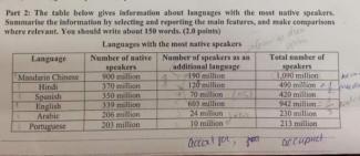
The table below gives information about the languages that high school students speak at home in one district

table
The table below gives information about the changes in most of travel in England between1985 to 2000
table
The chart below gives information about the production of grains, measured in million metric tons, from the years 2015 to 2035.


table
The chart below shows what Anthropology graduates from one university did after finishing their undergraduate degree course. The table shows the salaries of the anthropologists in work after five years. Summarise the information by selecting and reporting the main features, and make comparisons where relevant.


table
The table below shows the change in the number of people (million) taking part in five different physical activities between 2001 and 2009. Summarise the information by selecting and reporting the main features and make comparison where relevant.

table
The table below shows social and economic indicators for four countries in 1994, according to United Nations statistics. Describe the information shown below in your own words. What implications do the indicators have for the countries?


table
The table below shows local catches and imports of fresh fish into Perth, Australia for the years 2004 - 2014. Summarise the information by selecting and reporting the main features, and make comparisons where relevant.


table
the chart below shows the value of one country's exports in various categories during 2015 and 2016. the table shows the percentage in each category of exports in 2016 compared with 2015. summarize the information and make acomparison.


table
The table shows the changes in modes of travel in a European country between 1995 and 2025. It also shows a projection to the year 2015.


table
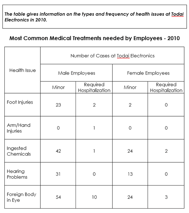
The table gives information on the types and frequency of health issues at Todai Electronics in 2010


table
The table shows the number of universities ranked top 200 in the world (2011) in three subjects in five countries. Summarize the information by selecting and reporting the main features, and make comparison where relevant.


table
The table above shows the percentage of mobile phone owners using various mobile phone features. Write a report of at least 150 words, summarizing the information and making comparisons where relevant.


table
the table below gives information on consumer spending on different items in five different countires in 2002.

table
The table and chart below give information on the police budget for 2017 and 2018 on one area of Britian. The table shows where the money came from and chart show how it was distributed.


table
The table below shows personal saving as a percentage of personal income for selected countries in 1970, 1990 and 2010.


table
The table below shows the number of temporary migrant worker in four countries in 2003 and 2006 and the number of these workers per 1,000 people in these countries in 2006. Summarise the information by selecting and reporting the main features, and make comparisons where relevant. You should write at least 150 word
table
The table below shows the percentage of first-year students who gave very good rating to the resources provided by a college, for three courses. Summaries the information by selecting and reporting the main features and making comparisons where relevant.

table
The table below shows the results of a survey that asked 6800 Scottish adults (aged 16 years and over) whether they had taken part in different cultural activities in the past 12 months. Summarise the information by selecting and reporting the main features, and make comparisons where relevant.


🚀 Prepare for IELTS writing section today!
- Unlimited Task 1 & Task 2 checksPractice with essays, charts, and letters.
- Personalized suggestions & mistake analysisSpot every mistake and boost your score.
- Topic ideas & vocabulary helpersExpand your ideas and use the right words.
- Progress trackingWatch your writing improve with every practice.