IELTS Academic Writing Task 1 Multiple Topics 2026
This list contains a selection of IELTS Academic Writing Task 1 multiple topics that were submitted by students who completed the IELTS exam in 2026. Select a topic at random and start practicing and enhancing your writing abilities.
multiple
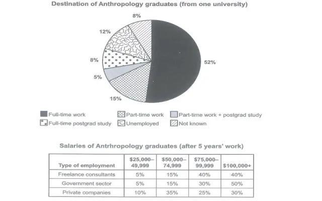
Careers of Anthropology graduates. The pie chart illustrates the careers that Anthropology students chose after graduation and the table indicates their salaries following 5 years of work in various sectors.


multiple
The table below give information about sales of Fairtrade-labelled coffee in 1999 and 2004 in five European Countries. Summarise the information by selecting and reporting the main features, and make comparisons where relevant.


multiple
The tables show the populations of eight capital and eight provincial cities in 1999. Summarize the information by selecting and reporting the main features, and make comparisons where relevant.


multiple
The line graph gives information about the number of books that were borrowed in four various libraries in 2014, with the piechart illustratesthe proportion of different types of books over the four months.


multiple
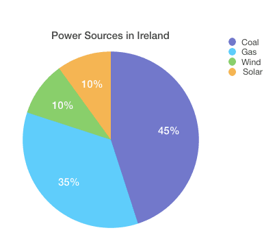
The pie graph below shows how electricity is produced in Ireland and the table shows the primary reasons for using electricity in the same country. Summarise the information by selecting and reporting the main features, and make comparisons where relevant.


multiple
The bar chart illustrates how seven European nations spend on relaxing activities as a proportion of total household, while the pie chart demonstrates the tendency of the average yearly expenditure on entertaining activities per household in the U.K.

multiple
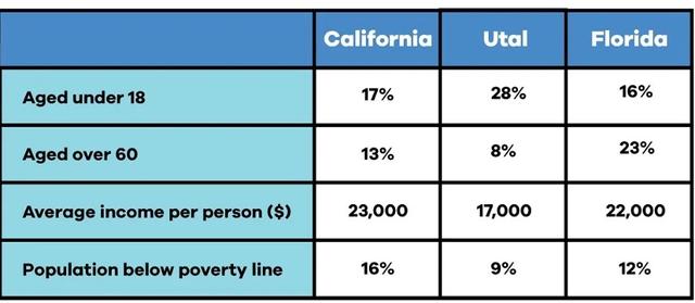
The table below shows information about age, average income per person and population below poverty line in three states in the USA. Summarize the information by selecting and reporting the main features and make comparisons where relevant.

multiple
The line graph and pie chart below show information on crime in the UK for the last year. Summarise the information by selecting and reporting the main features, and make comparisons where relevant. You should The Relationship Between Age and Crime, last year Types of Property Crime in the UK, last year


multiple
The map below shows part of the town of Huntingdon, one as it is now and one showing proposed. Summarize the information by selecting and reporting the main features and make comparisons where relevant.


multiple
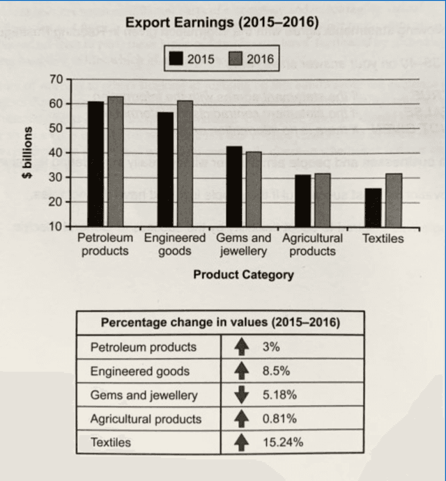
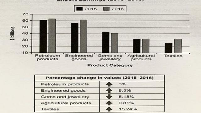
The chart below shows the value of one country’s exports in various categories during 2015 and 2016. The table shows the percentage change in each category of exports in 2016 compared with 2015. Summarise the information by selecting and reporting the main features and make comparisons where relevant.


multiple
the table and pie chart below give information about population of Australia according to different nationalities and areas. for this task.


multiple
The map presents the development of the village of Ryemouth between 1995 and present. Summarise the information by selecting and reporting the main features and make comparisons where relevant. k


multiple
The chart shows internet speeds in five different Australian cities in megabytes per second in 2005 and 2015. The graph shows the type of internet connections Australian people had in 2010.


multiple
The table and pie charts below show the number of research students in Australian universities in 2001 and 2010.Summarise the information by selecting and reporting the main features, and make comparisons where relevant.


multiple
The table below shows the numbers of same day and overnight stays in public and private hospitals in 5 Australlan for last year. The ple chart below shows percentages of same day and overnight stays in public and private hospitals in the same 5 Australian states.
multiple
The pie charts below illustrate degrees granted in different sectors at the National University in the 1990, 2000, and 2010.


multiple
The graphs below provide information on global population figures and figures for urban populations in different world regions. Summarise the information by selecting and reporting the main features, and make comparisons where relevant.


multiple
the chart below shows the value of one country export in various categories during 2015 and 2016. the table shows the percentage change in value of export in 2016


multiple
The table shows the average number of vehicles per hour on two roads during the week. The pie charts show the proportion of different types of transportation using each road.


multiple
The table below shows the age profilof tourist on backpacking holiday and the guided tours in New Zealand in 2005, and the pie chart gives the satisfaction rating of their stay. Summarize the information by selecting and reporting the main features, and makecomparisons where relevant.

multiple
The graphs give data about proportions of the results of a research at a new shopping mall in Auckland, New Zealand

multiple
The picture and flow chart illustrate how frozen fish pie is prepared in a factory production line.
multiple
The tble and pie chart show in percentage terms the results of a survey of a new shopping complex in auckland newzeland.

multiple
The map below shows the development of an area between 1995 and the present. Summarize the information by selecting and reporting the main features and make comparisons where relevant.


multiple
The table illustrates the cost of three environmental projects for sustainable forestry in the next five years. The pie chart, on the other hand, depicts four sectors allocated in the project in the first year.


multiple
The pie chart shows the percentage of males and females arrested in the UK from 2015- 2020 and the bar chart shows the reasons for these people's arrest. Summarize the information by selecting and reporting the main features and make comparisons where relevant.
multiple
Map the maps below describe an area before and after the construction of a hydroelectric power plant


multiple
The graph and table show the number of individuals' working hours and the number of paid holidays from 1998 to 2004. Summarise the information by selecting and reporting the main features, and make comparisons where relevant.
multiple
The pie chart compares the percentages of males and females who were arrested between 1990 and 1994, while the bar graph illustrates the main reasons for recent arrests.


multiple
The table below shows the numbers of visitors to Ashdown Museum during the year before and the year after it was refurbished. The charts show the results of surveys asking visitors how satisfied they were with their visit, during the same to periods. Summarise the information by selecting and reporting the main features, and make comparisons where relevant.
multiple
The pie chart illustrates several destinations of anthropology alumni from one university after they finished their bachelor degree and the table gives information on the payment of the anthropology graduates after working for 5 years.


multiple
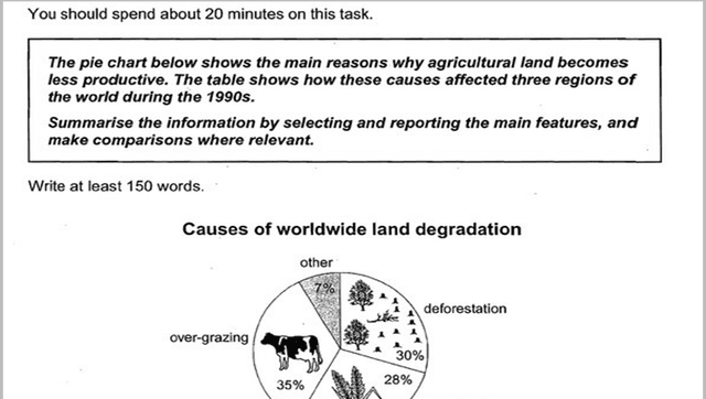
The pie chart below show the main reason why agricultural land becomes less productive. The table shows how these causes affected three regions of the world during the 1990s.


multiple
The chart below shows what anthropology grafuates from one University did after finishing their undergraduate degree course. The table shows the salaries of the anthropologists in work after five years. Summaries the Information by selecting amd reporting the main features.
multiple
The bar chart below shows us seafood imports for 1986, 1996 and 2016, and forecast for 2026. The pie chart shows the geographical structure of theses imports in 2016.
multiple
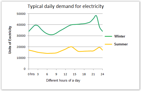
The line graph compares usage of daily electricity between winter and summer by hours, while the pie graph illustrates consumption of electricity by house tools. A glance at the graphs reveal that the most of demand is in the winter. Not suprisingly, the heating rooms and water cover the mass majority of the consumption.

multiple
The table and charts below give information on the police budget for 2017 and 2018 in one area of Britain.The table shows where the money came from and charts show how it was distributed. Summarise the information by selecting and reporting the main features,and make comparison where relevant.


multiple
The pie chart below shows the main reasons why agricultural land becomes less productive. The table shows how these causes affected three regions of the world during the 1900s. Summarise the informaion by selecting and reporting the main features, and make comparisons where relevant.

multiple
The table below shows the number of students at a Malaysian secondary school during two school years. the charts show the result of a survey asking these students what ttheir favourite sports is

multiple
In the real test, this will take you about 20 minutes, but there is no time limit here. STEP 1 - Read the task The line graphs below show the subscriptions to mobile and fixed phone lines in four different countries between 2005 and 2015. Summarise the information by selecting and reporting the main features and make comparisons where relevant.


multiple
The table and charts below give information on the police budget for 2017 and 2018 in one are of Britian. The table shows where the money came from and the charts show how it was distribiuted.


multiple
The table shows the worldwide market share of mobile phone manufacturers in the 2015. Summarise the information by selecting and reporting the main features, and make comparisons where relevant.


multiple
The map bellow show the chances that occurred to a town named Willington in 1780,1860 and 2000.


multiple
The table and charts below give information on the police budget for 2017 and 2018 in one area of Britain. The table shows where the money came form and the charts show how it was distributed.

multiple
the graph below illustrates the demand for electrical power in england during typical days in winter


multiple
The first table below shows changes in the total population of New York City from 1800 to 2000. The second and third tables show changes in the population of the five districts of the city (Manhattan, Brooklyn, Bronx, Queens, Staten Island) over the same period. Summarise the information by selecting and reporting the main features, and make comparisons where relevant.


multiple
The line graph shows the change in the amount of electricity used during a day in two seasons and pie chart indicates the different uses of electricity. Describe the main features and make comparisons where relevant

multiple
The tables below give information about sales of Fairtrade-labelled coffee and bananas in 1999 and 2004 in five European countries. Summaries the information by selecting and reporting the main features, and make comparisons where relevant.
multiple
the chart below shows the value of one country's exports in various categories durin 2015 and 2016. the table shows the percentage cahnge in each category of exports in 2016 compared with 2015. summerise the information by selecting and reporting the main features, and make comparisons where relevent.


multiple
The chart below shows what Anthropology graduates from one university did after f inishing their undergraduate degree course. The table shows the salaries of the anthropologists in work after five years. Summarize the information by selecting and reporting the main features, and make comparisons where relevant.

multiple
The charts show what ik graduated and postgraduate students who did not go into full-time work did after leaving college. Summer is the information by selecting and reporting main features and make comparisons where relevant.


multiple
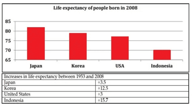
The bar chart gives us the information about the life expectancy in Japan, United States, Korea, and Indonesia and the table shows us the change in the life expectancy between 1953 and 2008. Summarise the information by selecting and reporting the main features and make comparisons where relevant.

multiple
The given pie chart illustrates us the causes of wordwild land degradation also the table below


multiple
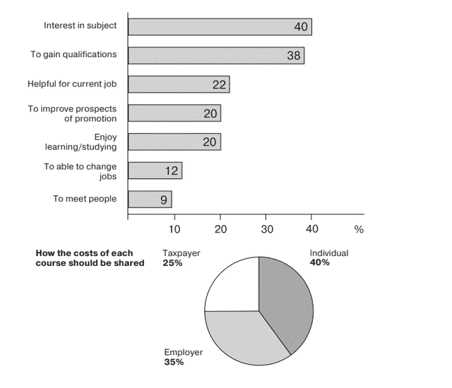
The chart below show the result of a survey of adult education. The first chart shows the reasons why adults decide to study. The pie chart shows how people think the cost of adult education should be shared.

multiple
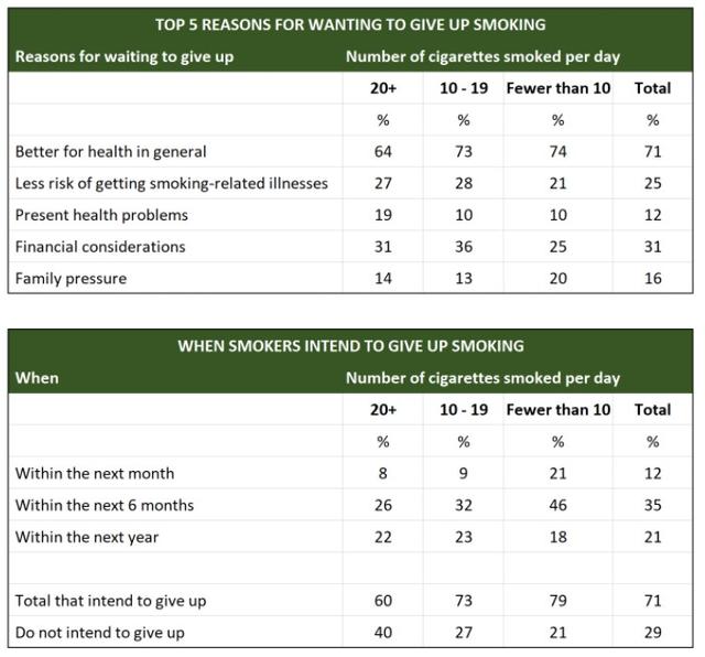
The tables below show people's reasons for giving up smoking, and when they intend to give up. Summarise the information by selecting and reporting the main features, and make comparisons where relevant.

multiple
The maps below show the centre of a small town called Islip as it is now, and plans for its development.


multiple
The diagrams below show the main reasons workers chose to work from home and the hours males and females worked at home for the year 2019. Summarize the information by selecting and reporting the main features, and make comparisons where relevant.


multiple
The map illustrates the changes in Stockford City in 1986 and present time. Summarize the key points and make comparison. Write the essay in 150 words.


multiple
The pie chart below shows the main reasons why agricultural land becomes less productive. The table show how these causes affected three regions of the world during the 1990s. Summarise the information by selecting and reporting the main features, and make comparisons where relevant.


multiple
the graph below illustrates the demand for electrical power in england during typical days in winter and summer and how electric current is used in average English home.
multiple
The chart below gives information about how people aged 25-34 are housed in the UK. Summerize the information by selecting and reporting on the features, and make comparisons where relevant.
multiple
The table illustrates the projected costings during the five years in American dollars for three environmental strategies for stable forestry, whilst the pie chart presents the anticipated expenses distributed by four sectors in the first year.


multiple
The table and pie charts show the number of research students in Aaustralia universities in 2001 and 2010


multiple
The table and pie charts below show the number of research students in Australian universities in 2001 and 2010. Summarize the information by selecting and reporting the main features, and make comparisons where relevant.

multiple
The pie chart below shows the main reasons why agricultural land becomes less productive. The table shows how these causes affected three regions of the world during the 1990s. Summarise the information by selecting and reporting the main features, and make comparisons where relevant.

multiple
The table below shows the numbers of visitors to Ashdown Museum duringthe year before and the year after it was refurbished. The charts show the result of surveys asking visitors how satisfied they were with their visitduring the same two periods. Summarise the information by selecting and reporting the main features, andmake comparisons where relevant.


multiple
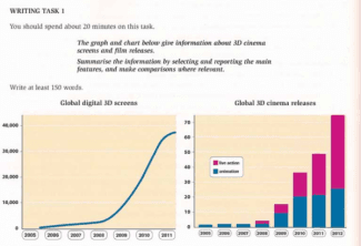
WRITING TASK I The graph and chart below give information about 3D cinema screens and film releases. Summarise the information by selecting and reporting the main features. and make comparisons where relevant.

multiple
The line graph shows the number of customers in four restaurants between 1990 and 2015. Summarise the information by selecting and reporting the main features, and make comparisons where relevant.


multiple
The chart and graph below give information about three categories of workers in Australia and the unemployment levels within those groups. Summarize the information by selecting and reporting the main features, and make comparisons where relevant.


multiple
The charts below show total British exports and the countries that Britain exports to. Summarise the information by selecting and reporting the main features, and make comparisons where relevant.


multiple
The pie chart shows the percentage of persons arrested in the five years ending 1994 and the bar chart shows the most recent reasons for arrest. Summarize the information by selecting and reporting the main features

multiple
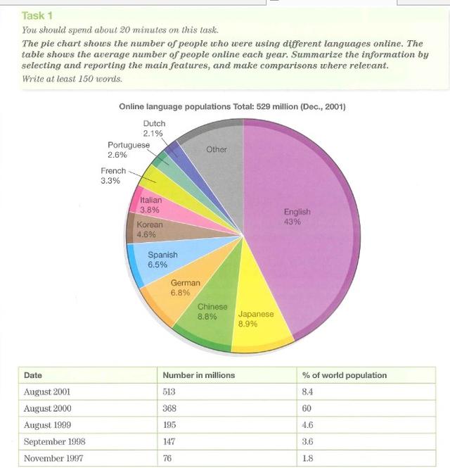
The pie chart shows the number of people who were using different languages online. The table shows the average number of people online each year. Summarize the information by selecting and reporting the main features, and make comparisons where relevant.

multiple
The table shows the percentage of journeys made by different forms of transport in four countries, and the bar graph show the results of a survey into car use.
multiple
The tables provide information about why people travel to destinations out of the country and where they go from 1994 to 1998.


multiple
The chart below shows the value of one country export in various categories during 2015 and 2016. the table shows the percentage change in value og export in 2016
multiple
The pie chart represents the types of careers that Antropology graduates after completing their Bachelor’s degree course from one University. The table displays the wages after five years of working in this particular field.


multiple
The table below shows information about age, average income per person and population below the poverty line in three states in the USA. Summarise the information by selecting and reporting the main features and make comparisons where relevant.


multiple
The pie graph below shows the electrivity production in ireland and the tables shows the primary reasons for using electricity in the same country

multiple
The pie chart below shows the main reasons why agricultural land becomes less productive. The table shows how these causes affected three regions of the world during the 1990s. Summarise the information by selectng and reporting the main features, and make comparisons where relevant.

multiple
The chart below shows the value of the country's export in various categories during 2015 and 2016. The table shows the percentage change in each category of exports in 2016 compared with 2015. Summarize the information by selecting and reporting the main features, and make comparisons where relevant.

multiple
The given map illustrates how the waterfront area of a town called Darwin developed over a 5 years period from 2009 to 2014.


multiple
The graph and bart chart below show the average monthly rainfall and temperature for one region of East Africa


multiple
The chart below shows Anthropology graduates from one university did after finishing high school degree course with their salary grade after 5years.

multiple
the police budget for 2017 and 2018 in one area of Britain. where the money came from and the charts show how it was distributed. Summarise the information by selecting and reporting the main features, and make comparisons where relevant.


multiple
The map below shows a school in 1985 and the school now. Summarize the information by selectiong and reporting the main features and make comparisons where relevant. (CONG THANH)


multiple
The bar chart below shows the perportions of English men and women of different ages who were living alone in 2011, and the pie chart compares the numbers of bedrooms in these one-person households.


multiple
The map below shows the development of the village of Ryemouth between 1995 and present. Summarise the information by selecting and reporting the main features and make comparisons where relevant.
multiple
The map shows a public park (Grange Park) when it first opened in 1920 and the same park today. Summarise the information by selecting and reporting the main features and make comparisons where relevant.


multiple
The chart bellow shows the value of one country's exports in various categories during 2015 and 2016. The table shows the percentage change in each category or exports in 2016 compared with 2015.

multiple
The bar chart illustrates the percentage of people in five different age groups in the UK who donated money to charity in the years 1990 and 2010. The age groups represented are: 18–25, 26–35, 36–50, 51–65, and 65 and over. For each age group, there are two bars indicating the percentage of people who donated in 1990 and 2010 respectively. Summarise the information by selecting and reporting the main features, and make comparisons where relevant.


multiple
The pie chart below shows where energy consumption is used in a typical Australian household, and the table source the amount of electricity used according to the number of occupants. Summarise the information by selecting and reporting the main feature and make comparison very relevant


multiple
The line graph below shows the number of monthly active users of some social network and messaging services between 2010 and 2015. Summarise the information by selecting and reporting the main features, and make comparisons where relevant.


multiple
The charts below give information about the way in which water was used in different countries in 2000. Summarise the information by selecting and reporting the main features, and make comparisons where relevan


multiple
Th e maps below show an industriaal area in the ttown of Norbinton, planned future development of the site. Summarise the information by selecting and reporting the main features and make comparisons where relevant.


multiple
The bar and line chart below shows average monthly temperatures and bathing suit sales in New York for the first 6 months of 2012. Summarise the information by selecting and reporting the main features, and make comparisons where relevant.


multiple
The diagram below gives information on transport use in Edmonton. Summarize the information by selecting and reporting the main features and make comparisons where relevant.


🚀 Prepare for IELTS writing section today!
- Unlimited Task 1 & Task 2 checksPractice with essays, charts, and letters.
- Personalized suggestions & mistake analysisSpot every mistake and boost your score.
- Topic ideas & vocabulary helpersExpand your ideas and use the right words.
- Progress trackingWatch your writing improve with every practice.