IELTS Academic Writing Task 1 Line Topics 2026
This list contains a selection of IELTS Academic Writing Task 1 line topics that were submitted by students who completed the IELTS exam in 2026. Select a topic at random and start practicing and enhancing your writing abilities.
line
The graph below shows the average monthly change in the prices of three metals during 2014. Summarise the information by selecting and reporting the main features, and make comparisons where relevant


line
The line graph shows changes in the amount and type of fast food consumed by Australian teenagers from 1975 to 2000.Describe the information shown in the graph.


line
The graph below shows that the percentage of Austeralian export to 4 countries from 1990 to 2012


line
The graph below shows the percentage of people in different age groups in one city who attended music concerts between 2010 and 2015.


line
The line graph below shows the consumption of four kinds of meat in a European country from 1979 to 2004
line
The graph below shows the rate of smoking per 1000 people in Someland from 1960 to 2000. Write a report for a university lecturer describing the information in the graph below.


line
The graphs below show a prediction to 2018 by the International Monetary Fund of the world’s Gross Domestic Product (GDP) growth.


line
The three charts below show the value in Australian dollars of Australian trade with three different countries from 2004 to 2009. Write a report for a university lecturer describing the information below.


line
The first graph shows the number of train passengers from 2000 to 2009; the second compares the percentage of trains running on time and target in the period. Summarize the information by selecting and reporting the main features and make comparisons where relevant.
line
The graph below shows the information on waste disposal in a European country from 2005 to 2008.


line
The line graph illustrates the Dubai gold sales in 2002, showing monthly data points that reflect fluctuations in sales volume throughout the year.


line
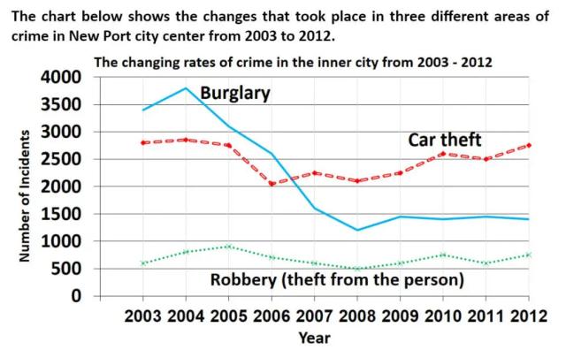
The chart below shows the changes that took place in three different areas of crime in New Port city center from 2003 to 2012. The changing rates of crime in the inner city from 2003 - 2012
line
The chart below shows the total number of minutes (in billions) of telephone calls in the UK, divided into three categories, from 1995–2002. Summarise the information by selecting and reporting the main features, and make comparisons where relevant.


line
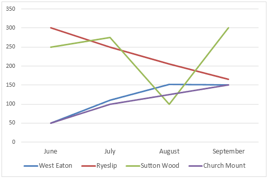
The line graph shows the number of books borrowed from four libraries in the mouths of June, July, August and September of

line
The graph shows the obesity rate in one country over a period of time. Summarise the information by selecting and reporting the main features, and make comparisons where relevant.
line
Depicted in the line graph is the population of citizens in the state of Oregon by county. Describe it.
line
The graph below shows the number of shops that closed and the number of new shops that opened in one country between 2011 and 2018. Summarise the information by selecting and reporting the main features, and make comparisons where relevant. Aisu2


line
The graphs below show the number of visitors to two cities in a given year. Summarize the information by selecting and reporting the main features, and make comparisons where relevant.


line
The line chart depicts the figures of foreigners visiting the coast, the lake and the mountain, and series 3 of a European country from 1987 to 2007.


line
The graph below shows the consumption of fish and some different kinds of meat in a European country between 1979 and 2004. Summarise the infomation by selecting and reporting the main features, and make compasions where relevant. Wirte at least 150 words.(Huseyn 1)


line
The line graph compares how much time it would take for three companies to manufacture a refrigerator in 1990 and 2000


line
The graph shows the proportion of the population aged 65 and over between 1940 and 2040 in three different countries.
line
The graph below shows the number of tourists visiting a particular Caribbean island between 2010 and 2017. Summerise the information by selecting and reporting the main features, and make compariosns where relevant. Dameliya 4


line
The graph shows the proportion of the population aged 65 and over between 1940 and 2040 in three different countries. Summarise the information by selecting and reporting the main features and make comparisons where relevant.


line
The line chart below shows the number of cars produced in three countries from 2003 to 2009. Summarise the information by selecting and reporting the main features, and make comparisons where relevant.


line
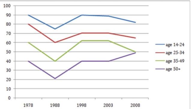
the graph below show the percentage of people by age group visting the cinema at least once per month in one particular country between 1978 and 2008.


line
The graph below shows the quantities of goods transport in the Uk between 1974 and 2002 by four different modes of transport. Summarise the information by selecting and reporting the main features and makecomparisons where relevant.


line
Test 1: The graph below shows the average monthly change in the prices of three metals during 2014. Summarize the information by selecting and reporting the main features and make comparisons where relevant.


line
The line graph shows value changes in the UK steel industry between 1970 and 2000, while the second line chart shows employment status in the same industry.


line
The line chart below shows the results of a survey giving the reasons why people moved to the capital city of a particular country. Summarise the information by selecting and reporting the main features, and make comparisons where relevant.
line
The chart below shows the average cost of a monthly contract for four different mobiles (cell phones) in a European country from January to September 2002, measured in euros.


line
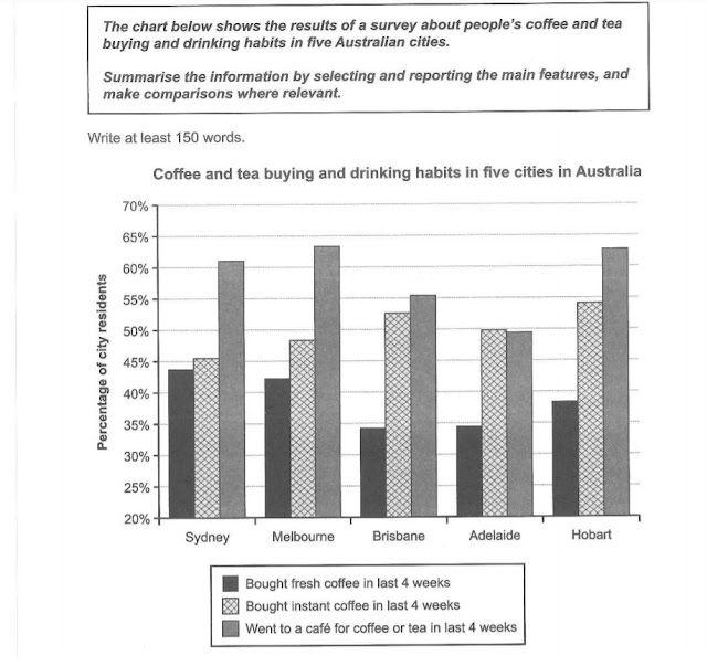
The chart below shows the results of a survey about people's coffe and tea buying and drinking habits in five Australian cities.

line
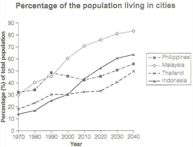
The graph below gives information about the percentage of the population in four Asian countries living in cities from 1970 to 2020, with predictions for 2030 and 2040. Summarize the information by selecting and reporting the main features, and make comparisons where relevant.


line
The graph below shows the number of university graduates in Canada from 1992 to 2007. Summarise the information by selecting and reporting the main features and make comparisons where relevant.


line
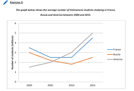
The graph below shows the average number of Vietnamese students studying in France, Russia and America between 2000 and 2015

line
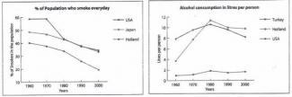
The two graphs below show the percentage of smokers and the consumption of alcohol in lites in selected countries, for the period 1960 - 2000. 3959 arse the information by choosing and reporting the key features, and make any relevant comparisons.
line
The graph below shows the amounts of waste produced by three companies over a period of 15 years.


line
The chart below shows the price in Euros of 800 grams of four types of bread in one European country from 2001 to 2006


line
The graph below gives information about the percentage of the population in four asian countries living in cirites from 1970 to 2020, with predicitions for 2030 and 2040. Summarise the information by selecting and reporting the main features, and make comparisons where relevant.

line
The line graph shows the number of people using five kinds of public facilities in a town in France at different times during the year 2022. Summarise the information by selecting and reporting the main features and make comparisons where relevant.


line
The graph below shows the consumption of fish and some different kinds of meat in a European country between 1979 and 2004. Make compate in' where ven bv saleting and reporting the main features, and


line
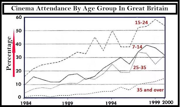
The line chart shows average attendance at the cinema among various age groups in the Great Britain from 1984 to 2000.

line
The graph below shows the average monthly change in the prices of three metals during 2014. Summarise the information by selecting and reporting the main features, andmake comparisons where relevant.

line
The line chart below shows the results of a survey giving the reasons why people moved to the capital city of a particular country. Summarize the information by selecting and reporting the main features, and make comparisons where relevant.


line
The chart shows the number of international students studying at a UK university between 1995 and 2015. Summarise the information by selecting and reporting the main features and make comparisons where relevant.


line
The graph below shows the average monthly change in the prices of three metals during 2014. Summarise the information by selecting and reporting the main features, and make comparisons where relevan

line
The chart shows requests for in formations at a tourist office in the United Kingdom from january to June. Summarize the information by selecting and reporting the main features and make comparison where relevant. The chart shows requests for in formations at a tourist office in the United Kingdom from january to June. Summarize the information by selecting and reporting the main features and make comparison where relevant.


line
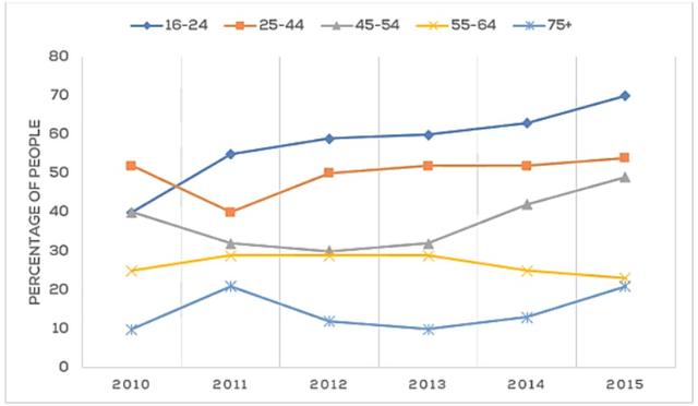
The line chart shows the percentage of people of different ages groups in the city who attended music concerts between 2005 and 2015.
line
The line graph illustrates the use of 3 kinds of fast food in Britain between 1970 and 1990. Summarise the information by selecting and reporting the main features, and make comparison where relevant.
line
clothing export The graph below gives information on the differences in clothing exports from three different countries.
line
The graph below shows the average monthly change in the prices of three metals during 2014. Summarise the Information by selecting and reporting the main features, and make comparisons where relevant.

line
The two line graphs show the number of births and deaths in the United Kingdom. The figures shown are from 10-year intervals starting in 1951 and going into 2051. Summarise the information by selecting and reporting the main features, and make comparisons where relevant.

line
The graph below shows tourism statistics among Venezuelian students from 2011 to 2014. Summarize the information by selecting and reporting the main features and make comparisons where relevant. 150 words


line
The graph below shows U.S. Energy Consumption by Fuel (1980-2030). Summarize the information by selecting and reporting the main features and make comparisons where relevant.


line
The graph below gives information about the percentage of the population in four countries living in cities from 1970 to 2020, with predictions for 2030 and 2040. Summarise the information by selecting and reporting the main features and make comparisons where relevant.

line
The line graph below shows changes in the amount and type of fast food consumed by Australian teenagers from 1975 to 2000. ▪️Summarise the information by selecting and reporting the main features, and make comparisons where relevant.

line
The line graph portrays the average figure of American people who visit a museum at a certain time in two seasons such as summer and winter in 2003.


line
The graph below shows the population figures of different types of wild birds in the United Kingdom between 1970 and 2004. Summarize the information by selecting and reporting the main features and make comparisons where relevant.
line
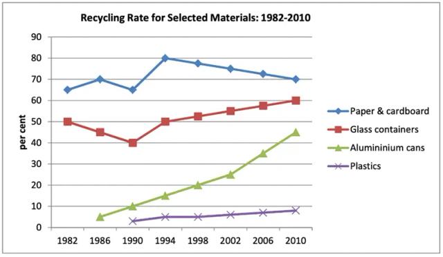
the graph below shows the proportion of four different material that were recycled that were recycled from 1982 to 2010

line
The graph below shows Twitter use by age group in the USA between November 2010 and May 2013. Summarise the information by selecting and reporting the main features, and make comparisons where relevant.


line
The graphs below show the percentage of men and women aged 60-64 who were employed in four countries in 1970 and 2000. Summarize the information by selecting and reporting the main features and make comparisons where relevent


line
The graph below shows the differences in the consumption of three fast food among Australian teenager. Write a report describing the information shown below.


line
The line graph below shows changes in the amount and type of fast food consumed by Australian teenagers from 1975 to 2000. Summarize the information by selecting and reporting tha main features, and make comparisons where relevant.

line
The line graph shows thefts per thousand vehicles in four countries between 1990 and 1999. Summarize the information by selecting and reporting the main features and make comparisons whare relevant.


line
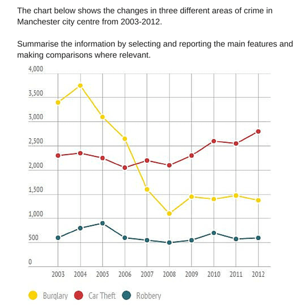
The chart below shows the change in three different areas of crime in Machester city centre from 2003-2012.
line
The line graphs below show the number of houses built in the UK between 2010 and 2020. Summarise the information by selecting and reporting the main features, and make comparisons where relevant.


line
the graph below shows average carbon dioxide (CO2) emissions per person in the Unite Kingdom, Sweden, Italy and Portugal between 1967 and 2007. Summarize the information by selecting and reporting the main features, and make comparisons where relevant.


line
The chart below show the changes that took place in three areas of crime in New Port city center from 2003 to 2012.

line
The line graph shows the percentages of Australian export with four countries. The graph below shows the percentage of Australian exports to 4 countries from 1990 to 2012


line
The charts give information about honey-bee colonies and honey production in the US Summerise the information about honey-bee colonies and honey production by selecting and reporting the main features and make comparisons where relevant.


line
The graph below shows the number of overseas visitors to three different areas in a European country between 1987 and 2007. Summarize the information by selecting and reporting the main features and make comparisons where relevant.


line
"Interpret the provided line graph that depicts the percentage of youngsters receiving inadequate healthcare facilities in six different European countries during the years 2008 to 2022. Describe the trends in healthcare provision for young individuals in each country, noting any fluctuations or improvements over the years. Highlight any exceptional changes in specific years and compare the countries' progress in addressing inadequate healthcare for the youth."


line
The graph below shows the different types of activities attended by three groups of people living in the UK in 2005. Summaries the information by selecting and reporting the main features,and make comparisons where relevant.


line
The graph below shows the average time spent by four car manufacturers to produce vehicles at their US factories. Summarize the information by selecting and reporting the main features, and make comparisons where relevant.


line
The graph below shows electricity protection ( in terawatt hours) in France between 1980 and 2012
line
The two graphs below show the percentage of smokers and the consumption of alcohol in litres in selected countries for the period 1960-2000. Write a report for a lecturer describing the information in the graphs.

line
The line chart illustrates the labour force employment in economic sectors during the period from 1930 to 2010 in USA. These five economic sectors include industrial sector, sales and office, farming and fishing and foresting, technical sector, and other services.


line
The graph below shows the consumption of three spreads from 1981 to 2007.Summarise the information by selecting and reporting the main features and make comparisons where relevant.
line
The graph below shows the unemployment rates in the UK, the rest of Europe and Japan from 1993 to 2007. Summarise the information by selecting and reporting the main features, and make comparisons where relevant.


line
The graph below shows the number of overseas who came to the uk for different purposes between 1989 and 2009. Summarize the information by selecting and reporting the main features and make comparisons where relevant.


line
The graph below shows the number of tourists visiting a particular Caribean island between 2010 and 2017. Summarise the information by selecting and reporting the main features ,and make comparision where relevent.


line
The graph below gives information on the usage of water for agricultural purposes in two different countries between 2000 to 2010. Summarise the information by selecting and reporting the main features, and make comparisons where relevant.


line
The graph below shows the percentage of adults whose healthcare need went unmet in the past year from 2008 to 2022 in 6 different European nations. Summarise the information by selecting and reporting the main features, and make coparisons where relevant.

line
The graph below compares SAT math results according to gender from 1992 to 2000 in a particular school. Summarize the information by selecting and reporting the main features, and make comparisons where relevant.


line
The graph below shows the average closing prices of selected precious metals from 2013 to 2021. Summarise the information by selecting and reporting the main features and make comparisons where relevant.
line
The graph below shows average cabon dixide emmisions per person in the United Kingdom, Sweden, Italy and Portugal between 1967 and 2007.


line
The graph below shows the differences in wheat exports over three different areas.Write a report for a university lecturer describing the information shown below. Summarise the information by selecting and reporting the main features, and make comparisons where relevant.


line
Q: The line graph below shows the percentage of spending in a European country from 1960 to 2000. Summarise the information by selecting and reporting the main features, and make comparison where relevant
line
The graph below shows U.S. Energy Consumption by Fuel (1980-2030). Summarize the information by selecting and reporting the main features and make comparisons where relevant. Beka 2
line
The graph below shows the number of shops that closed and the number of new shops that opened in one country between 2011 and 2018. Summarise the information by selecting and reporting the main features, and make comparisons where relevant.
line
the graph shows the amount earned by graduates of different age groups in 2002.it includes thoes with a degree,those with a higher degree and those with other qualifications.


🚀 Prepare for IELTS writing section today!
- Unlimited Task 1 & Task 2 checksPractice with essays, charts, and letters.
- Personalized suggestions & mistake analysisSpot every mistake and boost your score.
- Topic ideas & vocabulary helpersExpand your ideas and use the right words.
- Progress trackingWatch your writing improve with every practice.