IELTS Academic Writing Task 1 Lines Topics 2026
This list contains a selection of IELTS Academic Writing Task 1 lines topics that were submitted by students who completed the IELTS exam in 2026. Select a topic at random and start practicing and enhancing your writing abilities.
lines
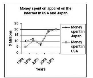
The graph on the rigth shows the amounts spent on clothes on the Internet in the USA and Japan between 1999 and 2003. Write a report for a university lecturere describing the information shown

lines
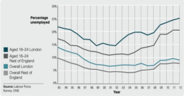
The graph below shows changes in young adult unemployment rates in England between 1993 and 2012.

lines
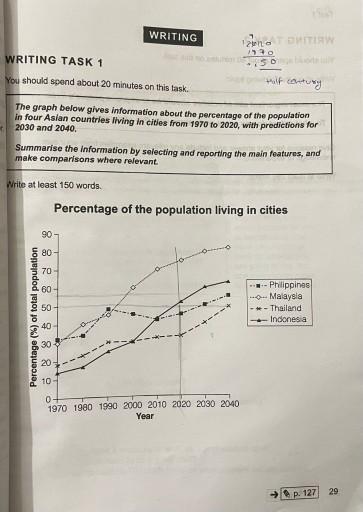
The graph below gives information about the percentage of the population in four Aisian countries living in cities from 1970 to 2020 with prediction for 2030 and 2040.


lines
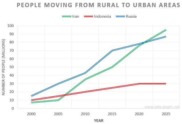
The diagram explains the migration of people from Iran, Indonesia, and Russia to a metropolitan city between 2000 and 2025.

lines
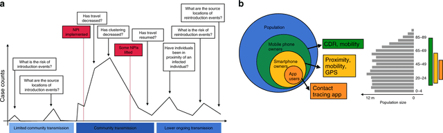
The graph above shows the use of land lines and mobile phones in 6 different countries. Summarise the information by selecting and reporting the main features and make comparisons where relevant.

lines
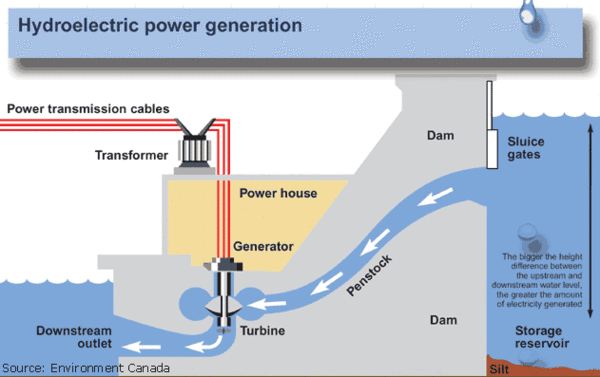
The diagram illustrates the basic principles of a hydraulic dam.The process includes a large dam,powerhouse and long distance power lines.



🚀 Prepare for IELTS writing section today!
- Unlimited Task 1 & Task 2 checksPractice with essays, charts, and letters.
- Personalized suggestions & mistake analysisSpot every mistake and boost your score.
- Topic ideas & vocabulary helpersExpand your ideas and use the right words.
- Progress trackingWatch your writing improve with every practice.