IELTS Academic Writing Task 1 Unknown Topics 2026
This list contains a selection of IELTS Academic Writing Task 1 unknown topics that were submitted by students who completed the IELTS exam in 2026. Select a topic at random and start practicing and enhancing your writing abilities.
unknown
The diagram below shows the plan of a medical centre in 2008 and 2010. Summerize the information by selecting and reporting the main features and make comparisons where relevant


unknown
The charts below provide information about the websites where consumers from Australia and New Zealand bought products in 2012, as well as their reasons for online shopping. Summarise the information by selecting and reporting the main features, and make comparisons where relevant.


unknown
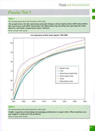
The graph shows the life expectancy of people living in Asian regions from 1950 and predicts life expectancy until 2300. Summarize the information by selecting and reporting the main features, and make comparions where relevant.

unknown
The graph below shows how people buy music. Summarise the information by selecting and reporting the main features, and make comparisons where relevant.


unknown
The chart below shows the reasons why people travel to work by bicycle or by car. Summarise the information by selecting and reporting the main features, and make comparisons where relevant.


unknown
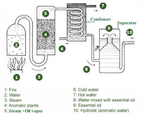
The diagram below shows how honey is made in small-scale commercial production. Summarize the information by selecting and reporting the main features, and make comparisons where relevant.


unknown
This graph below gives information from a 2008 report about consumption energy in the USA since 1980 with projections until 2030. Summarise the information by selecting and reporting the main features and make comparison where relevant
unknown
The diagram below illustrates how a simple water filter is constructed and how it functions to produce clean drinking water. Write a report for a university, lecturer describing the information shown below. Summarise the information by selecting and reporting the main features and make comparisons where relevant.


unknown
The charts below show the average percentages in typical meals of three types of nutrients, all of which may be unhealthy if eaten too much. The three meals are breakfast, lunch, dinner, and snacks.


unknown
The diagram below shows the water cycle in both forested and urban areas. Summarise the information by selecting and reporting the main features and make comparisons where relevant.


unknown
The diagram below shows how salt is removed from the sea water to make it drinkable. Summarize the information by selecting and reporting the main features, and make comparisons where relevant.


unknown
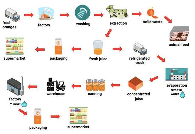
The diagram below shows how orange juice is produced Summarise the information by selecting and reporting the main features, and make comparisons where relevant.

unknown
The chart below shows the book sales for five different types of fiction books from 2006 to 2010. Summarise the information by selecting and reporting the main features, and make comparisons where relevant. Beka
unknown
The chart below show the average percentage in typical meals of three types of nutrients, all of which may be unhealthy if eaten too much. Summarise the information by selecting and reporting the main features and make comparison where relevant

unknown
The chart illustrates the career paths and salary ranges of Anthropology graduates from a university five years after completing their undergraduate degree. It highlights various employment destinations and income levels for graduates in different sectors.


unknown
The graph below shows the information about medical care in three European countries between 1980 and 2000. Summarise the information by selecting and reporting the main features and make comparisons where relevant.


unknown
Some charts are used to show predictions of the future, estimates of the past and projections of the future


unknown
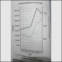
The graph below shows how much money a city council gave to book clubs over a four-year period. Summarise the information by selecting and reporting the main features, and make comparisons where relevant.


unknown
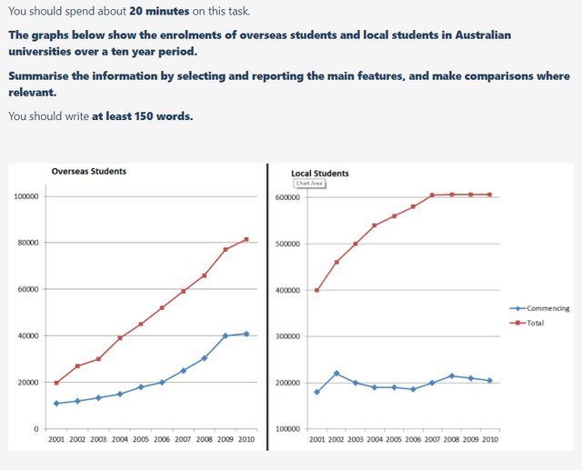
The graphs below show the enrolments of overseas students and local students in Australian universities over a ten year period.

unknown
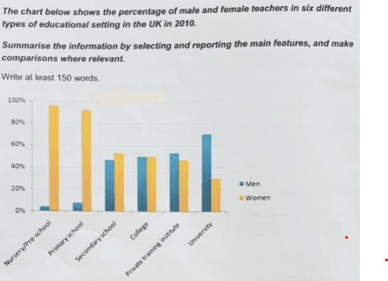
The chart shows the percentage of males and females teachers in six types of educational settings in The UK in 2010

unknown
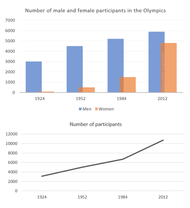
The chart and graph below give information about participants who have entered the Olympics since it began.


unknown
The diagram below shows how electricity is generated in a hydroelectric power station. Summarise the information by selecting and reporting the main features, and make comparisons where relevant. M


unknown
The graphs below show the different reasons of two group of students to choose Dorrifod University Summarize the information by selecting and reporting the main features and mae comparisons with relevant.


unknown
The diagram below shows how a hot balloon works. Summarise the information by selecting and reporting the main features and making the comparisons where relevant


unknown
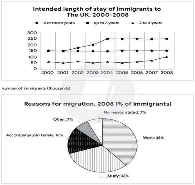
The chart gives information abour migration to the UK. The chart shows how long immigrants in the years 2000-2008 intented to stay in the UK. And the pir chart shows reasons for migration in 2008.

unknown
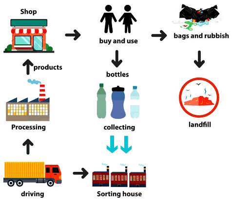
The diagram below shows the process for recycling plactic bottles. Summarise the information by selecting and reporting the main features.


unknown
The charts below show the proportion of people’s total spending on different commodities and services in a particular European country in 1998 and 2008.


unknown
The graph below gives information about the percentage of the population in the four asian countries living in cities from 1970 to 2020 with predictions for 2030 and 2040. summarise the information by selecting and reporting the main features and make comparisons where relevent.


unknown
The graph below shows the number of shops that closed and the number of newshops that openedin one county between 2011and 2018.


unknown
The chart below shows the places visited by different people living in Canada. Summaries the information by selecting and reporting the main features, and make comparisons where relevant.


unknown
The chart below shows the number of international applicants to the universities of one European country. Summarize the information by selecting and reporting the main features, and make comparisons where relevant.


unknown
The chart below shows fruit sales in a supermarket for three different months after an advertising campaign to promote sales of peaches, pears and strawberries.


unknown
The diagram gives information about the number of cars used in three different cities of the US by automobile type. Summarize the given information by selecting and reporting the main features, and make comparisons where relevant.


unknown
The graph below show the types of music albums purchased by people in Britain according to sex and age.


unknown
The diagrams depict the scheme of development for Youngsvillie’s town in New Zealand between 1980 and 2005.


unknown
The chart below shows information about changes in average house prices in five different cities between 1990 and 2002 comparedwith the average house prices in 1989. Summarise the information by selectingandreporting the main features, and make comparisons where relevant.


unknown
describe a graph that shows average growth in domestic products in wealthy countries, globalisers and non-globalisers.


unknown
The graph below gives information on the numbers of participants for different activites at one social centre in melbourne, australia for the period 2000 to 2020.


unknown
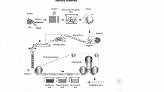
The diagram below shows the stages and equipment used in the process of making matches. Summarize the information by selecting and reporting the main features, and make comparisons where relevant

unknown
The graph below gives information from a 2008 report about consumption ofenergy in the USA since 1980 with projections until 2030. Summarise the information byselecting and reporting the main features,andmake comparisons where relevant.


unknown
The chart below shows the number of trips made by children in a country in 1990 and 2010 to travel to and from school by means of different methods of transport.


unknown
The diagram below shows the production of ethanol oil from grain. Summarize the information by selecting and reporting the main features and make comparisons where relevant.


unknown
The diagram illustrates the Life Cycle process of frogs in a pond. Summarize the information by selecting and reporting the main features and make comparisons where relevant.
unknown
The chart below shows the proporsional of Energy produced from different sources in a country between 1985 and 2003.


unknown
The two charts show information about the college graduate and postgraduate students who did not go to full-time jobs and instead they were busy with other activities in 2008


unknown
This graph displays the number of daily United Kingdom travelers by car, bus or train over the period of 60 years from 1970


unknown
The diagram below shows information about performance of sector wise indexs in India from 2000 to 2010.


unknown
The diagram below shows the process for recycling plastic bottles. Summarize the information by selecting and reporting the main features, and make comparisons where relevant.
unknown
The diagram shows the life cycle of the Monarch butterfly. Summarise the information by selecting and reporting the main features, and make comparisons where relevant.
unknown
This diagram shows the process of wool production. Summarise the information by selecting and reporting the main features, and make comparisons where relevant.


unknown
the chart below shows informtion about wages for health care professionals in four diffrent countries.summarize the information.


unknown
The diagram below shows the process of electricity production. Summarise the information by selecting and reporting the main features, and make comparisons where relevant. IELTS Process/Diagram

unknown
The diagram below shows the process of producing edible oils and fats, and margarine. Summarise the information by selecting and reporting the main features, and make comparisons where relevant.


unknown
The graph shows the proportion of energy that was produced from coal in four European countries from 1995 to 2010.


unknown
The diagram shows how small and large Venus Flytrap species handle small prey to optimize their use of digestive enzymes Summarise the information by selecting and reporting the main features, and make comparisons where relevant.


unknown
U.S. Energy Consumption - You should spend 20 minutes on this task. The graph below shows U.S. Energy Consumption by Fuel (1980-2030). Summarize the information by selecting and reporting the main features and make comparisons where relevant.


unknown
The charts provide information on household income and spending on clothes and food for an average family in the UK in two different periods: 2010 and 2013
unknown
The diagram below shows how recycled paper is made. Summarise the information by selecting and reporting the main features, and make comparisons where relevant.


unknown
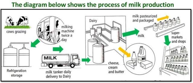
The diagram shows the process by which milk and related product are produced. Summarize the information by selecting and reporting the main feactures

unknown
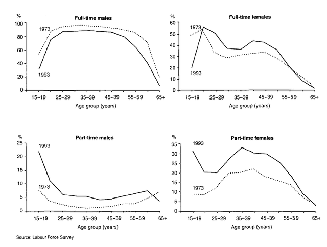
The graphs below show the number of men and women in full and part-time employment in Australia between 1973 and 1993. Summarise the information by selecting and reporting the main features, and make comparisons where relevant.


unknown
The charts compare the amount of water used for agriculture, industry and homes around the world, and water use in Brazil and the Democratic Republic of Congo.
unknown
The chart below shows the distribution of different income groups in cities and regional centres of Australia. Summarise the information by selecting and reporting the main features, and make comparisons where relevant.


unknown
The chart below shows gives information about Southland’s main exports in 2000,*20.., and future projections for 2025. Summarise the information by selecting and reporting the main features, and making comparisons where relevant. Write atleast 150 words.
unknown
The charts show the share of global manufacturing and exports for four countries between 1985 and 2005. Summarise the information by selecting and reporting the main features, and making comparisons where relevant. Show ideas and vocabulary


unknown
The chart gives information on the percentsage of women going into higher education in five countries for the years 1980 and 2915. Summarise the information by selecting and reporting the main features and make compar


unknown
The graph below gives information the number of participants for different activities at one social center in Melbourne, Australia, for the period 2000 to 2020. Summarise the information by selecting and reporting the main features, and make comparison where relevant.


unknown
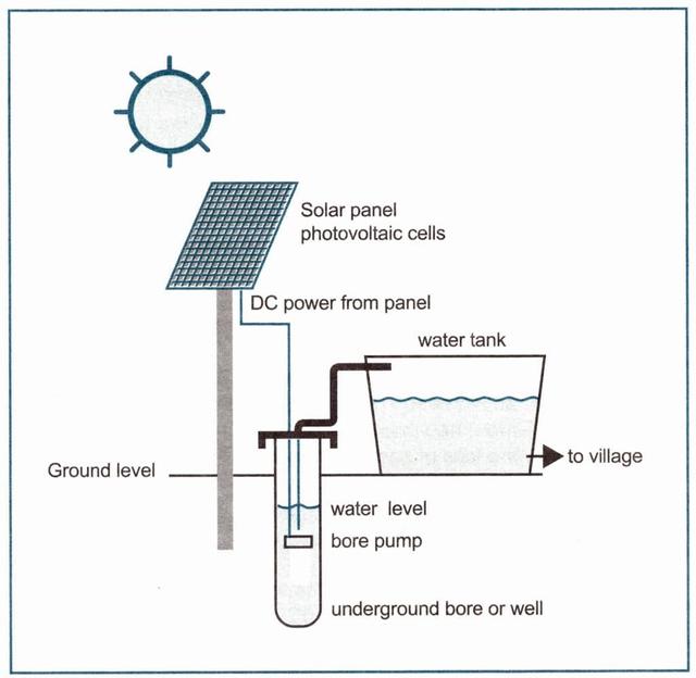
The diagram below shows how a solar powered water pump works. Summarise the information by selecting and reporting the main features, and make comparison where relevant.

unknown
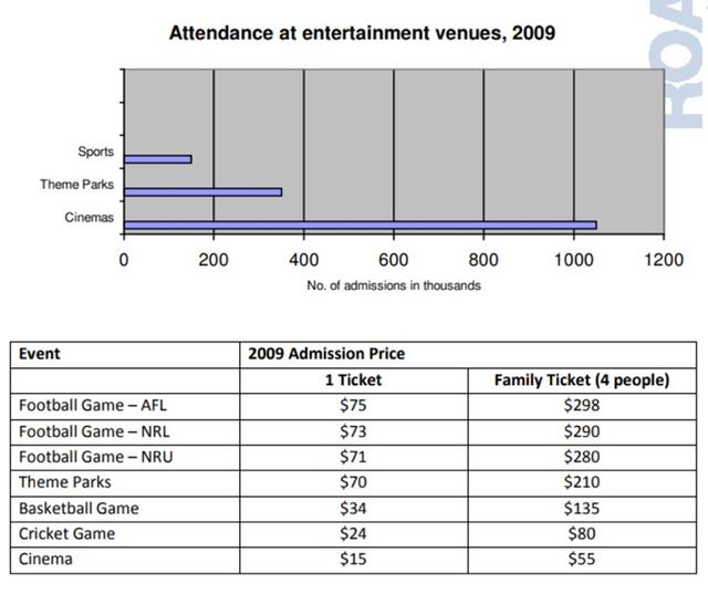
The charts below give information about attendance at entertainement venues and admission prices to those venues in 2009. Summarise the information by selecting and reporting the main features, and make comparisons where relevant.

unknown
The diagram below show the stages and equipment used in the cement-making process, and how cement is used to produce concrete for building purposes. Summarize the information by selecting and reporting the main features, and make comparisons where relevant.


unknown
The graph below shows the results of a survey on the percentage of people who drank soft drinks every day over 7 day period in 2019 in the 4 countries of the United Kingdom.


unknown
The chart below shows how frequently people in the USA ate in fast food restaurants between 2003 and 2013. Summarize the information by selecting and reporting the main features, and make comparisons where relevant.


unknown
The chart shows the proportion of survey respondents that showed interest in particular sports in three different years in the UK. Summarize the information by selecting and reporting the main features and make comparisons where relevant.


unknown
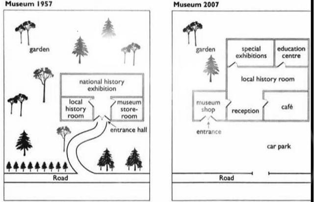
the diagram shows the floor plan of a public library 20 years ago and how it looks now. Summaries the information by selecting and reporting the main features, and make comparisons where relevant.


unknown
The graph shows estimated oil production capacity for several Gulf countries between 1990 and 2010.


unknown
The chart below shows the number of international applicants to the universities of one European country. Summarise the information by selecting and reporting the main features, and make comparisons where relevant

unknown
The graph below shows the proportion of the population aged 65 and over between 1940 and 2040 in three different countries. Summarise the information by selecting and reporting the main feature and make comparisons where relevant


unknown
The diagram below shows the formation of a supervolcano and the stages involved. Summarise the information by selecting and reporting the main features, and make comparisons where relevant.


unknown
The charts below show the proportions of consumer expenditure by sector. Summarise the information by selecting and reporting the main features, and make comparisons where relevant.


unknown
The charts below show the changes in ownership of electrical appliance and amount of time spent doing housework in households in one country between 1920 and 2019 The charts below show the changes in ownership of electrical appliance and amount of time spent doing housework in households in one country between 1920 and 2019


unknown
The given graphs illustrate the conclusion of what cultural and leisure activities boys and girls prefer to do in their free time.


unknown
The graph below shows the changes in food consumption by Chinese people between 1985 and 2010. Summarise the information by selecting and reporting the main features, and make comparisons where relevant.


unknown
El Nino is the name of a warm ocean current that affects weather patterns on both sides of the Pacific Ocean. The diagrams compare normal conditions in the Pacific with El Nino conditions.


unknown
The graph below gives information on the numbers of participants for different activities at the social center in Melbourne, Australia for the period 2000 to 2020 Image for topic: The graph below gives information on the numbers of participants for different activities at the social center in Melbourne, Australia for the period 2000 to 2020


unknown
The diagram shows the different stages in the production of lead. Summarise the information by selecting and reporting the main features, and make comparisons where relevant.


unknown
The graph below shows the percentage change in the number of international students graduating from universities in different Canadian provinces between 2001 and 2006.


unknown
Write IELTS essay with at least 150 words with the topic "The diagram below shows the water cycle, which is the continuous movement of water on, above and below the surface of the Earth. Summarize the information by selecting and reporting the main features and make comparisons where relevant."


unknown
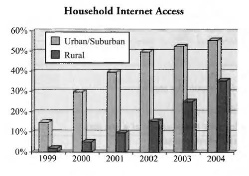
The graph below shows the percentage of urban\suburban and rural households in a European country that had Internet access between 1999 and 2014.

unknown
the charts below give information about levels of education in glascow,a city in scotland , in 2010


unknown
The diagrams below show the water supply system in Australia present and in future. Summarise the information by selecting and reporting the main features and make comparisons where relevant.
🚀 Prepare for IELTS writing section today!
- Unlimited Task 1 & Task 2 checksPractice with essays, charts, and letters.
- Personalized suggestions & mistake analysisSpot every mistake and boost your score.
- Topic ideas & vocabulary helpersExpand your ideas and use the right words.
- Progress trackingWatch your writing improve with every practice.