
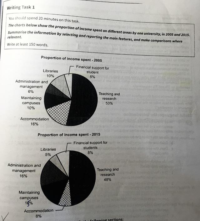
The pie charts provide information about the percentage of expenditure of a university in different areas between 2005 and 2015.
Overall
, it can clearly be seen that teaching and research usage was the dominant funding for the university, Linking Words
while
the financial support for students was almost less financed areas in both given periods.
Looking at the data in more detail for the teaching and research field was distributed almost half of the percentage of the income of the educational institution 53% in 2005 and 48% in 2015, to compare with the financial support for students which was spent just about 8% in each year shown. The administration and management pointed at 6% of input in 2005, it nearly tripled after a decade with a percentage of 16.
Linking Words
Moreover
, students who were interested in reading and lived in university accommodations lost an opportunity to fund exactly half, presenting spending of 10% and 16% in 2005 and 5% and 8% in 2015, respectively. Now focus on the detail of maintaining campuses remained the same both in 2005 and 2015 with 10%.Linking Words