
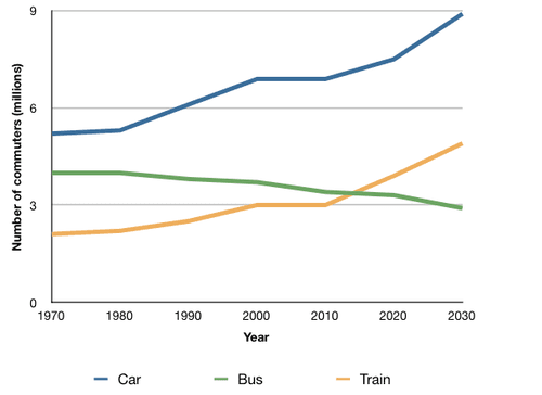
The line chart gives data about the median number of UK travellers using public transport
such
as cars, buses, or trains between 1970 and 2030. From an Linking Words
overall
perspective, it is readily apparent that Linking Words
while
all three groups started at a similar level, in the end, automobiles were the most prioritized, plus the others had a steady increase and decrease.
First of all, in 1970 all of the categories started at a relatively alike degree specifically around the 2 to 5 million mark. Linking Words
However
, after some time trains and vehicles started to exponentially rise and had comparatively parallel roads, Linking Words
nonetheless
for the reason of their dissimilar foundations one was less than the other, Linking Words
additionally
, both almost expanded to the point of doubling their number
Second of all, the only category left endured a completely different action and steadily declined from 4 to 3, Linking Words
nevertheless
did not end too different from what it started withLinking Words