
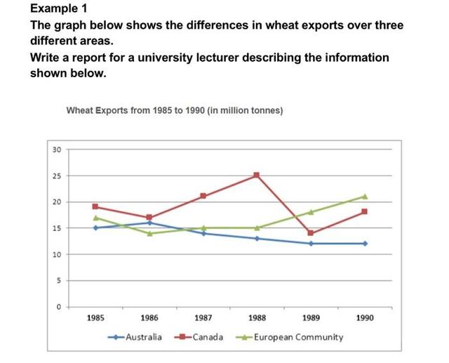
The given line chart compares the amount of
wheat
sent abroad from three regions - Use synonyms
Australia
, Canada, and the Use synonyms
European
Use synonyms
community
over the six-year period from 1985 to 1990.
Fix capitalization
Community
Overall
, Canada recorded the largest overseas delivery of Linking Words
wheat
throughout the period despite some fluctuations. Another noticeable observation is that Use synonyms
the
Correct article usage
apply
Australia
’s Use synonyms
wheat
exports consistently fell, Use synonyms
whereas
those of the Linking Words
European
community grew Use synonyms
stably
from 1985 to 1990.
In 1985, Canada exported about 19 Rephrase
steadily
million
Use synonyms
tons
of Use synonyms
wheat
, slightly more than the Use synonyms
European
Use synonyms
community’s
figure, which stood at around 16 Fix capitalization
Community’s
million
Use synonyms
tons
. Meanwhile, Use synonyms
Australia
exported approximately 15 Use synonyms
million
Use synonyms
tons
, the lowest among the three. Over the next two years, Canada’s Use synonyms
export
rose significantly to reach a peak of 25 Fix the agreement mistake
exports
million
Use synonyms
tons
in 1988. Use synonyms
However
, Linking Words
this
data Linking Words
then
fell sharply to around 14 Linking Words
million
Use synonyms
tons
in 1989 before recovering slightly in 1990.
Use synonyms
On the other hand
, the amount of Linking Words
wheat
exported from Use synonyms
Australia
showed a gradual decline, going down from 15 Use synonyms
million
Use synonyms
tons
in 1985 to about 11 Use synonyms
million
Use synonyms
tons
in 1990. Use synonyms
By contrast
, the Linking Words
European
community witnessed a steady increase in Use synonyms
wheat
sales overseas over the same period, exceeding Use synonyms
Australia
in 1989 and Use synonyms
hitting
Verb problem
reaching
the
peak of 21 Correct article usage
a
million
Use synonyms
tons
by 1990.Use synonyms