
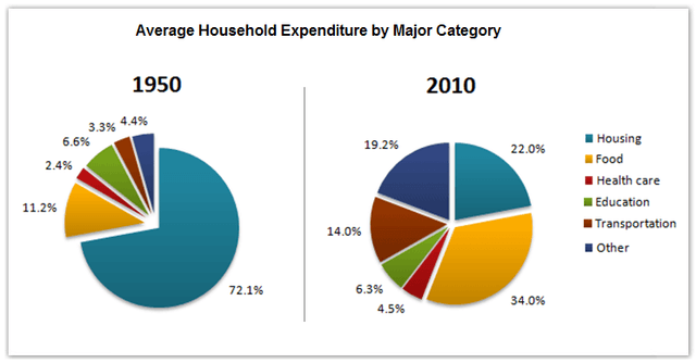
The two pie charts illustrate the average
household
expenditures percentage-wise in 1950 and 2010 in a country.
Use synonyms
Overall
, in the given Linking Words
period
, the lowest contribution was made by the healthcare Use synonyms
sector
. At the beginning of the Use synonyms
period
, housing was the most significant Use synonyms
sector
. In comparison, Use synonyms
at the end
of the Linking Words
period
food, housing and other services became the largest segments in outlay.
Use synonyms
Food
Correct article usage
The food
sector
accounted for 11.2% of the Use synonyms
household
's expenditure in 1950 and experienced a more than two-fold increase to 34% in 2010. Use synonyms
Household
expenditure from healthcare was 2.4% in 1950 and had a slight growth of 2% in 2010. At the beginning of the Use synonyms
period
, transportation and other services spent up only 3.3% and 4.4% respectively, and these figures rose to 14% and 19.2% in 2010.
Housing which comprised a quarter of Use synonyms
household
spending in 1950 fell to 22% in 2010. In 1950 the education Use synonyms
sector
was at 6.6% and decreased by 0.3% in 2010.Use synonyms