
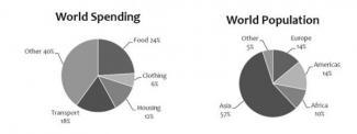
The pie charts compare the shares of four major items in global expenditure,
as well as
how the global community is distributed.
Linking Words
Overall
, the largest proportion of money in the world is allocated to food, Linking Words
while
transport, housing and clothing are other significant items. Linking Words
Moreover
, the public of Asia is responsible for the largest group of humans.
Linking Words
According to
the first chart, the most significant amounts are paid for food (almost a quarter of global expenditure) and transport (almost 20%), Linking Words
while
housing Linking Words
also
accounts for a considerable proportion. The least among the four is spent on clothing (merely 6 per cent) and the remaining 40% is spent on a variety of other items.
The Linking Words
second
chart shows that there is a significant difference between the populaces of Asia and that of other continents since approximately 3 out of every 5 human beings live in Asia. Europe and the Americas share similar proportions and together are host to roughly one-Linking Words
third
of the world’s people, Linking Words
while
the inhabitants of Africa form a mere one-tenth.Linking Words