
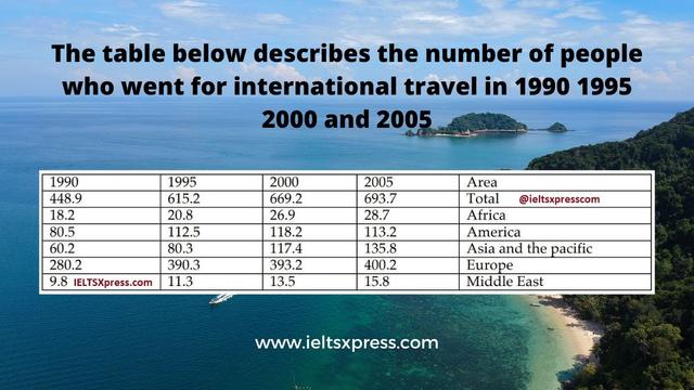
The provided diagram illustrates the proportion of tourists from different continents along the lines of Africa, America, Asia and the Pacific, Europe and the Middle East over 25-year periods.
Overall
, the years taken into consideration started from 1990 to the end of the period time of 2005. It is noticeable that the total sum of international tourists dramatically increased throughout the reporting period.
Observing the details, it is remarkable that every continent traveller except America massively rose from 1990 to 2005. Africa, Asia, Europe and the Middle East started at 18.2, 60.2, 280.2 and 9.8 (Linking Words
million
) and gradually climbed to reach a peak at 28.7, 135.8, 400.2 and 15.8 (Use synonyms
million
) respectively. Use synonyms
On the contrary
, the Americans were the only community whose quantity of visitors dropped from 118.2 Linking Words
million
in 2000 to 113.2 Use synonyms
million
in 2005 during the reporting time.
To summarise, with what has been analysed and compared, it is crucial to highlight that most continent travellers except American travellers are more present in modern society.Use synonyms