
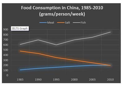
The provided diagram illustrates the proportion of foods consumed by the Chinese population over 25-year periods.
From an
overall
perspective, it is clear from the line graph that Linking Words
fish
and meat categories experienced a gradual increase Use synonyms
while
in, contrast salt dramatically dropped to the bottom line throughout the reporting period.
Observing the details, it is remarkable that the Linking Words
fish
encountered both rose and fell, at the beginning Use synonyms
fish
started at approximately 600 and slowly increased to 700 in 1990 Use synonyms
then
slightly decreased to 600 again in 1995 Linking Words
subsequently
Linking Words
fish
significantly rose to reach its peak at roughly 850 in 2010. Use synonyms
Similarly
, the meat started from the bottom line at 100 and steadily climbed to 200 in the 20th, century. Linking Words
On the contrary
, salt began at 500 but unfortunately met reductions and continued to drop to 200 in 2010.
To summarise, with what has been analysed and compared, it is crucial to highlight that Linking Words
fish
and meat are more present in the modern world.Use synonyms