
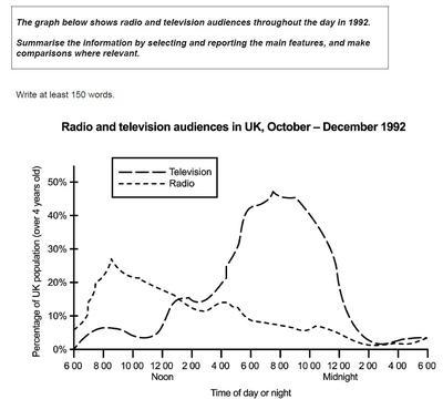
This
line graph illustrates the number of people, who forwards Linking Words
television
and Use synonyms
radio
in 1912. It is clear from the graph that, Use synonyms
television
Followers are more than Use synonyms
radio
audiences.
Use synonyms
Overall
, as we see at 8:00 am earlier large numbers of people watch Linking Words
television
. Use synonyms
However
, in Linking Words
Uk
people prefer Add a comma
,Uk
television
and Use synonyms
radio
,and in Use synonyms
this
,paragraph I will compare between percentages in the graph
Linking Words
According to
Linking Words
Linking Words
that
is shown, at 6 am the smallest number, watching Correct pronoun usage
what
television
clearly shows a Use synonyms
sharply increasing
over four hour to almost 45% percentage, but in one hour it drop down to 2:00am , as through midnight, a numeric viewers, if we compare to morning.
On the other hands, in percentage of Replace the word
sharp increase
radio
listeners in the morning at 6 am is a half more than Use synonyms
television
watcher, so in 9:00 am percent of public about 30%, wish represents the most time they are available to listen, and is contained to decline to 0% percent at midnight.Use synonyms