
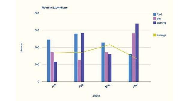
The bar chart depicts the monthly spending in
dollars
of a family in the USA on three items Use synonyms
food
, Use synonyms
gas
and clothing in 2010. the bar chart Use synonyms
also
includes a line to illustrate the average. It is clear from the graph that, the highest point in the average was recorded in March and the lowest point in April.
Linking Words
Overall
, the Linking Words
food
spending in January was over 400 Use synonyms
dollars
, and Use synonyms
that is
higher than the Linking Words
gas
and clothing as they were below 400 Use synonyms
dollars
. Use synonyms
However
. In February, spending on Linking Words
food
and clothing had increased to over 400 Use synonyms
dollars
, Use synonyms
while
Linking Words
gas
spending had decreased to under 400 Use synonyms
dollars
. Use synonyms
Nevertheless
. The average shows a slight increase.
In the month of March, the average climbed to up than 400 Linking Words
dollars
, the clothing dropped to under 400 Use synonyms
dollars
, and the Use synonyms
food
spending decreased a little bit, Use synonyms
in addition
the Linking Words
gas
spending increased by nearly 400 Use synonyms
dollars
.The outlay in April recorded the lowest average and the lowest Use synonyms
food
spending with the highest clothing and Use synonyms
gas
outlay.Use synonyms