
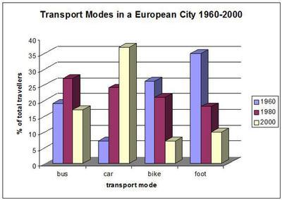
The given chart illustrates data about the proportion of the number of travellers based on four types of transport accommodation in a particular city which is divided into 1960, 1980, and 2000.
Generally speaking, automobiles showed great growth
whereas
buses and eco-friendly modes presented a fluctuating and opposite tendency.
In the year 1960, roughly 7% of people used cars to travel around and during the period the popularity soared dramatically up to over 40%. Linking Words
While
autos became the most popular choice of vehicles, eco-friendly modes provided a significant decline.
Most of the European population had chosen to go on foot (nearly 35%) and rode bikes (25%) in 1960 Linking Words
although
in the next 40 years, there was a gradual decrease of people using them to approximately 9% and 6%, respectively.
Buses were preferred by half of the population compared to walking with 17% even though the number rose slightly in 1980, it eventually fell and ended with only 16%.Linking Words