
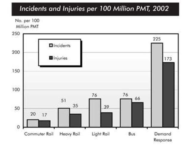
The provided bar chart represents the growth of incidents and injuries in different types of transport, among 100 million traveller miles in the year 2002. The data was given in millions and it can be split into two sections, highest and lowest trends.
Overall
, it is obvious to see that the data of the demand response was the highest in both incident and injury, the commuter rail was the safest.
First of all, the chart below shows the comparison of each type of transport Linking Words
that is
safe and unsafe. Beginning with the demand response, was reached the peak at 225 for incidents and 173 for injuries, which was over 100 more than the rest of the sections. The rest of the lower trends were the bus, light, heavy, and commuter, all of these stood at around the same level. The bus, light, and heavy rail were a mere over 50-80 incidents, and around 35-70 respectively, for injuries. Linking Words
Whereas
, the commuter rail was at the least of the bar graph merely at 20 in both sectionsLinking Words