
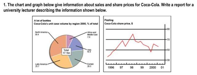
The given figures represent the sales and share prices of Coca-Cola. The volume of sales divided by region was presented in a pie
chart
.It is clear from the graph that , the share prices between 1996 and 2001 were displayed in a line Use synonyms
chart
.
Use synonyms
According to
what is shown, in the pie Linking Words
chart
, it can be seen that North America was the largest section, which is 30.4% ,Use synonyms
whereas
Africa and the Middle East are the smallest part, which is 7%. The line Linking Words
chart
starts the period at the bottom of the graph,which Use synonyms
just
above 30, it was increased to nearly 50% and dropped in the middle of the year 1997 and reached the peak of the graph in 1988 and it fluctuated and ended the timeframe at above 50.
Add a missing verb
was just
To sum up
, we could say that, the information experienced fluctuate trend throughout the whole timeframe.Linking Words