
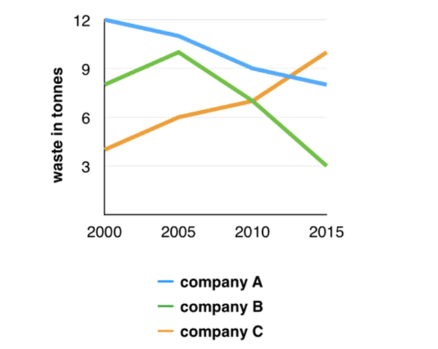
The provided
line
chart presents the amount of rubbish generated by three companies during the past 15 years from 2000 to 2015.
The blue Use synonyms
line
shows the amount of waste in Use synonyms
tonnes
of Use synonyms
Company
A. Meanwhile, the green Use synonyms
line
represents Use synonyms
Company
B and the orange Use synonyms
line
is for Use synonyms
Company
C.
The trends of those three entities were completely different. To start, Use synonyms
Company
A was on a downward trend for 15 years. The number of wastes gradually dropped from 12 Use synonyms
tonnes
in 2000 to 8 Use synonyms
tonnes
in 2015. Use synonyms
In addition
, Linking Words
Company
B’s figures fluctuated. It rose from 8 Use synonyms
tonnes
in 2000 to 11 Use synonyms
tonnes
in 2005, Use synonyms
then
it sharply dropped to 3 Linking Words
tonnes
in 2015. Use synonyms
Furthermore
, waste from Linking Words
Company
C continuously climbed from 4 Use synonyms
tonnes
in 2000 to 11 Use synonyms
tonnes
in 2015. Use synonyms
According to
the diagram, Linking Words
Company
C had the highest amount in 2015, followed by Use synonyms
Company
A and Use synonyms
Company
B relatively.Use synonyms