
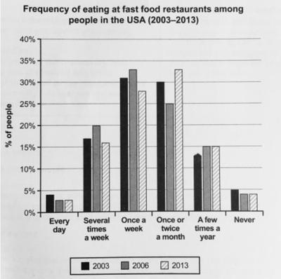
The chart illustrates how often people in the USA at in fast food restaurants, shown between the period
of
2003 and 2013.
Change preposition
apply
Overall
, the trajectory for those going once a week and once or twice a month showed the highest percentage across the three time periods. With 2006 and 2013 hitting well above 30%.
In relation to the ones attending several Linking Words
times
a week and a few Use synonyms
times
a year, the number that ate at fast food dinners several Use synonyms
times
a week Use synonyms
were
slightly similar to that of the latter. Significant differences in proportion were reflected in 2016 Correct subject-verb agreement
was
were
a fifth went Correct your spelling
where
to
fast joints, Replace the word
too
in contrast
to the same year in Linking Words
chart
for a few Add an article
the chart
a chart
times
a year, which is at 15%.
For the modes in every day and never, they were almost the same, depicting a small minority of under 5%, with a peak in 2003 for both and similarities in the proportion of the two in 2006 and 2013 respectively.Use synonyms