
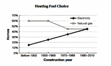
The line graph delineates data on homes built over the years between 1950 and 2010 in terms of heating fuel choices.
Overall
, what stands out Linking Words
of
the chart is that the consumption of natural gas showed a downward trend, Change preposition
from
in contrast
, using Linking Words
of
electricity to heat houses presented an upward trend.Change preposition
apply
Also
, both of the energy sources interceded at the same point in 2010.
Now, turning to the details, starting from 1950, the percentage of natural gas used in houses was at the highest point which remained Linking Words
60
% until 1969, meanwhile the consumption of electricity increased twofold from 14% to 28%. İt is crystal clear that, from 1970 to 1989, a dramatic decrease was observed in Change preposition
at 60
a
selection of natural gas which made up just under a half.
Correct article usage
the
On the other hand
, over the given period, the proportion of heat chosen as a heating fuel continued to grow.Commencing from 1970, the percentage of choices increased by 14%, which resulted in service Linking Words
to reach
a peak as an option to heat houses by 45% in Change the verb form
reaching
early
2000sChange the article
the early