
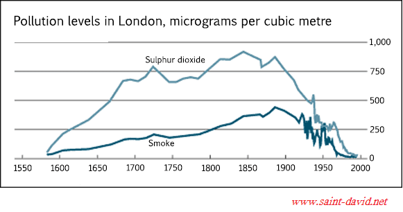
The given line graph illustrates the contamination degrees in London during the period from 1600 to 2000.
Overall
, a brief assessment of the data reveals that the amount of sulphur dioxide emission was higher than the smoke level over the whole time frame, with the exception of 1950.
Linking Words
To begin
with, Linking Words
started
at just under 250 Wrong verb form
starting
micrograms
per cubic metre, the figure of sulphur dioxide had increased approximately twice by 1650. Meanwhile, it started to fluctuate from 1700 at about 700 Use synonyms
micrograms
to 1900 at roughly 850 Use synonyms
micrograms
per cubic metre. From Use synonyms
this
, the emission value kept falling down with insignificant oscillations to Linking Words
the
zero in 2000.
Regarding the smoke level, it was growing quite gradually from just under 50 Correct article usage
apply
micrograms
at the beginning to about 350 Use synonyms
micrograms
per cubic metre in 1850. The figure Use synonyms
then
slightly climbed before 1900 (by around 100 Linking Words
micrograms
) and continued diving, similar to the sulphur dioxide, to the end of the given period.Use synonyms