
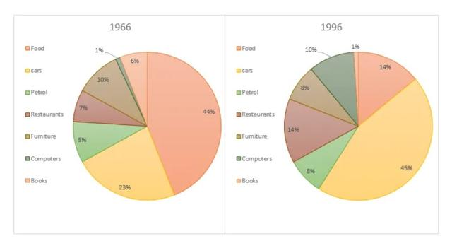
the pie charts illustrate the changes in American patterns of output for 30 years between 1966 and 1996. food and cars made up the two biggest items of the figure during both
the
years and together,they comprised well over half of the household Correct article usage
apply
expense
.
food accounted for 44% of the spending in 1966 ,but Fix the agreement mistake
expenses
this
came down sharply by Linking Words
two thirds
, to 14%,in 1966 Add a hyphen
two-thirds
however
, the outlay on cars almost doubled,rising from 23% in 1966 to 45% in 1996.
spending on dining out doubled,rising from 7% to 14% .the proportion of Linking Words
amount
spent on operating computers increased dramatically to 10% in 1996 from 1% in 1966. Correct article usage
the amount
however
, as Linking Words
computers
expenditure rose , the percentage of outlay on books fell considerably from 6% to 1%. Americans spent approximately the same amount on petrol and furniture during both years.
Change the noun form
computer
to sum up
,increased amounts spent on cars, computers and eating out in 1966 were made by drops in expenditure on food and books in 1966.Linking Words