
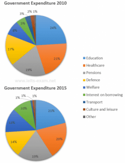
The pie chart illustrates the amount of money spent on several categories during two almost similar level in 2015.(20%).The allocated Percentage on pension was 19% during both
years
(2010,2015)by a local government.
Use synonyms
Overall
,it is obvious the majority of the expenditure was on education and health care in the given two Linking Words
years
.when compared to 2010, in 2015 there is a significant rise in the money which was dedicated to welfare and interest in borrowing.
In both 2010 and ,2015 maximum expenditure was on education, counting 24% and 21% respectively.Education,being the second entity in the country's expenditure accounted for 21% in the first given year and stood atUse synonyms
Add an article
an
years
The most striking growth was noticed in welfare and interest in borrowing.The latter doubled during 2015; compared to 2010(10%) Use synonyms
while
the former increased from 7% to 14%.Other areas were considered with minimal change during the two Linking Words
years
.Use synonyms