
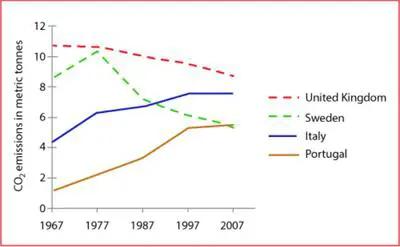
The line graph compares the average emissions of carbon dioxide in four different countries UK,
Sweden
, Italy and Portugal over a period of 40 years.
Use synonyms
Overall
, it can be seen that radiation in the UK rises sharply. Linking Words
Whereas
, Portugal witnessed a decline over the period.
In 1967, each inhabitant of the United Kingdom produces 11 metric Linking Words
tonnes
of carbon dioxide which was significantly high among other countries. In the first year, Use synonyms
Sweden
experienced a peaked tonne of discharge. Italy had experienced ups and downs over time. Portugal emitted 2 Use synonyms
tonnes
of CO2 in the year 1967.
Use synonyms
Moreover
, the UK fell down over the duration with 9 Linking Words
tonnes
. Use synonyms
Although
, Linking Words
Sweden
experienced peaks and valleys in the 40 years. In 1987 it had 7-meter Use synonyms
tonnes
of radiation. Use synonyms
In addition
, Italy remained constant from 1997 to 2007. Linking Words
Furthermore
, the radiations in Portugal are relatively low. In the time 2007, Linking Words
Sweden
and Portugal had nearly 6 metric Use synonyms
tonnes
of CO2.Use synonyms