
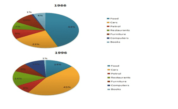
The pie charts illustrate the expenditures of the American people on seven essential items between the years 1966 and 1996.
Overall
, as observed in the year 1966 the citizens spent most on food and Linking Words
cars
, Use synonyms
while
less on computers. Meanwhile, by 1996 there is a drastic shift seen that more people choose Linking Words
cars
over other important things Use synonyms
while
making books the lowest of their interest.
Way back in 1966, food is imperative for Americans which garnered the highest percentage (roughly 44%). Closely followed by Linking Words
cars
at 23%. Trailing behind Furniture, Petrol, Restaurants, books, and computers at 10%,9%,7%,6%, and 1%, respectively, which the latter being the lowest.
Turning to the year 1996, a notable significant change happened to make Use synonyms
cars
the primary need of the people in America at approximately 45%, Use synonyms
while
spending more than half of the per cent on other categories. Food and restaurant had a similar percentage (14%). Petrol and Furniture shared the same per cent (8%). Linking Words
While
making computers the second lowest at just 10%. Linking Words
Whereas
a small fraction was noted on books (1%).Linking Words
lsc_00000