
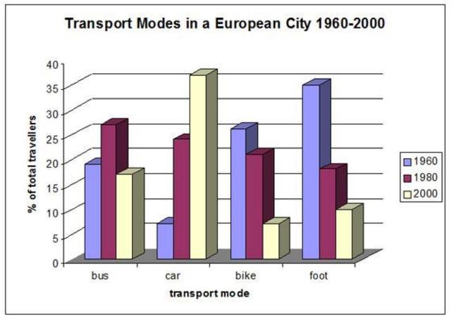
The bar graph illustrates four different transport types people used to commute to work in a city in Europe between 1960 and 2000.
Overall
, Linking Words
while
the proportion of people who used cars had increased over the period, the percentage of those who used other means of transport fell over time.
Regarding the car, Linking Words
although
it was the least popular mode of transport in 1960, standing at just over 5% of travellers, it experienced considerable growth to become the most popular one, accounting for more than 40 % in 2000. Linking Words
By contrast
, bike and walking had dropped their proportion throughout the period. The figures started at approximately 25% and 34% in 1960 respectively, but they both plunged to under 10% in 2000.
In terms of buses, in 1960 just about 18% of travellers took advantage of buses, followed by a steep rise to over 25% in 1980. Afterwards, the figure dropped to the lower level of 1960, representing roughly 16% in 2000.Linking Words