
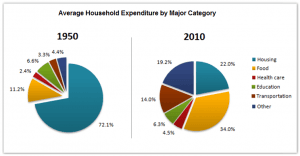
The pie chart illustrates the information regarding the 34%.
amount
spent on different facilities from 1950 to 2010.The data is calibrated in percentage.
Use synonyms
Overall
,in 1950 the maximum Linking Words
amount
was spent on housing Use synonyms
whereas
in 2010 the maximum Linking Words
amount
was spent on food.
At a fleeting glance, in 1950 a large proportion of the money was spent on housing as compared to other facilities.The Use synonyms
amount
used for food was greater which was 11.2% in comparison to education.Interestingly,the expenditure spent on health care and transportation was 2.4% and 3.3% respectively.The Use synonyms
amount
spent on other was less whilst on education which was 6.6%.
Probing ahead,in 2010 more Use synonyms
amount
of money was used for foodUse synonyms
Change preposition
by
In addition
,money spent on housing was more than others which Linking Words
were
19.2%.Surprisingly,expenditure used for education and health care was 6.3% and 4.5% respectively.Correct subject-verb agreement
was
Moreover
, the Linking Words
amount
spent on transportation was less as compared to housing by 8%.The minimum Use synonyms
amount
was used by transportation which was 4.5% only.Use synonyms