
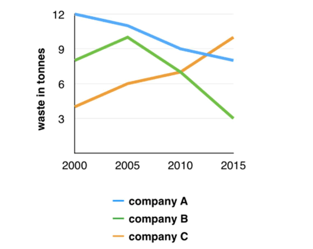
The graph above gives details regarding the production of waste from the 3 most renowned companies (a,
b
,Use synonyms
c
) and the changes that took place in its rate from the Use synonyms
years
2000-2015.
Organisation A has improved envirirmently as its unwanted products per cent decreased slowly over the past 15 Use synonyms
years
from 12 % to 9%. Use synonyms
While
Linking Words
,
Remove the comma
apply
B
had a steep elevation in the year 2005.Later, with strict ,Use synonyms
amedements
the graph has shown a dramatic fall.
Correct your spelling
amendments
On the other hand
, institution Linking Words
c
has shown quite opposite results as there is a drastic rise in its waste contribution from 5% to 11% over Use synonyms
years
.
In conclusion, though at the start of the decade, the highest contribution of garbage is by A followed by Use synonyms
B
and Use synonyms
lastly
by Linking Words
C
.Use synonyms
But
,as the Remove the conjunction
apply
years
passed ,ecological degradation is observed in Use synonyms
C
Use synonyms
while
A and Linking Words
B
showed appraisal.Use synonyms
Furthermore
, Linking Words
b
has the least contributionUse synonyms