
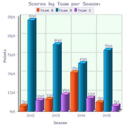
The bar graph illustrates the
scores
that Use synonyms
team
A, Use synonyms
B
, Use synonyms
C
, and D got over four various seasons from 2002 to 2005.
Use synonyms
Overall
, it is evident that all the Linking Words
scores
fluctuated over the research period. Use synonyms
In addition
, Linking Words
team
Use synonyms
B
always had the highest Use synonyms
scores
.
In 2002, the Use synonyms
scores
of Use synonyms
Team
Use synonyms
B
started at a peak of 82 Use synonyms
points
, compared to 5 Use synonyms
points
in Use synonyms
Team
A and 10 Use synonyms
points
in Use synonyms
Team
Use synonyms
C
. From 2002 to 2004, there was a significant decrease in the Use synonyms
scores
of Use synonyms
Team
Use synonyms
B
to 43 Use synonyms
points
, Use synonyms
while
Linking Words
Team
A rose to 35 Use synonyms
points
and Use synonyms
Team
Use synonyms
C
went up to 12 Use synonyms
points
even though it decreased by 3 Use synonyms
points
, compared with 15 Use synonyms
points
in 2003.
Use synonyms
At the end
of the period, Linking Words
Team
Use synonyms
B
witnessed a dramatic increase in the Use synonyms
scores
to 55 Use synonyms
points
. The figures for the other two teams fell minimally to 8 Use synonyms
points
in Use synonyms
Team
A and 5 Use synonyms
points
in Use synonyms
Team
Use synonyms
C
.Use synonyms