
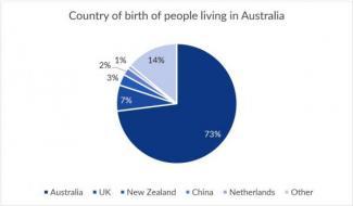
The pie chart shows the percentage of Australia’s population in terms of
the
place of birth. Correct article usage
apply
While
the table graph illustrates the place in which these Linking Words
people
reside.
Use synonyms
Overall
, the majority of Linking Words
people
who are living in Australia were born in Use synonyms
this
nation as well. Linking Words
In addition
, Linking Words
urban
area is considered to be the place where residents prefer to live in.
Concerning the pie chart, Australia is the birthplace in which Add an article
the urban
an urban
accounts
for the largest proportion at 73%. There Wrong verb form
accounting
are
14% of Unnecessary verb
apply
people
were born in other countries which is twice as much as that in Use synonyms
United
Kingdom. Correct article usage
the United
However
, New Zealand, China and Linking Words
Netherland
are very small Fix the agreement mistake
Netherlands
percentage
which take up only 6% combined.
Turning to the second set of data, standing at 99% of residents born in China living in cities is much higher than the proportion of Fix the agreement mistake
percentages
UK
, Australia and Correct article usage
the UK
Correct article usage
the Netherland
Netherland
consisting of 89%, 83%, Fix the agreement mistake
Netherlands
90
% respectively. New Zealand is the birthplace with the greatest proportion Correct word choice
and 90
Use synonyms
people
living in the outskirt at 20%Change preposition
of people