
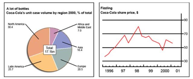
The pie chart below illustrates the percentage of coca cola's volume being consumed in 5 different regions,
while
the line graph gives information about the share price of that drink between 1996 and 2001. Linking Words
Overall
, as we can see, North America had the largest proportion, and the highest cost of fizzling was in 1998.
Looking at the line graph, it is easily apparent that there was a steady growth of 40 dollars from 96-97, Linking Words
then
a sharp decline took place in the middle of the year 1997. Linking Words
However
, the share price increased steeply which reached a peak of 80 dollars in 1998. From 1998-2000, the expenditure of fizzling fell to a low close to 48 dollars .
North America and Latin America, in sequence, had the greatest portion which was about 30% and 26%. Linking Words
Moreover
, the Europeans Linking Words
in
the third rank in consuming coca cola with approximately one-fifth of the total which was around 17 billion bottles. Add a missing verb
were in
Finally
, the smallest proportion belonged to African and Middle Linking Words
east
people who merely made up 7% of the total.Replace the word
Eastern